
Visual style
Serif headline
A serif headline is a large heading set in a typeface with small finishing strokes on its letters, usually paired with a sans-serif for body text.
- Also called
- Serif display type, Serif heading, Editorial headline
- Spotted on
- 71 of 422 homepages
- Browse examples
- Hero sections →
What is a serif headline?
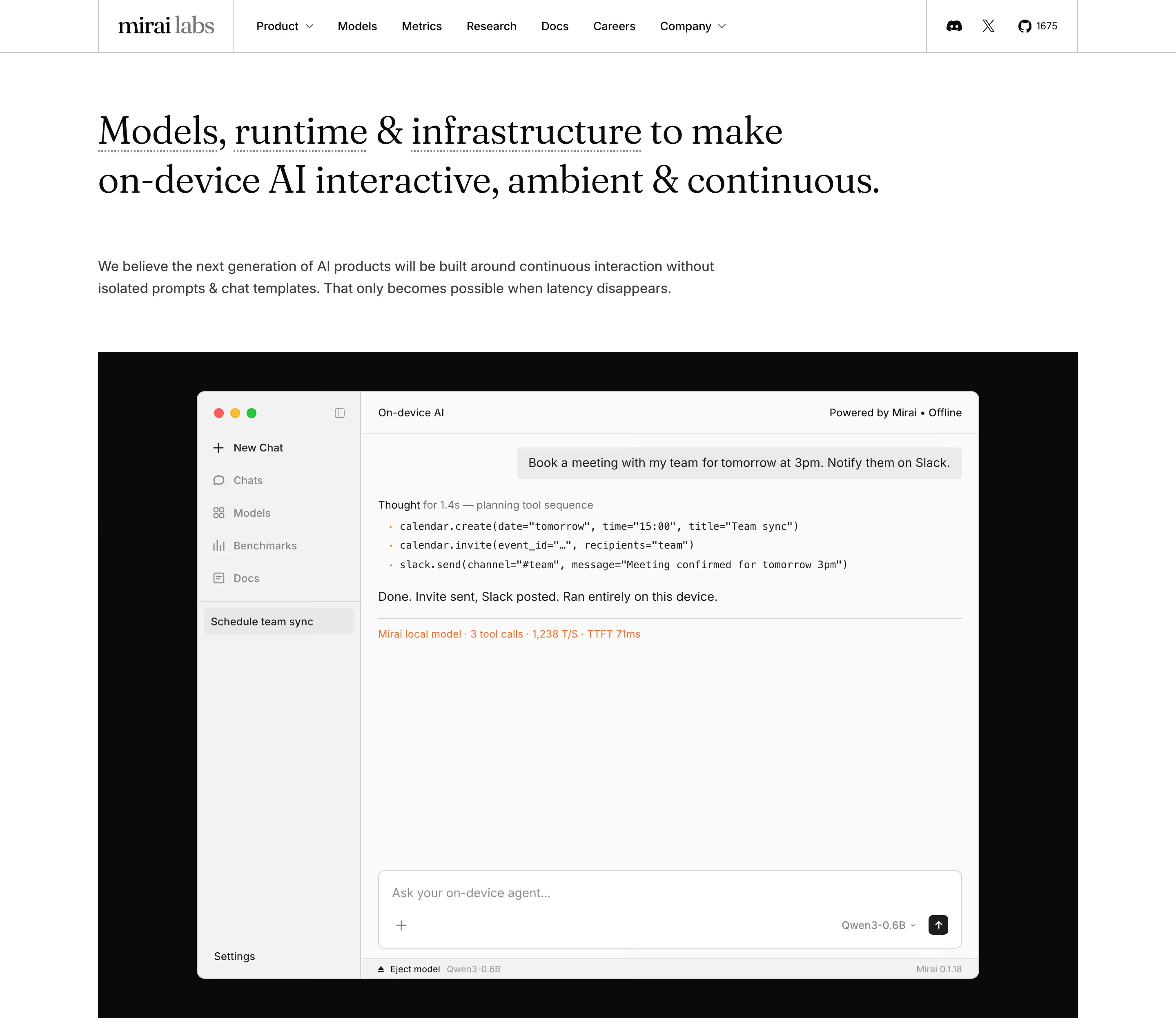
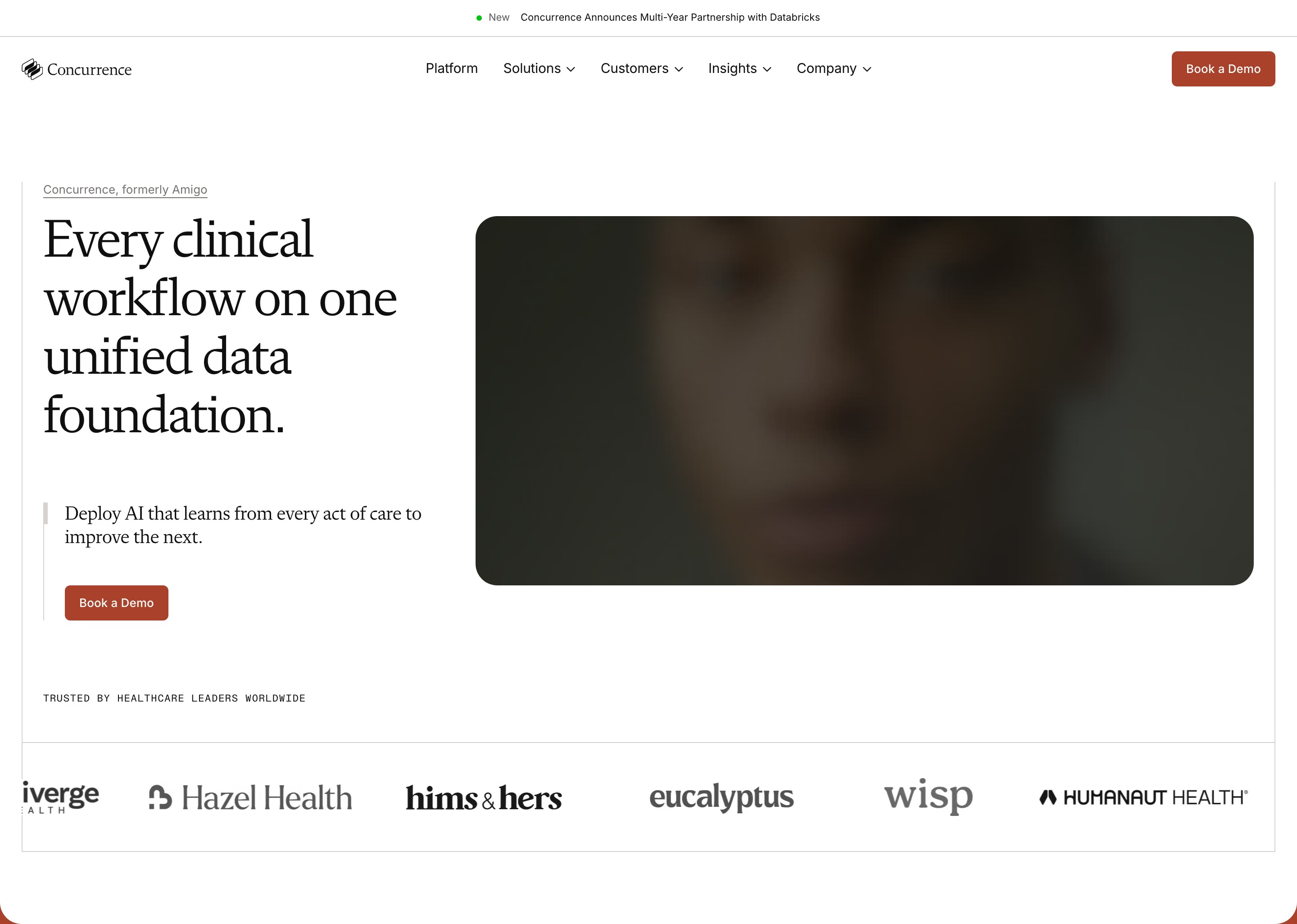
For years the SaaS default was a geometric sans everywhere. A serif headline is the quickest way to step out of that: it reads as editorial, considered and a little warmer. Our reviews find it across AI tools, finance and writing apps, often in faces such as Tiempos, Source Serif, Fraunces or PP Kyoto over an Inter or Geist body.
It is usually a hero-first decision. Fly sets "Computers for agents" in a very large serif over a pink-to-blue gradient; Craft and AssemblyAI center and left-align serif headlines over plain sans subheads. Many add one italic phrase for emphasis, as Lume does with a violet italic last word.
The serif should be for display only. Small serif labels, buttons and UI text next to a sans interface look like a mistake. The pairing works when the contrast is deliberate: serif for the voice, sans for the product.
Serif headline examples from real SaaS sites
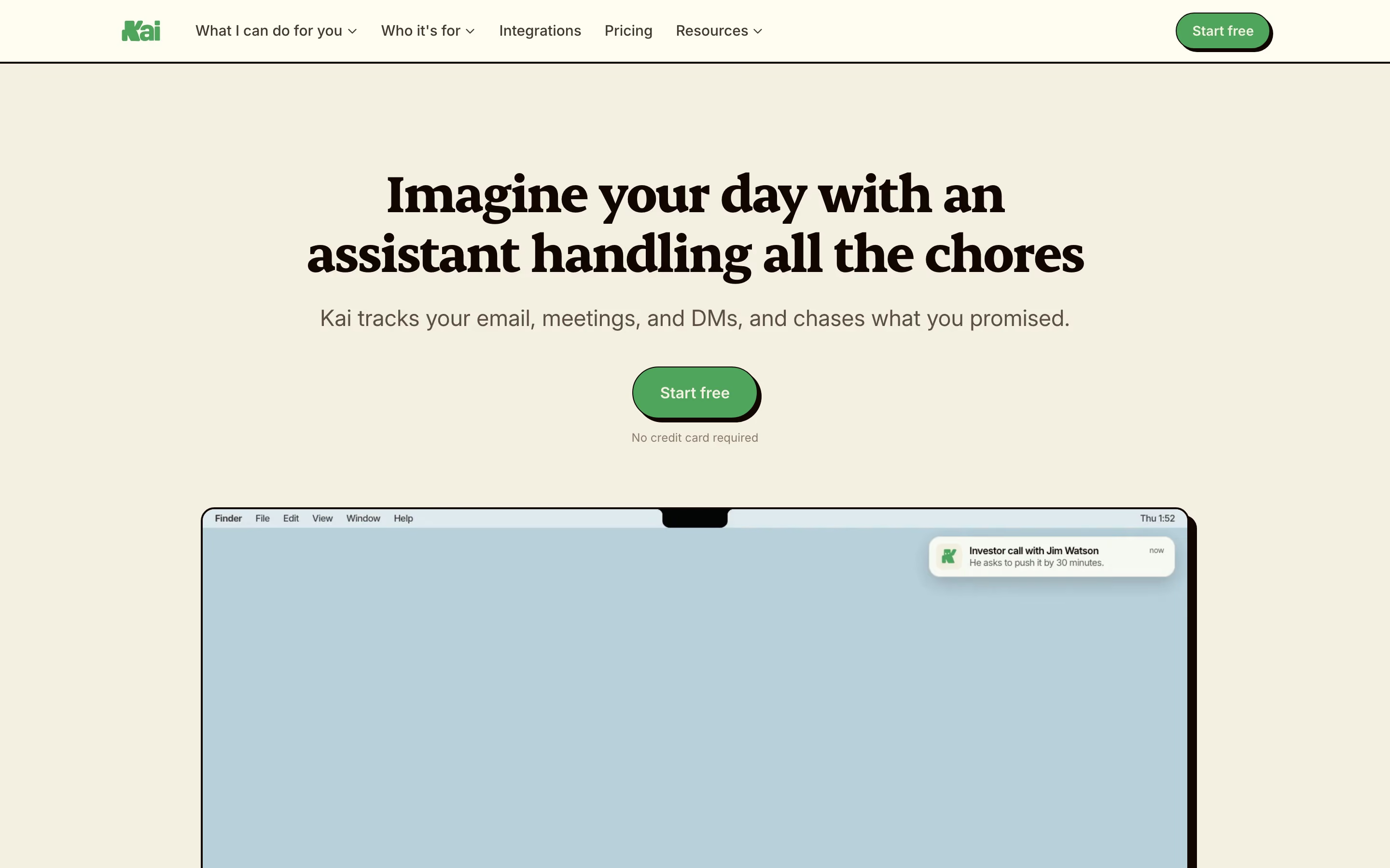
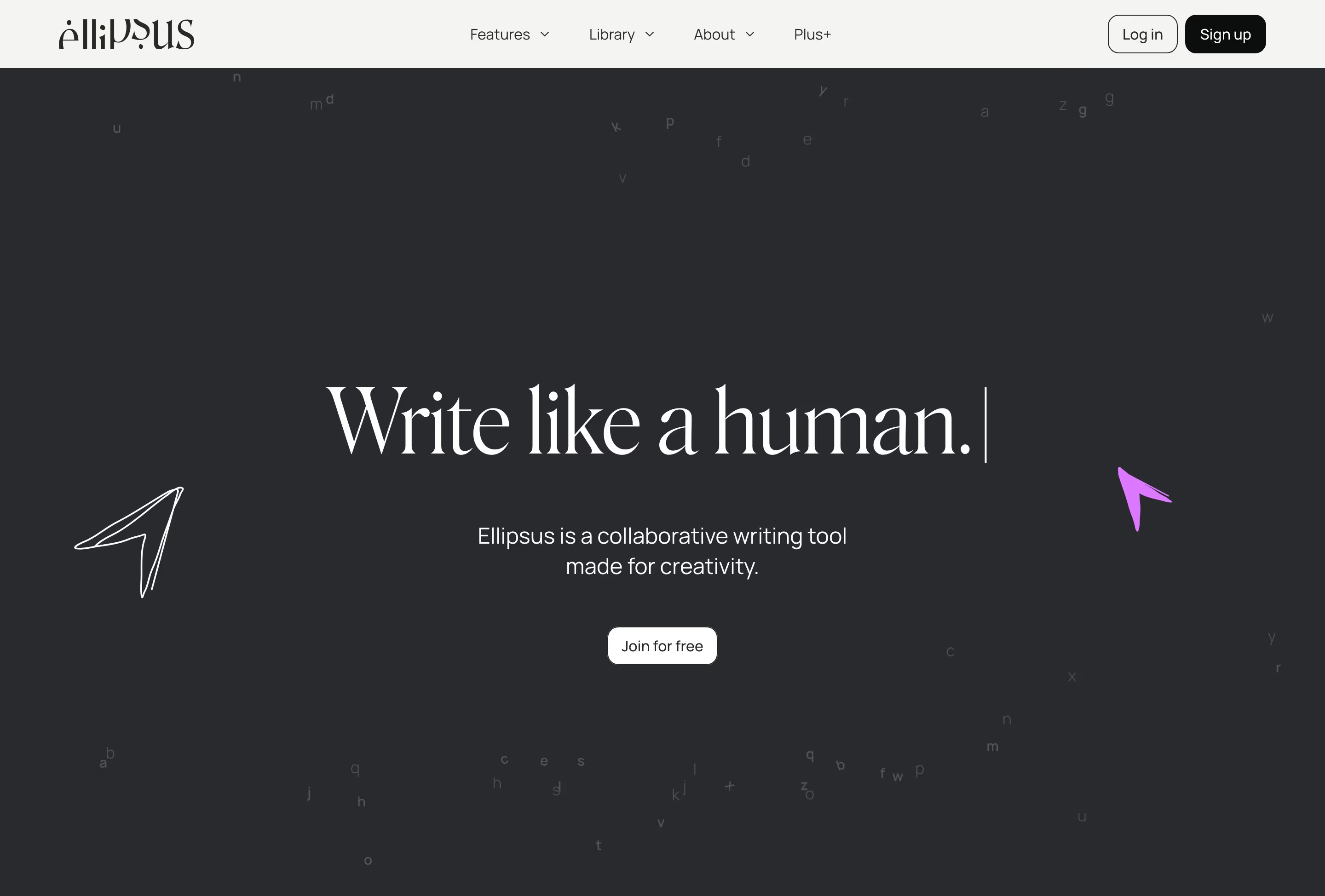
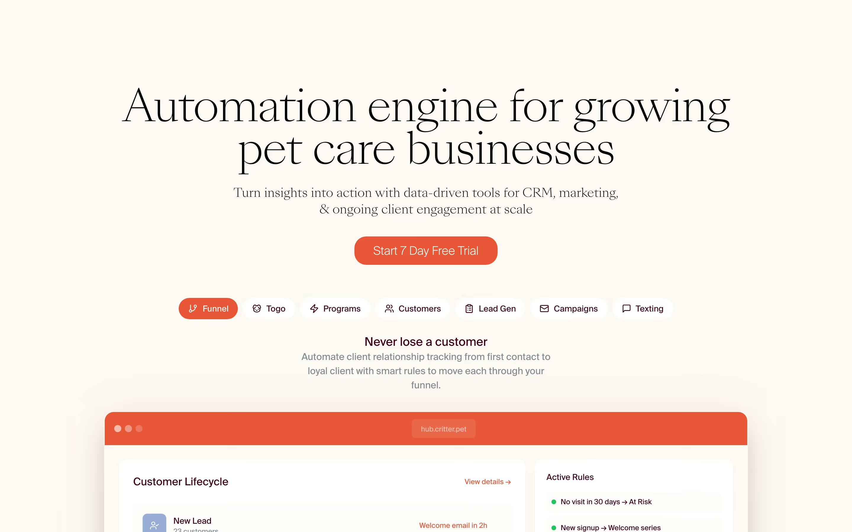
Each one is a hero capture whose design review mentions the serif headline.
When to use a serif headline, and when not to
Use it for
- Standing apartCompetitors all use the same geometric sans, and you want the headline to look different at a glance.
- Writing and thinking toolsProducts about notes, research, documents or AI writing, where an editorial tone fits.
- Trust-heavy categoriesFinance, legal and healthcare, where a classic serif reads as steady.
Avoid it for
- Dense UI textButtons, tables and labels stay in sans; serif at small sizes hurts scanning.
- Low-resolution contextsVery thin serifs on light backgrounds can break up on low-density screens.
- Hard-technical brandsInfrastructure and developer tools built on monospace and sans may find a serif off-voice.
Anatomy of a serif headline
- 1Display serifA serif face at large size, often a light or regular weight rather than bold.
- 2EmphasisAn optional italic or colored word or phrase inside the headline.
- 3Sans pairingA sans-serif for subhead, body, buttons and navigation to keep the interface crisp.
- 4Tight spacingReduced line height and slightly negative tracking so large serif lines hold together.
Common serif headline variants
1. High-contrast serif
Thick-thin strokes in the Didone or transitional style, the most fashion-like option.
2. Soft serif
Rounded, warmer faces such as Fraunces that feel friendly rather than formal.
3. Serif with italic accent
A sans or serif headline where one phrase switches to serif italic for emphasis.
Spotted in our design reviews
Our reviews describe a serif headline on 71 of the 422 SaaS homepages in the catalog. A few of them:
A pill reading "Join us at Resend Forward" sits above the left-aligned headline "Email for developers", set in a light serif.
Resend · Above the fold
Above the fold, a dark photograph of a warehouse aisle sits behind the serif headline "Perfect orders." and "Built on Riff.", with "deliver on time" highlighted in green in the paragraph beneath.
Riff · Above the fold
The huge four-line serif headline, "The AI notepad for back-to-back meetings", sits above "Notes, actions and memory.
Granola · Above the fold
The centred serif headline "Lume is joining Harvey." sets the last word in violet italics, with the monospace date "MARCH 3, 2026" under it.
Lume · Above the fold
The serif headline "Voice AI infrastructure for builders" sits left of the subhead, which begins "Trusted by millions of developers".
Assemblyai · Above the fold
The serif headline "Remember everything.
Ancher · Above the fold
A centred serif headline, "The world's data for AI agents", leads to one black "Try API for free" button and a query box with a results table, flanked by scattered sky-photo tiles.
Exa · Above the fold
A centred serif headline "Do work in the meeting" sets the word "in" in italic.
Tana · Above the fold
Often confused with
Serif headline vs. monospace font
Monospace signals code and precision, usually in small labels; a serif headline signals editorial voice at the largest size on the page.
Serif headline vs. minimalism
Minimal sites often pair with serif headlines because one strong typographic choice can replace imagery, but neither requires the other.
Frequently asked
Should body text be serif too?
Rarely on SaaS sites. Almost every serif headline in our catalog sits over a sans-serif body; the contrast between them is part of the look.
Does a serif headline make a SaaS brand look old-fashioned?
Not with a contemporary face, generous size and a modern layout around it. Old-fashioned comes from default system serifs like Times, not from serifs as such.