
Forms & inputs
Minimalism
Minimalism is a visual style that strips a page to a few elements, generous space and a restrained palette, so type and one focal object carry the design.
- Also called
- Minimal design, Minimalist website, Monochrome design, Clean design
- Spotted on
- 19 of 422 homepages
- Browse examples
- Minimal designs →
What is minimalism?
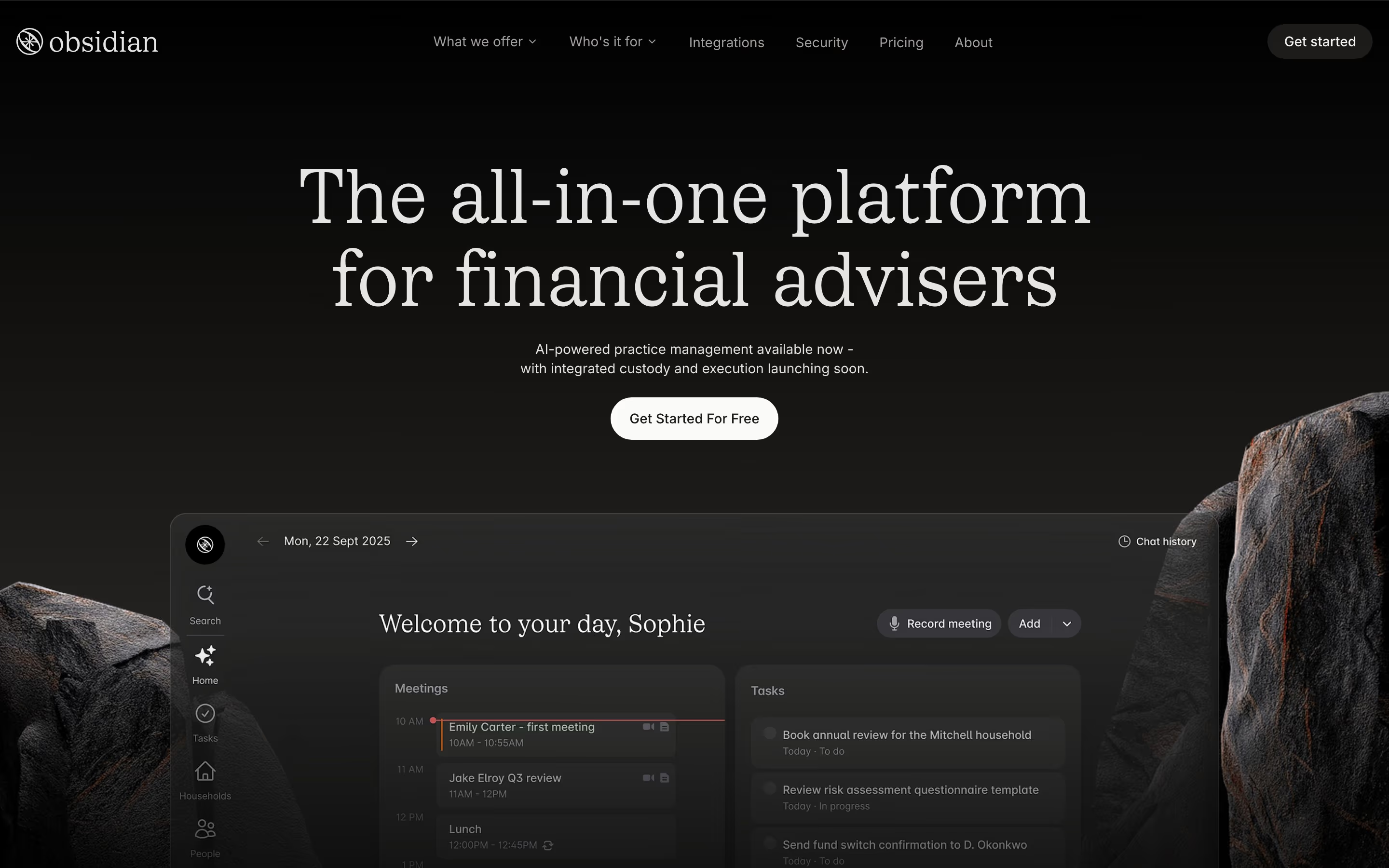
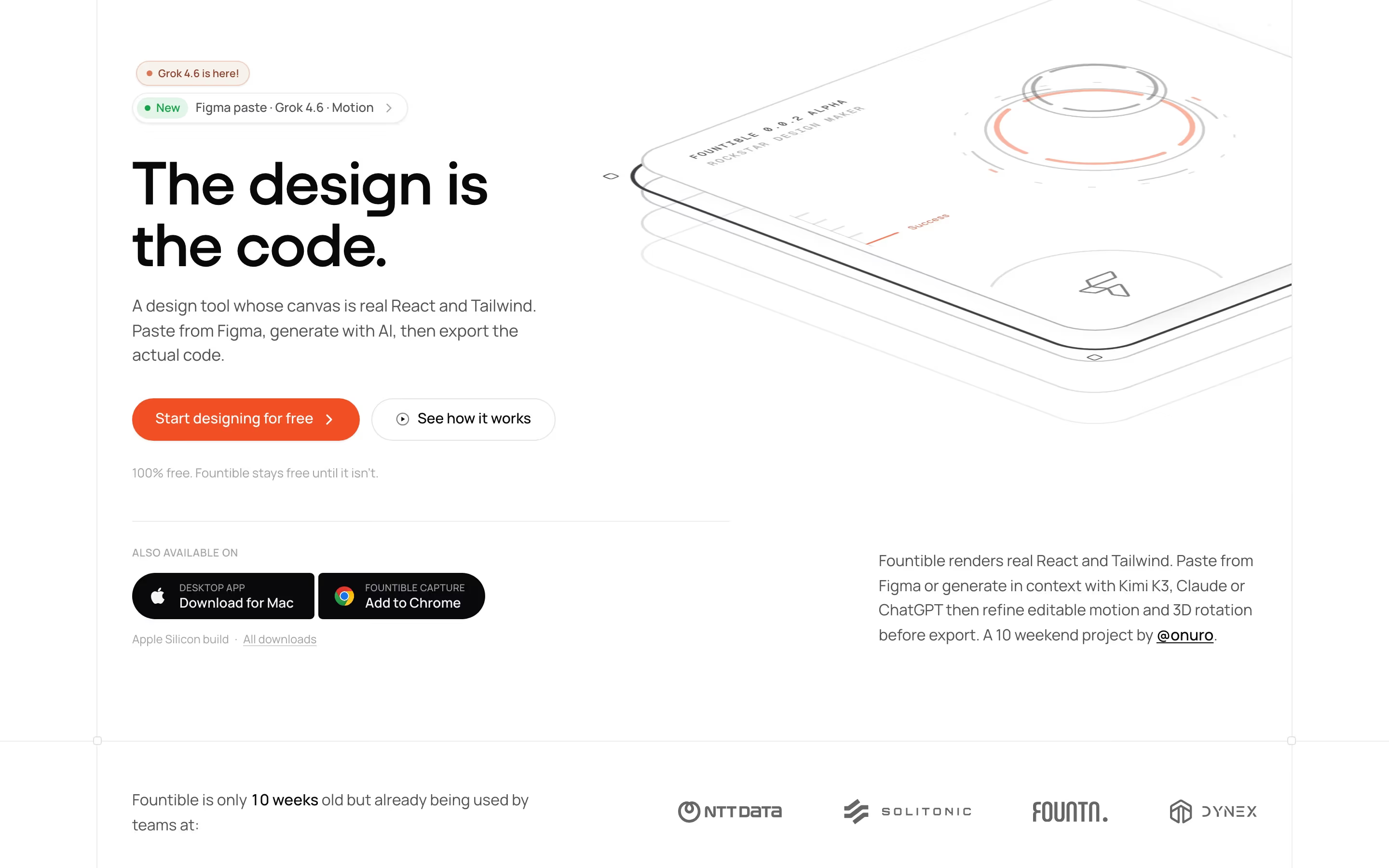
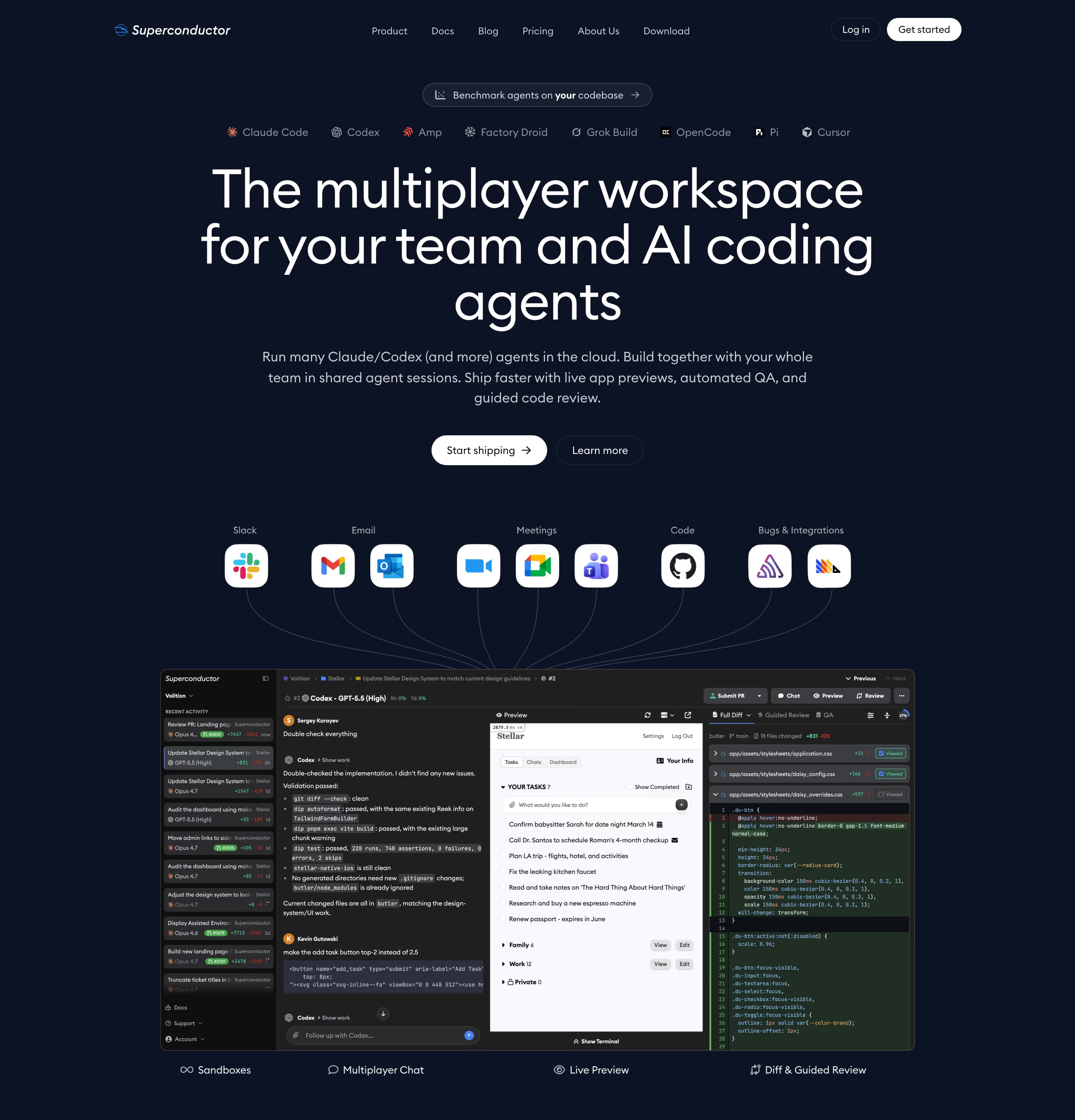
Minimal SaaS sites rely on what is left: a strong headline, a clear type scale, lots of space and usually one accent color. Our reviews describe Vercel's palette as near monochrome, off-white with near-black type and mid-grey hairlines, and Beside's as a near-monochrome scheme where greys carry the cards and dividers. Warp, Stacker and Antimetal are reviewed as light, minimal pages built the same way.
Minimalism is harder than it looks. With no color or decoration to lean on, every remaining choice is visible: a cramped type scale, uneven spacing or a vague headline has nowhere to hide. The sites that pull it off use typography as their main design tool and reserve their single accent for buttons and links, so it still means "click here".
Minimal does not mean empty of content. Many minimal SaaS pages are long; they stay minimal by repeating a small set of components and colors instead of inventing a new treatment for each section.
Minimalism examples from real SaaS sites
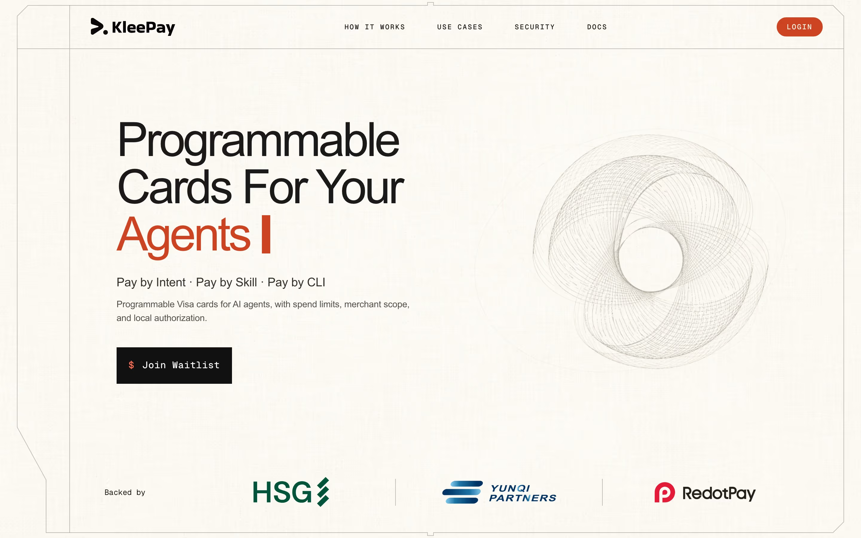
Heroes from the catalog.

When to use minimalism, and when not to
Use it for
- Strong brand mark or headlineA recognizable logo or a sharp value proposition that can stand alone on the page.
- Colorful product UIWhen screenshots already carry color, a monochrome page keeps them the focus.
- Discerning audienceDesigners and developers who read restraint as quality.
Avoid it for
- Weak messagingMinimal pages expose vague copy. Fix the headline before removing everything around it.
- Complex productsIf buyers need many proofs and explanations, stripping visuals can make the page harder to scan.
- Playful brandsConsumer or community products whose personality lives in color and illustration.
Anatomy of minimalism
- 1Neutral groundWhite, off-white or near-black, with greys for cards and dividers.
- 2Type systemOne or two typefaces with clear size and weight steps doing the work of hierarchy.
- 3WhitespaceGenerous spacing between and within sections, so each block has room.
- 4Single accentAt most one color, kept for primary buttons and links.
- 5Focal objectOne mark, screenshot or line of type per screen that the eye lands on.
Common minimalism variants
1. Light minimal
Off-white ground, near-black type, hairline rules and one accent: the most common form.
2. Monochrome
Tints of one hue (usually grey) for every surface, so hierarchy comes from value alone.
3. Document style
A page that reads like plain text, with few images and almost no decoration.
Spotted in our design reviews
Our reviews describe minimalism on 19 of the 422 SaaS homepages in the catalog. A few of them:
This block is deliberately sparse.
Ramp · CTAs
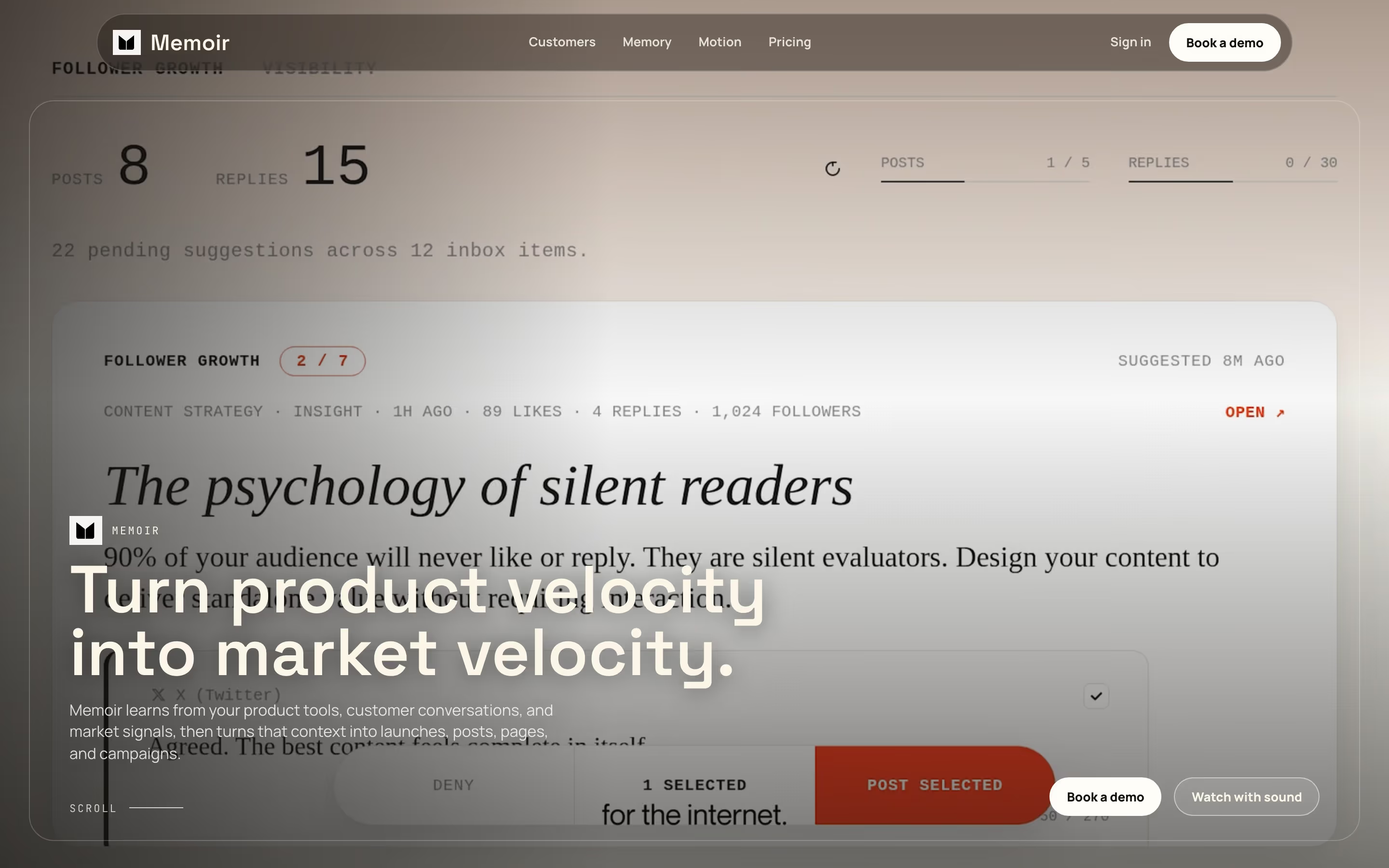
The page is light and minimal, and the hero shows the working interface in full rather than an illustration.
Devin · Overview
The page is a white, minimal layout 6317 pixels tall at desktop width, with black type and black pill buttons as the main contrast.
Stacker · Overview
Black rounded actions and faint grey borders keep the layout restrained.
Lunagraph · Overview
The Warp homepage is a light, minimal page four desktop slices long, set on a near-white #fcfcfc background.
Warp · Overview
Colour stays near-monochrome, using #1c1c1c and #010101 for dark fields, #fafafa for light ones and #373737 and #676767 for secondary text, with thin orange accents on card borders and result figures.
V7labs · Overview
Colour is near monochrome: an off-white ground of #fafafa, near-black #020202 for type and the triangle, and mid-greys such as #c8c8c8 for faded text and hairlines.
Vercel · Overview
It is a light, minimal page on a pale grey ground, #e9eae4, with headlines set in Test Signifier and body copy in Geist.
Antimetal · Overview
Often confused with
Minimalism vs. dark mode
Dark mode describes the background color; minimalism describes how little is on the page. A dark page can be minimal or busy.
Minimalism vs. grid background
Visible grid lines add structure to minimal pages but also add decoration; true minimal pages often leave the grid implied.
Frequently asked
Does a minimal website mean less content?
No. It means fewer kinds of elements and less decoration. A minimal page can be long; it stays minimal by repeating a small set of components and colors.
How many colors does a minimal website use?
Usually a neutral palette of black, white and greys plus at most one accent, kept for interactive elements so it stays meaningful.