
Page sections
Why choose us section
A why choose us section is a block, often headed "Why {product}?", that lists the few reasons a buyer should pick this product over the alternatives.
- Also called
- Why us, Why choose us, Benefits section, Differentiators section
- Spotted on
- 16 of 422 homepages
- Browse examples
- Why choose us sections →
What is a why choose us section?
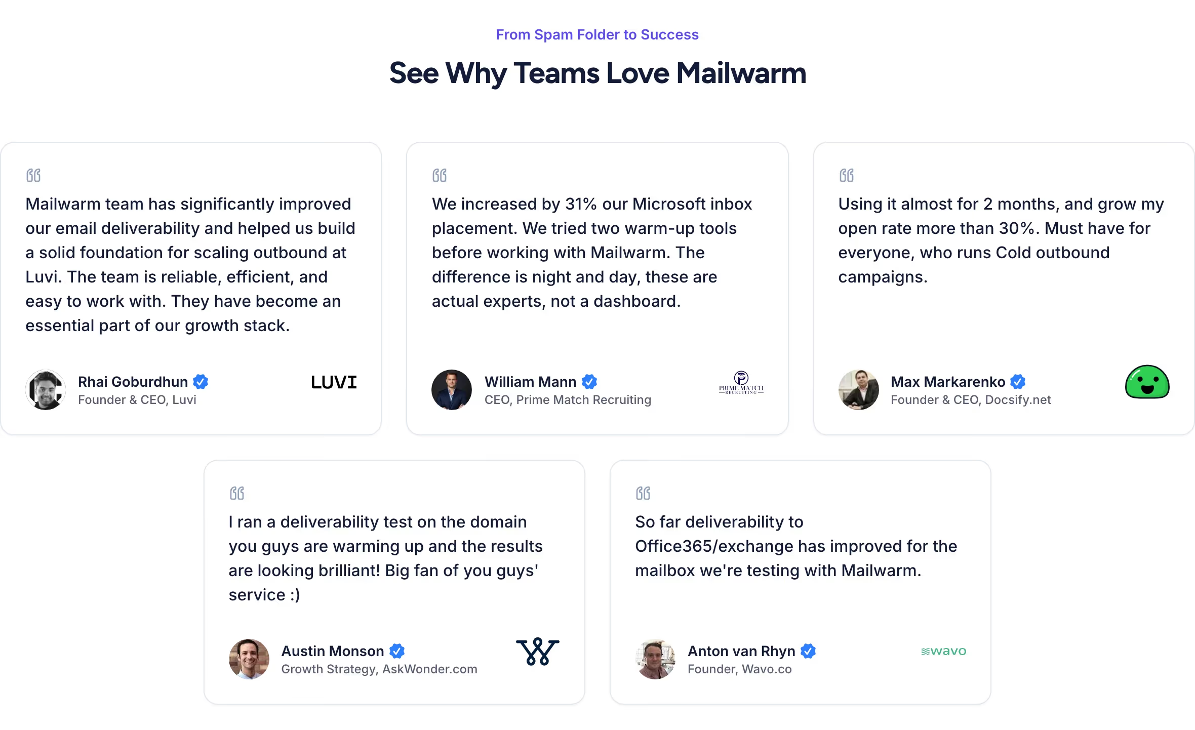
Feature sections explain what a product does; a why-choose-us section argues why it is the better choice. On SaaS sites it usually appears mid-page as three or four reasons, each with an icon, a short title and a sentence.
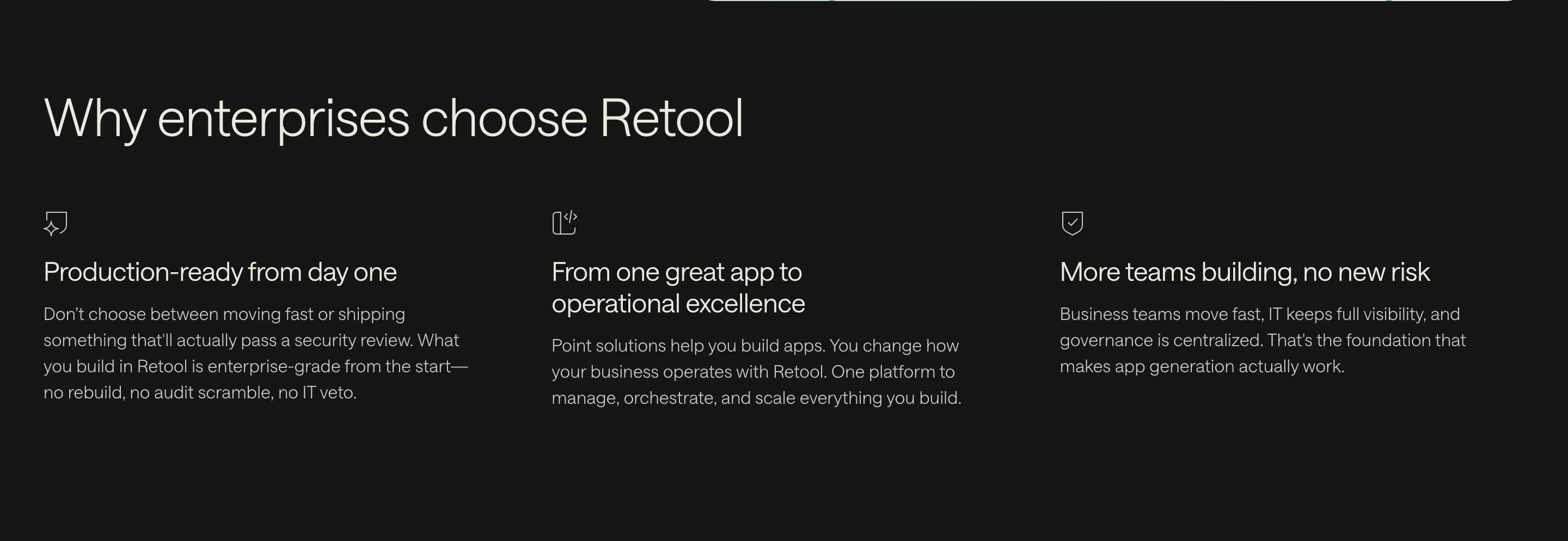
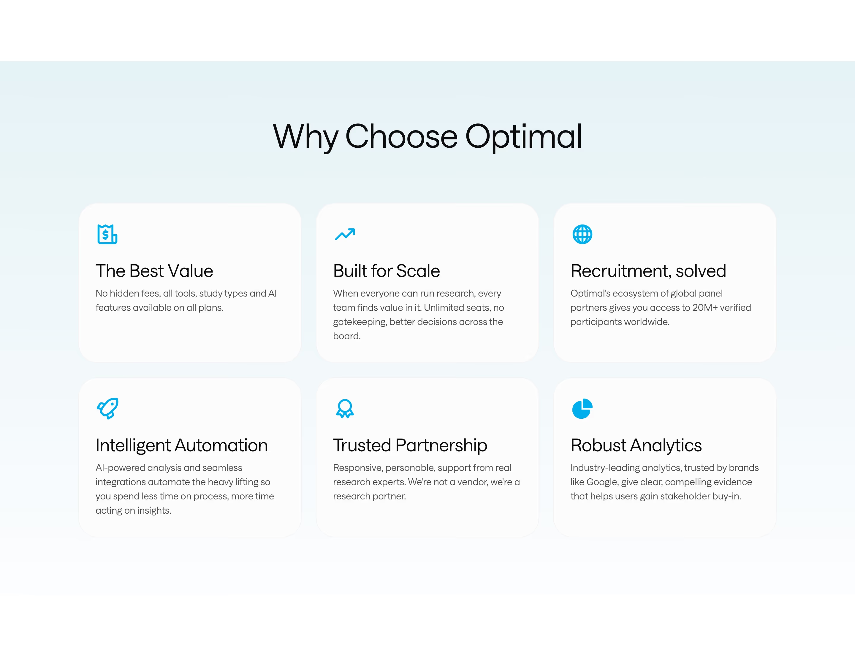
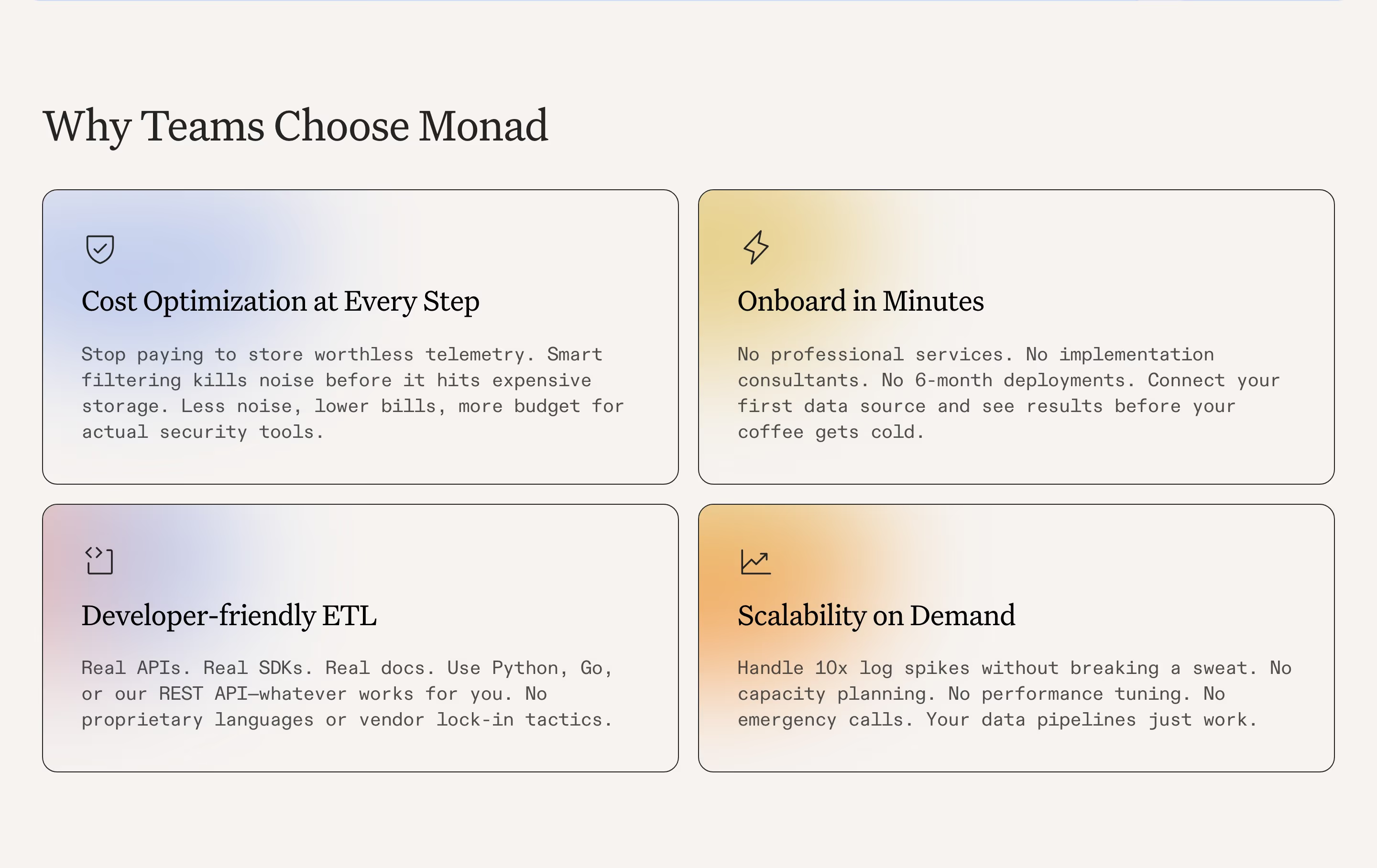
The format in our reviews is consistent: Retool's "Why enterprises choose Retool" introduces three columns with line icons; Monad and Fal both use a two-by-two grid of cards; PostHog keeps it to three bullets under "Why PostHog?". Cloudflare turns it into a split panel contrasting "Fighting infra" with "Shipping with Cloudflare".
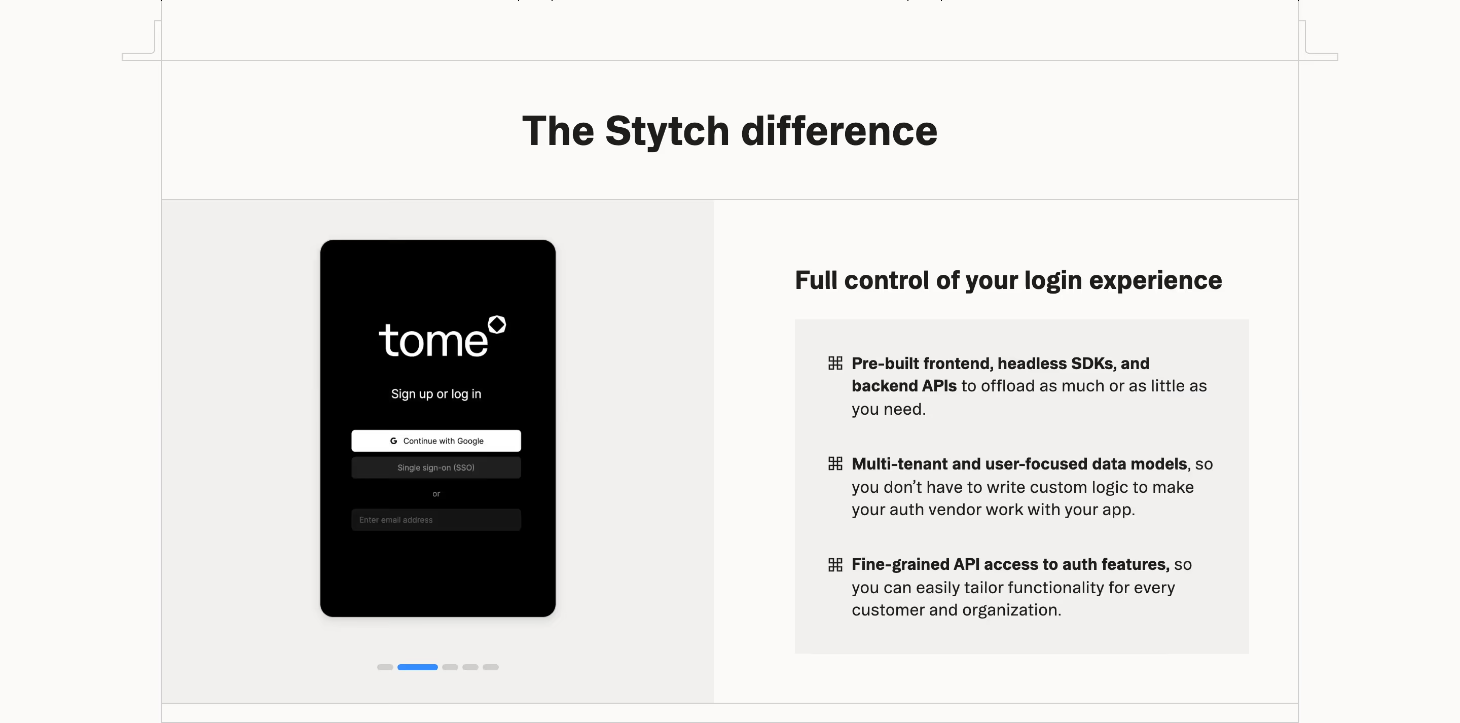
This section is only worth having if the reasons are actually differentiating. "Easy to use", "Secure" and "Great support" are claimed by every competitor. Reasons tied to something checkable (open source, pricing model, a speed benchmark you publish) earn their space.
Why choose us section examples from real SaaS sites
Why Choose Us from the catalog.

When to use a why choose us section, and when not to
Use it for
- Crowded categoriesBuyers are comparing you to several similar tools and need a reason to pick yours.
- Clear differentiatorsYou have concrete advantages, such as a pricing model, architecture or openness, that competitors lack.
- Enterprise buyersA focused list helps a champion explain the choice internally.
Avoid it for
- Generic virtuesReasons any competitor could claim make the whole section skippable.
- Duplicating featuresIf the reasons are just feature names again, merge them into the feature section.
- New categoriesWhen there are no real alternatives, explain the problem instead of arguing against competitors.
Anatomy of a why choose us section
- 1Heading"Why {product}?" or "Why teams choose {product}".
- 2ReasonsThree to six items, each a short title and one or two sentences.
- 3Icons or visualsLine icons, small illustrations or a code sample per reason.
- 4Optional proofA stat, quote or comparison that backs a reason up.
Common why choose us section variants
1. Three columns
Icon, title and sentence in three equal columns.
2. Two-by-two grid
Four cards, sometimes with a visual in each.
3. Before and after
A split panel contrasting the old way with the product's way.
4. Bulleted list
A plain short list under the heading, as on PostHog.
Spotted in our design reviews
Our reviews describe a why choose us section on 16 of the 422 SaaS homepages in the catalog. A few of them:
The white "Why Clarasight" block states "$1.5T in corporate travel, meetings, and events spend still runs on disconnected systems and manual processes."
Clarasight · Why Clarasight and the first product card
"Why Attentive?" introduces six tiles in two rows of three: four text tiles ("Agentic AI", "Omnichannel", "Single Customer ID", "Expertise") with small icons, and two photographs placed diagonally.
Attentive · Logo strip, value grid and channel cards
The "Why Zite?" heading, "Build and deploy with confidence", leads three cards: "Understand how your apps work", "Let your team build, safely" and "Limit app access with roles".
Zite · Three steps and trust cards
Under the diagram, a "WHY COMPOSIO" tag introduces "Your agents are smart.
Composio · Why-Composio tabs and numbered feature rows
A two-by-two grid under "Why choose fal?" holds four grey cards: "Fastest inference engine for diffusion models", "On-demand GPUs, serverless deployments", "Built for developers" with a code sample, and a pricing card headed "H100s, H200s, B200s starting at $1.89".
Fal · Why choose fal grid and enterprise block
"Why PostHog?" gives three bullets, starting "Transparency.".
Posthog · Data warehouse, pricing table and company values
A left-hand "Frequently asked questions" heading faces six plus-sign rows, starting with "Why Relace?" and "Is Relace SOC 2 compliant?".
Relace · Feature tiles, testimonials and FAQ
"Why WorkOS?" and "Expand your market" follow, with a video captioned "Watch: Crossing the Enterprise Chasm".
Workos · Directory sync, admin portal and customer proof
Often confused with
Why choose us section vs. feature section
Feature sections describe capabilities; a why-choose-us section ranks the reasons those capabilities matter versus alternatives.
Why choose us section vs. comparison table
A comparison table names competitors and checks off features row by row; a why-choose-us section argues the case in prose without a table.
Frequently asked
How many reasons should a why choose us section list?
Three or four. Past six, the list stops reading as a ranked argument and becomes another feature grid.
Should it name competitors?
Usually not on the homepage; that belongs on dedicated comparison pages. The section can still contrast "the old way" without naming anyone.