
Visual style
Glassmorphism
Glassmorphism is a style where panels look like frosted glass: semi-transparent, blurring whatever sits behind them and edged with a thin light border.
- Also called
- Frosted glass, Glass UI, Backdrop blur, Glass cards
- Spotted on
- 12 of 422 homepages
- Browse examples
- Colorful designs →
What is glassmorphism?
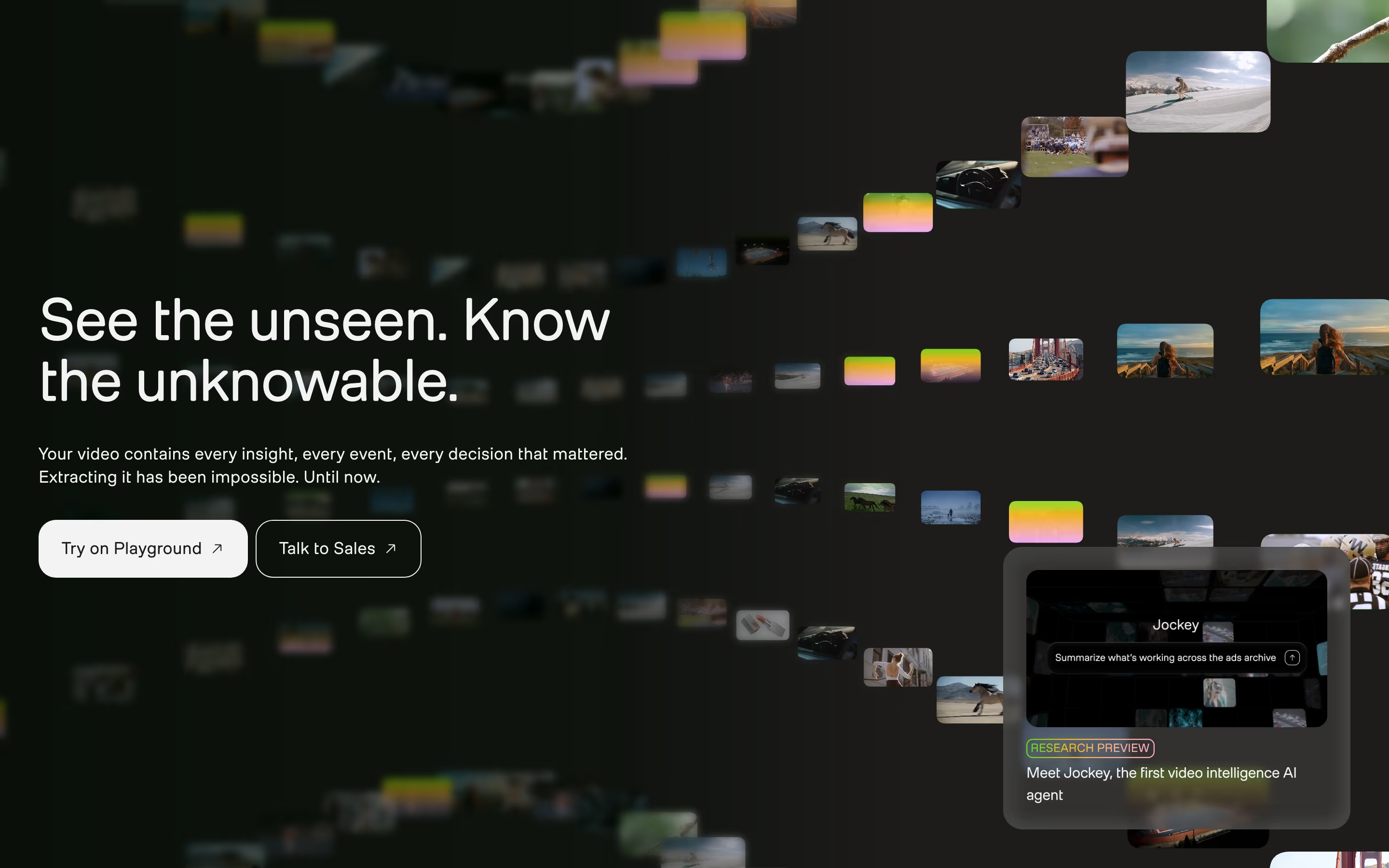
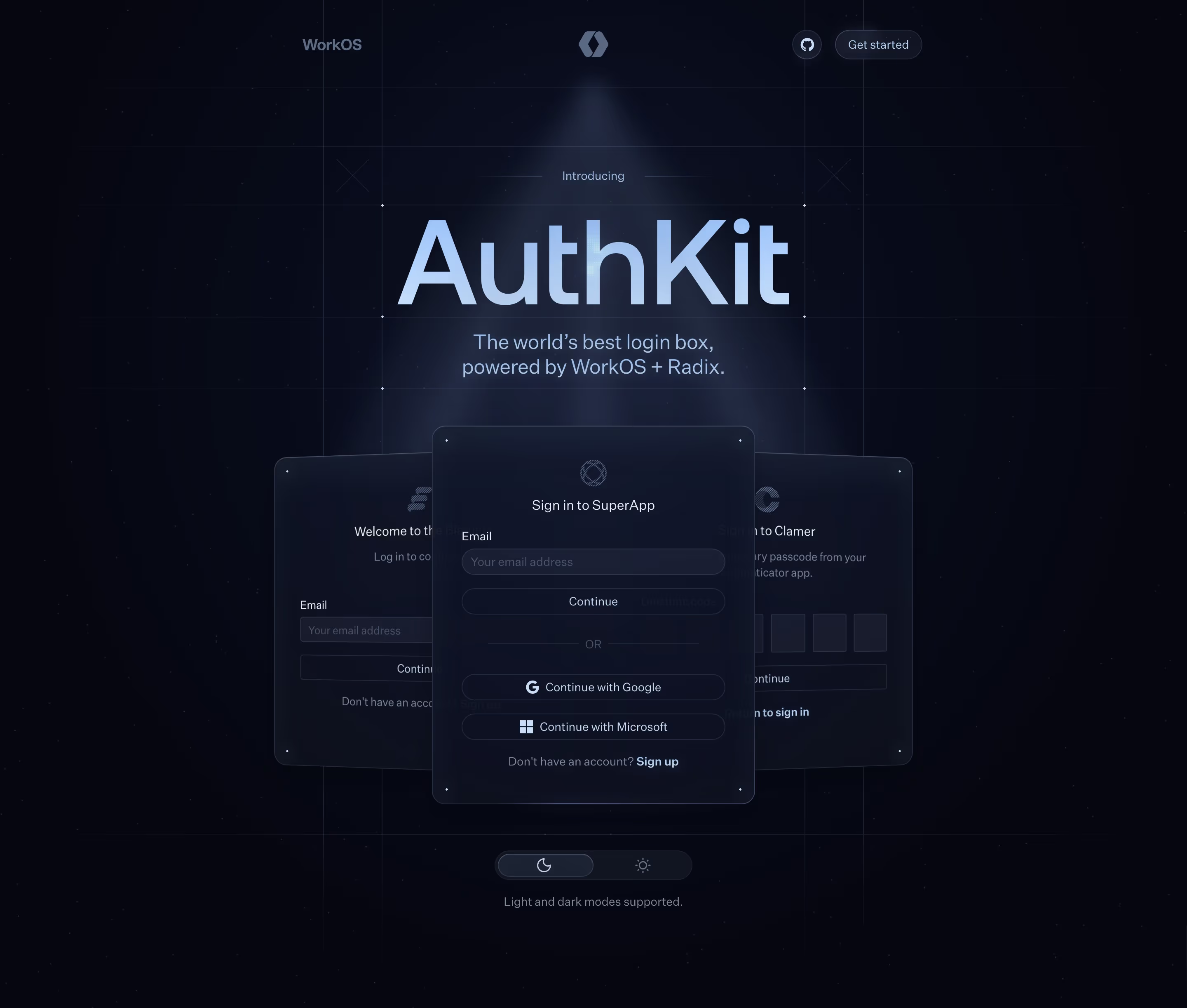
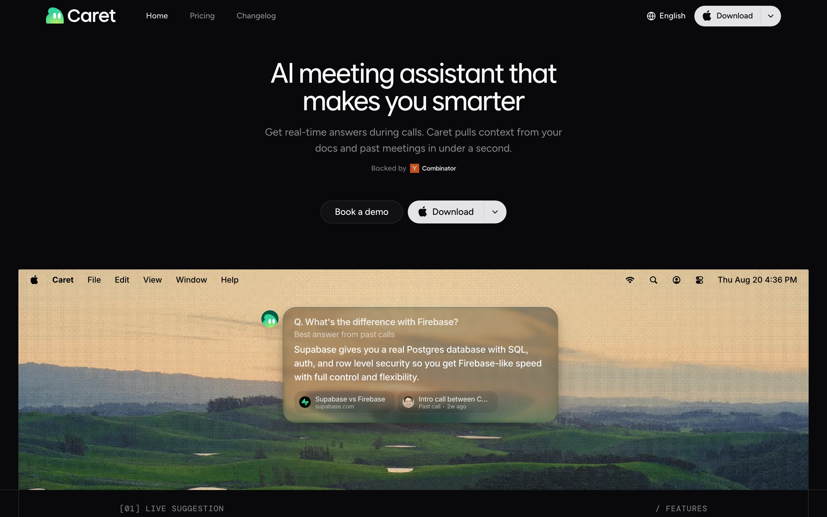
Glassmorphism makes interface panels feel like physical layers. On SaaS marketing sites it rarely covers a whole page; it shows up as one or two frosted cards floating over a photograph or a colorful backdrop. Our reviews record a frosted search card over Twelve Labs' hero, a translucent "Sign in to SuperApp" card rising from the bottom of AuthKit's, and a translucent answer card over Caret's landscape.
The style only works when there is something to see through it. A frosted card on a flat white page is just a grey card; the same card over a photo, gradient or glow picks up its color and reads as glass. That is why glass panels so often sit over landscape photography or vivid light.
Legibility is the trade-off. Whatever passes behind the glass changes the contrast of the text on it, so the strongest examples blur heavily, tint the panel slightly and keep the text on it short.
Glassmorphism examples from real SaaS sites
Each one is a hero capture whose design review mentions the glassmorphism.
When to use glassmorphism, and when not to
Use it for
- Rich backdropThe page already has a photograph, gradient or glow worth letting show through.
- Showing UI as a layerA single product card that should feel like it floats above the scene.
- Light, modern toneProducts that want to feel airy and current rather than heavy and enterprise.
Avoid it for
- Plain backgroundsOver flat white or black there is nothing to blur, and the effect disappears.
- Dense textLong copy on a translucent panel loses contrast as the background shifts behind it.
- Whole-page treatmentMaking every card glass removes the contrast that makes any one of them stand out.
Anatomy of glassmorphism
- 1Background blurA strong blur of whatever sits behind the panel, done in CSS with backdrop-filter.
- 2Translucent fillA white or tinted fill at low opacity, so color from behind bleeds through.
- 3Border highlightA thin, light border or inner edge that catches the light and defines the panel's shape.
- 4Colorful backdropA photo, gradient or glow behind the glass; without it the effect has nothing to show.
- 5Soft shadowAn optional diffuse shadow that lifts the panel off the scene.
Common glassmorphism variants
1. Floating card
One frosted card over a hero photo or gradient, usually holding a mock product element.
2. Glass navigation
A translucent, blurred nav bar that lets the page scroll visibly beneath it.
3. Glass chips and tiles
Small translucent labels or tiles laid over a colored panel.
Spotted in our design reviews
Our reviews describe glassmorphism on 12 of the 422 SaaS homepages in the catalog. A few of them:
A violet panel with a glass chip reading "PROSPECT LIST" leads into an off-white section, "Build forms at the drop of a prompt", with a dark "Explore forms" button and a tilted lime mockup.
Typeform · Forms and Growth Flow blocks
The active "Customer support" tab shows a frosted card with chat bubbles.
Ninjo · Tabbed demo and MCP band
"Introducing the Bretton AI platform." heads three frosted cards, "Templates", "Builder" and "Workbench", plus a wider three-column card: "Integrations & data", "Audit & evaluations", "Quality control".
Bretton · Logo strip, statement block and platform cards
A translucent card holds a Stanford Health Care logo and a serif quote from "Dr.
Concurrence · Stats, testimonial and audience cards
"What people notice when they use Synara." shows a row of avatars with "35+ posts and counting", a large frosted quote card marked "3 / 35" with arrows and a pause button, and a scrolling band of X post cards with like counts.
Trysynara · Social proof, privacy and model prompts
Translucent panels sit over the photographs: a code editor, a loss chart and a table.
Relace · Overview
The closing banner, "Put your next change in motion.", sets text and two buttons, "Try for Free" and "Book a Demo", against translucent blue tiles.
Tembo · Closing section and footer
The distinctive element is the absence of product screenshots: stacked translucent panels in orange and brown stand in for imagery throughout, and buttons are square-cornered.
Tennr · Overview
Often confused with
Glassmorphism vs. ghost button
A translucent button is usually a ghost or secondary button, not glassmorphism; the style is about blurred panels, not a see-through button fill.
Glassmorphism vs. gradient
The gradient is often the backdrop glass needs, but glassmorphism is the panel in front of it.
Frequently asked
Is glassmorphism accessible?
Only if text on the glass keeps enough contrast over every part of the background that can pass behind it. Heavier blur, a slight tint and short text make that much easier.
How is glassmorphism made in CSS?
With backdrop-filter: blur() on a panel whose background is a semi-transparent color, plus a thin light border. Check the result where the browser doesn't support the blur.