
Visual style
Grid background
A grid background is a faint pattern of lines or dots behind a page or section, making the layout look drafted on graph paper or a blueprint.
- Also called
- Grid pattern, Dot grid, Graph paper background, Technical grid, Grid lines
- Spotted on
- 20 of 422 homepages
- Browse examples
- Minimal designs →

What is a grid background?
Grid backgrounds are a signature of developer and infrastructure sites. They show the structure of the page instead of hiding it: our reviews describe AgentMail's dashed grid lines framing each section, Cartesia's faint grid lines and crosshair marks "like a drafting sheet", and Dub's hairline column rules and dot-grid backgrounds.
There are two families. A dot grid or faint line grid sits behind the hero as texture, as on Feather and Beside. A ruled layout grid goes further and draws the page's actual columns and section borders, so every block sits in a visible cell, as Render and Langbase do.
Grids read as precise and engineered, but they add visual noise. The strongest examples keep the lines very faint, let them frame sections rather than every element, and pair them with monospace labels so the technical feel is consistent.
Grid background examples from real SaaS sites
Each one is a hero capture whose design review mentions the grid background.
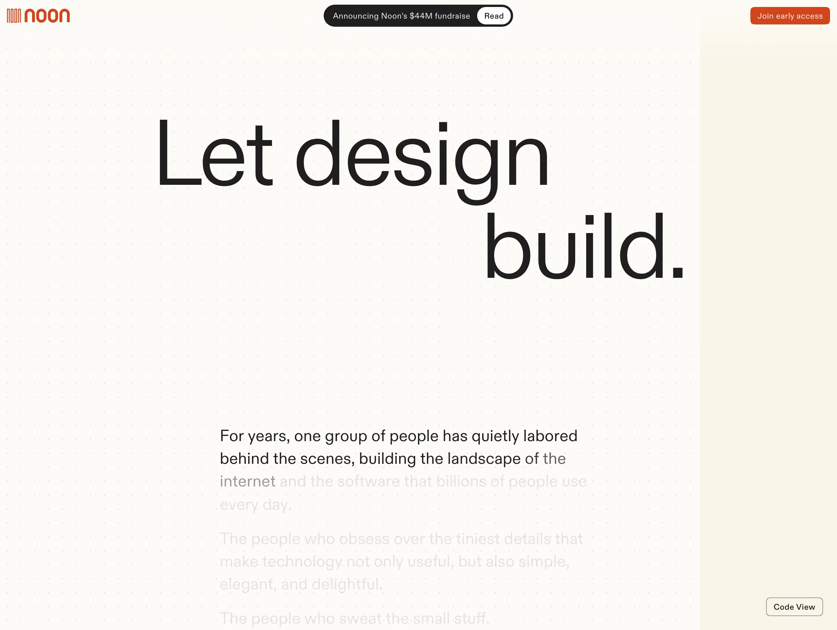





When to use a grid background, and when not to
Use it for
- Technical audienceAPIs, infrastructure and developer tools, where a drafted, engineered look matches the product.
- Canvas productsDesign tools and whiteboards, where a dot grid echoes the product's own workspace.
- Structure as decorationA page with little imagery that needs texture without adding illustrations.
Avoid it for
- Busy pagesLines behind dense cards and screenshots compete with the content and make the page feel cluttered.
- Warm, consumer brandsA blueprint feel can read as cold for products selling to non-technical buyers.
- Strong linesIf the grid is darker than the text dividers, it becomes the loudest thing on the page.
Anatomy of a grid background
- 1PatternEvenly spaced lines, dots or crosshairs, tiled across the background.
- 2ContrastVery low: a grey a few steps from the background so the pattern is felt more than seen.
- 3Fade or maskOften fades out toward the edges or the bottom of the hero so it doesn't fight the content.
- 4Section rulesOn ruled layouts, visible column and row lines that box each section into cells.
- 5MarkersOptional corner handles, crosshairs or bracketed labels that reinforce the drafted look.
Common grid background variants
1. Dot grid
A field of small dots, like a design canvas or dotted notebook paper.
2. Line grid
Faint square graph-paper lines behind the hero, sometimes only in the corners.
3. Ruled layout
Hairline or dashed rules that draw the page's real columns and section borders.
Spotted in our design reviews
Our reviews describe a grid background on 20 of the 422 SaaS homepages in the catalog. A few of them:
Between them, "Connect with your favorite tools" scatters app icons across a faint grid.
Dub · Analytics, integrations, partners and API
Thin orange gridlines fill the right half.
Jasper · Features
Thin grid lines continue through this area, retaining the drafting-board language even after the product screenshots have ended.
Wonder · Mission and footer
Faint grid lines and crosshair marks frame every section like a drafting sheet.
Cartesia · Overview
Thin grid borders repeat down the page, giving the long scroll a consistent structure.
Daytona · Overview
Thin grid rules divide most sections.
Promptwatch · Overview
Thin grid lines with dot markers, not background changes, separate sections.
Authkit · Overview
The hero sits on a dotted grid.
Beside · Overview
Often confused with
Grid background vs. bento grid
A bento grid is a layout of content cards in different sizes; a grid background is a decorative pattern behind content.
Grid background vs. grain texture
Both add texture to an empty background, but a grid is ordered and structural while grain is random speckle.
Frequently asked
Why do developer tool websites use grid backgrounds?
A grid makes the page look drafted and precise, which echoes code editors, terminals and blueprints. Paired with monospace labels it signals an engineering-first product.
How visible should a background grid be?
Barely. If the lines are noticeable before the headline, they are too strong; most good examples sit just a few shades off the background and fade toward the edges.