
Components
Divider
A divider is a thin line, horizontal or vertical, that separates groups of content such as list rows, footer areas or page sections without boxing them in.
- Also called
- Separator, Horizontal rule, Hairline rule, Rule line
- Spotted on
- 34 of 422 homepages

What is a divider?
Dividers are the lightest structural tool a designer has. On SaaS sites they separate FAQ rows, stack footer areas, split a form from its "or sign up with Google" alternative, and sit between rows of a pricing comparison. Altitude's FAQ divides its numbered questions with hairline rules; Windsurf's footer closes with a single row under one.
They earn their place on minimal and editorial designs, where cards would feel heavy. A hairline rule between the hero and the logo row, as on Clutch Security, says "new topic" without a background change. Some sites make the divider itself a motif: Wiza uses small moon-and-plus marks between centered sections.
Dividers become noise when they are everywhere: a line under every heading, between every paragraph and around every card. If spacing alone already separates two groups, the rule is redundant. Use them where rows are dense and alignment alone can't keep them apart.
Divider examples from real SaaS sites
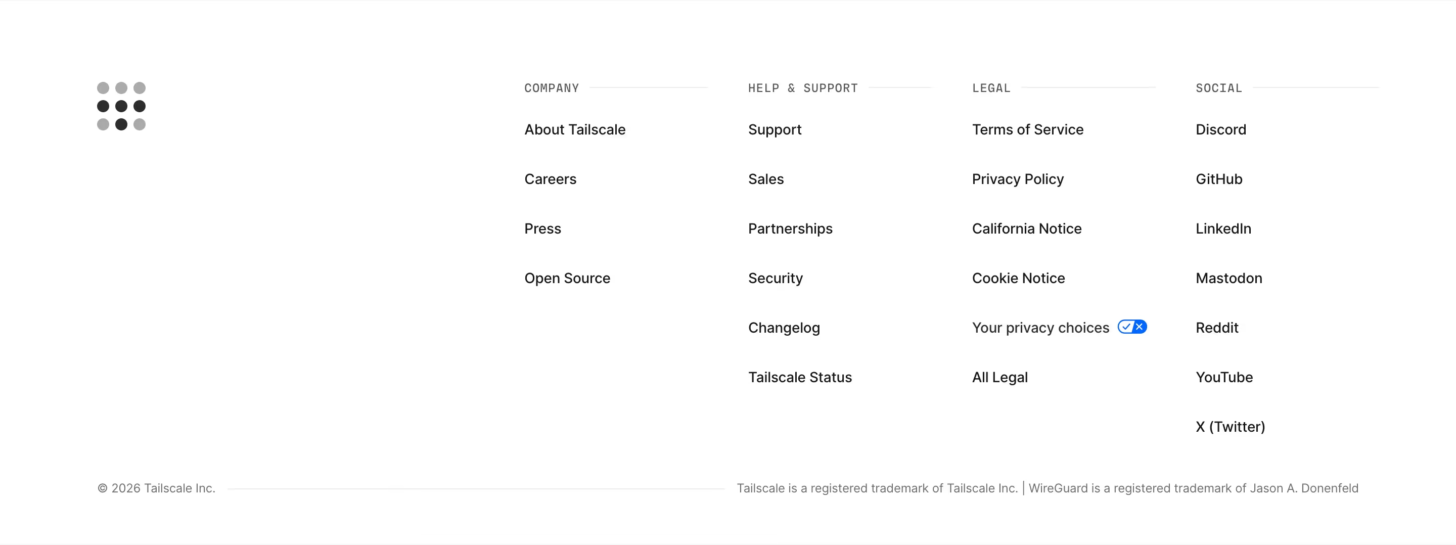
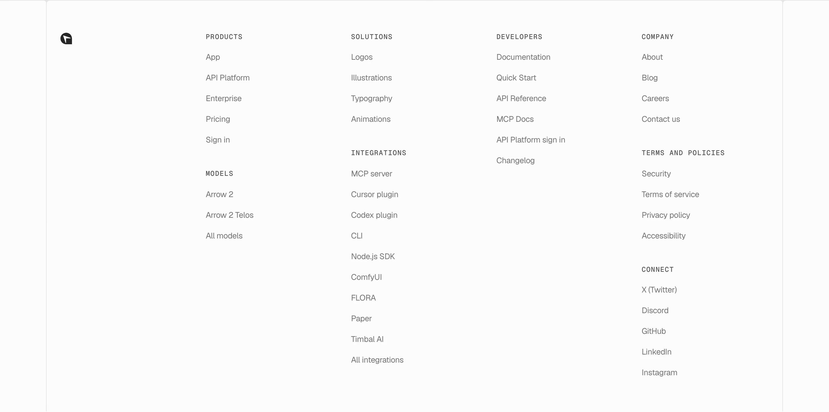
Each one is a footer capture whose design review mentions the divider.




When to use a divider, and when not to
Use it for
- Dense rowsLong lists, FAQs or job listings where whitespace alone would make rows blur together.
- Light structureMinimal designs that need separation without the weight of cards or background bands.
- Alternative pathsSplitting an email form from social sign-in buttons with an "or" line.
Avoid it for
- Already spacedIf generous spacing already separates sections, a line on top adds clutter.
- Between cardsBordered cards don't need rules between them; their edges already divide.
- Every headingA rule under each heading turns the page into a ruled notebook.
Anatomy of a divider
- 1LineA 1px stroke, usually a low-contrast grey or a translucent white on dark pages.
- 2SpacingEqual padding above and below so the line belongs to neither group.
- 3InsetFull-width, or inset to align with the content column.
- 4LabelAn optional centered word such as "or", or a section number, breaking the line.
Common divider variants
1. Hairline rule
A full-width 1px line between sections or above the footer.
2. List divider
Lines between rows in FAQs, job lists or mobile stacks.
3. Labeled divider
A line broken by "or" between two sign-in options.
4. Decorative divider
A dotted, stepped or ornamental mark that also carries brand character.
Spotted in our design reviews
Our reviews describe a divider on 34 of the 422 SaaS homepages in the catalog. A few of them:
A pill labelled "No credit card required" sits above the form, which has an email field, a yellow "Sign up for free" button, a divider and outlined "Sign up with Google" and "Sign up with Microsoft" buttons.
Apollo · Above the fold
A hairline rule closes the hero above the small grey line "Trusted by world-recognized brands".
Clutch Security · Hero and trust line
The band "Top law firms & companies trust us to consolidate stakeholders" sits over a six-by-two grid of twelve company wordmarks divided by hairline borders.
Rollups · Funding timeline and law-firm logo grid
An empty left half precedes a right-hand column of seven use cases, from "Fuel enterprise search" to "Analyze finances", each with a bold title, a grey description, an orange "Learn more" link and a hairline divider.
Merge · Use-case list and security block
"Cost" and "Security" follow with four and three bullets, each divided by a dotted rule.
Planetscale · Vitess diagram and topic sections
A "No platform fees." block then sets six feature cells in two rows of three with thin dividers, starting with "HIPAA and SOC2." and "Private networking." and ending with "Single sign-on."
Neon · Branching, auth and pricing features
At right are seven collapsed rows divided by thin rules, each with a plus sign, from "What is Kombai?" to "What stack does Kombai work with?"
Kombai · FAQs
WE'VE GOT ANSWERS.", each row divided by a thin grey rule with a right-aligned chevron.
Beehiiv · FAQs
Often confused with
Divider vs. card
A card separates content by enclosing it on all sides. A divider separates with a single line and leaves the content open.
Divider vs. stacked list
A stacked list is a vertical run of rows; dividers are often the lines between those rows.
Frequently asked
How dark should a divider be?
Light enough that it disappears when you aren't looking for it. A line that competes with body text is too strong; on light pages a pale grey, on dark pages a white at low opacity.
Dividers or whitespace?
Start with whitespace. Add a divider only where rows are close together or where the eye needs help following a long list.