
137 Dark SaaS website designs
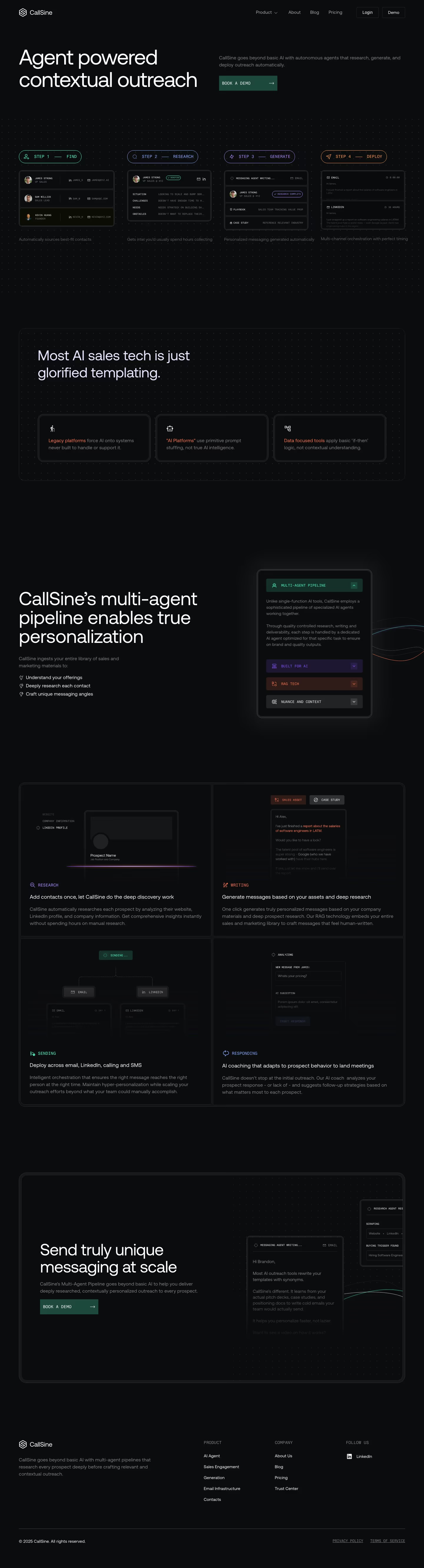
Dark-mode landing pages have become a signature of developer and AI products. These examples show how the best teams use deep backgrounds — making product UI glow, accent colors pop, and the whole page feel premium.
Sponsored by (opens in new tab)





















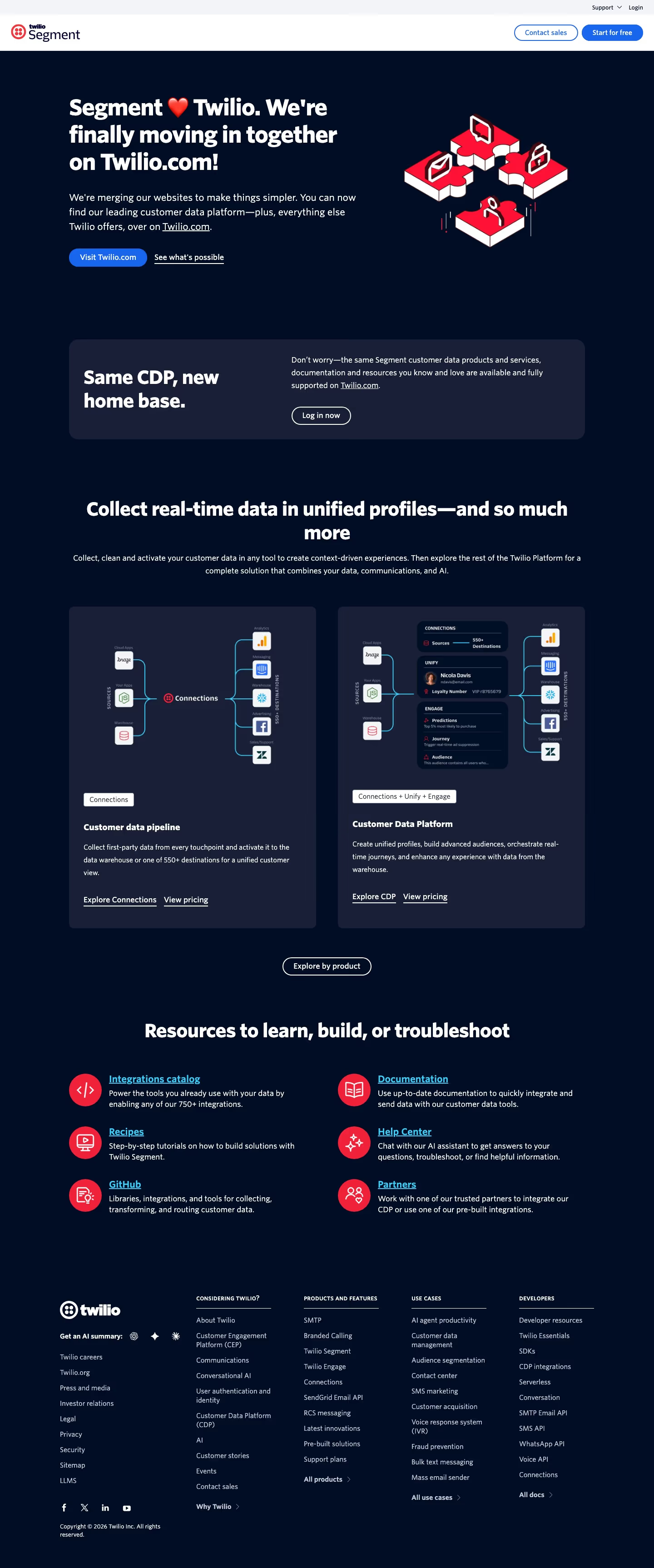

About dark designs
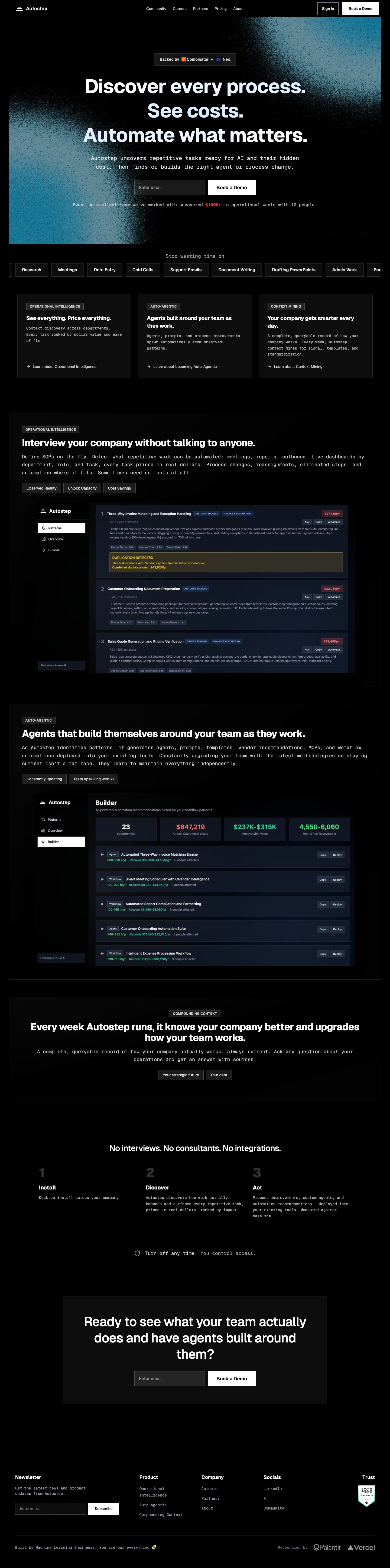
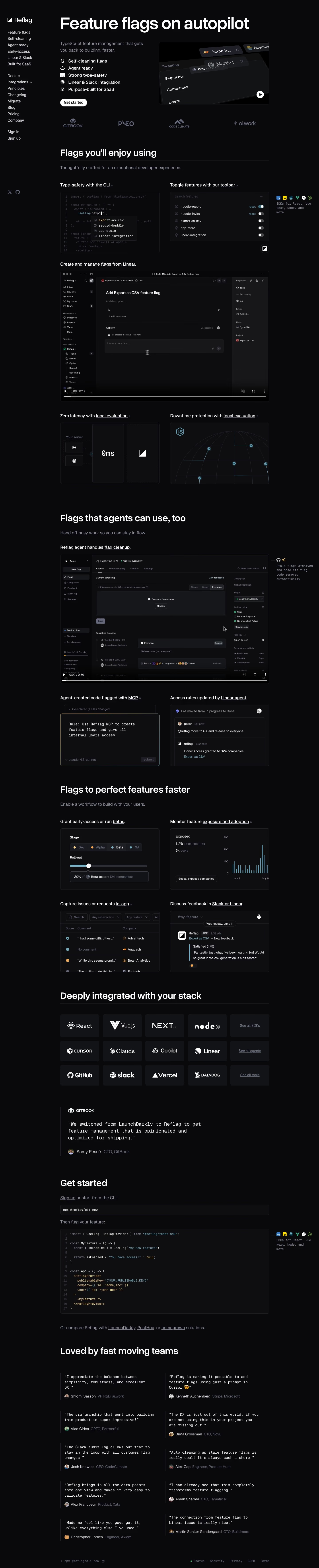
Dark landing pages became associated with developer tools and AI products largely because that's the audience already living in dark-themed editors and terminals all day — the aesthetic signals 'built by people like you' before a word of copy is read. The design trade-off is real, though: dark backgrounds make a single saturated accent color (an electric blue, a lime, a violet) read as far more vivid than the same color would on white, which is why dark sites tend to commit to one accent rather than several. The harder part is legibility — body text at insufficient contrast against a near-black background is a common failure mode that looks fine to a designer staring at a bright monitor and fails a real accessibility contrast check, so the best dark sites are deliberate about text color (usually an off-white or light gray, never pure white on pure black, which can cause visible glare/halation for some readers) rather than treating dark mode as a simple color inversion of a light design.
What to look for
- Enough contrast for comfortable reading
- An accent color that carries the brand
- Product UI or glows that exploit the dark canvas
- Consistent dark treatment across every section
From the blog
12 Dark Mode SaaS Websites, and What Actually Makes Them Work
Appwrite's dashboard matches its own dark marketing site. 1Password's doesn't. A real look at 12 dark SaaS websites — what keeps black from looking flat, and where the dark treatment quietly stops.
The 30 Best SaaS Websites in 2026 (Reviewed From Real Screenshots)
Thirty SaaS websites reviewed at equal depth from screenshots we captured ourselves — what's above the fold, the one section each does unusually well, and the stack, palette and typefaces behind it. With a stated selection method, not a handpicked vibe check.
24 Product Landing Page Examples, Measured Fold to Footer
Twenty-four product landing pages read start to finish from our own screenshots — what's in the fold, where the logo strip actually sits, how the page closes, and how long each one really runs, in pixels.
Frequently asked
Is dark mode better for conversions?
There's no universal answer — it depends on the audience. It tends to perform well for developer tools, AI products and technical audiences already comfortable with dark interfaces, and less predictably for broader consumer or enterprise buyers who may associate light, airy pages with approachability.
How do you keep dark mode accessible?
Check real contrast ratios (WCAG AA is 4.5:1 for body text) rather than eyeballing it — off-white text on very dark gray (not pure black) is usually safer than stark white-on-black, and a single strong accent color reserved for interactive elements keeps the hierarchy clear.
Which SaaS categories use dark mode most?
Developer tools, AI/ML products, security and infrastructure companies lean dark far more often than HR, e-commerce or finance products, which more often default to light themes to read as approachable and trustworthy to a broader buyer.