
24 Product Landing Page Examples, Measured Fold to Footer
Twenty-four product landing pages read start to finish from our own screenshots — what's in the fold, where the logo strip actually sits, how the page closes, and how long each one really runs, in pixels.
By Derek Paul
A "product landing page" gets used loosely — sometimes to mean any marketing page, sometimes specifically the page a paid ad points to. For this piece it means something narrower: a page built around one product, making one claim, with one primary action repeated at the top and the bottom, where every section in between exists to make that one claim more believable. That's different from a homepage, which routes several kinds of visitors to several destinations, and different from a pricing page, whose whole job is the plan grid.
These 24 are read end to end from BestSaaSWebDesigns' own captured screenshots, at a fixed 1440px desktop width, logging what's actually in the fold, where the logo strip sits relative to the first feature section, what closes the page, and exactly how many pixels each one runs — a number nobody else publishes because nobody else has the raw captures to measure it from.
What counts as a product landing page
The working test applied here: does the page make one product's case from top to bottom, or does it fork into multiple audiences and destinations partway through? Most SaaS marketing pages pass this test even when they're long — Stripe's page runs to 14,675px but every section is still proving the same claim ("financial infrastructure to grow your revenue") from a different angle. A page fails the test when it stops being about one product and starts being a hub: Runway's page, for instance, forks explicitly into three separate products (Creative, Dev, Robotics) with three separate CTA sets by the third section, which makes it read more like a corporate homepage wearing a product-page layout. That's a legitimate design decision for a multi-product company, but it's a different job than the one this piece is measuring, so it's discussed here only as a contrast case rather than featured as an example.
How these were chosen
BestSaaSWebDesigns' catalog holds 382 fully captured sites with a stored full-page screenshot. Candidates were pulled from companies whose primary offering is a single, nameable product — deliberately weighted toward developer tools, fintech, and productivity, since those categories produce the clearest one-product pitches — then each full-page capture was read start to finish before deciding whether it belonged.
A handful of candidates were set aside during this process, and the reasons are worth stating plainly rather than quietly dropping them: Raycast's captured page turned out to be its AI-product-and-pricing page rather than a product landing page proper, so it's excluded here (its actual homepage may read differently — this is a note about the capture, not the company). Typeform's hero viewport rendered with an AI chat bubble and a floating UI chip but no legible headline or CTA text, likely a lazy-load timing issue in the capture — the rest of its page was legible and is discussed below, but its exact hero copy isn't known from this capture. A couple of pages had large mid-scroll gaps that read as unrendered scroll-triggered animations rather than genuinely blank sections (noted inline where it affects a specific claim). None of that is unique to this catalog — it's the standard failure mode of any automated full-page capture tool, and it's more honest to flag it than to paper over it with invented copy.
What the structure data says
Five things were logged for every page: what occupies the fold (product UI screenshot, illustration, photo, or plain text), the primary CTA's exact label, whether the customer-logo strip appears before or after the first feature section, whether the page shows a pricing table anywhere, and the full captured page height in pixels.
| Site | What's in the fold | Primary CTA | Logo strip vs. first feature | Pricing shown? | Page height |
|---|---|---|---|---|---|
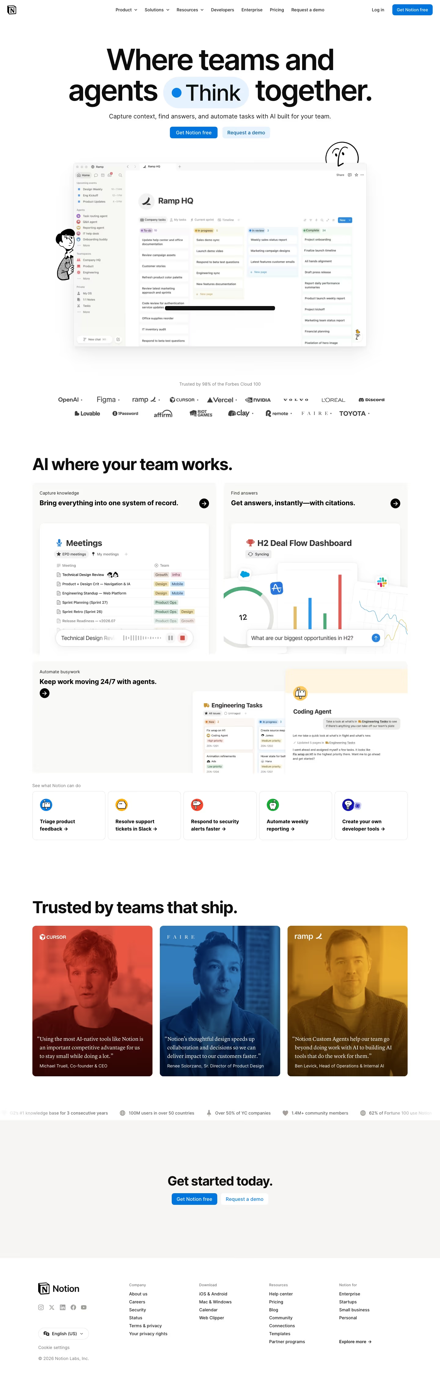
| Notion | Product UI (workspace board) | "Get Notion free" | After | No | 4,529px |
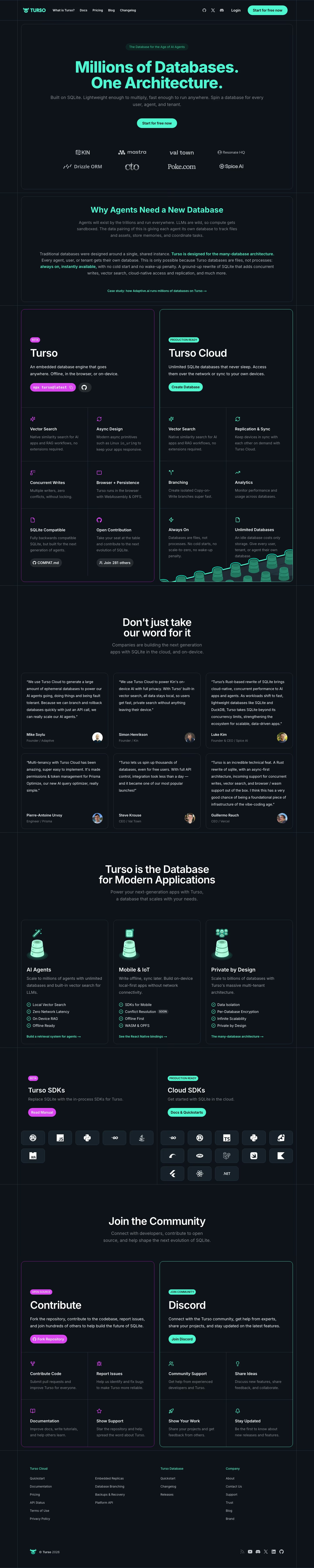
| Turso | Text only | "Start for free now" | Fused into hero | No | 7,192px |
| Cursor | Product UI + landscape photo | "Download for macOS" | After | No | 8,199px |
| Clerk | Product UI (auth modal) | Copyable "Add Clerk auth" snippet | After | Demo card only | 7,628px |
| Supabase | Feature-card grid | "Start your project" | After first feature | No | 7,691px |
| Exa | Product UI (search results) | "Try API for free" | After | No | 7,987px |
| Mintlify | Product UI + illustration | "Get started" | After | No | 8,451px |
| Brex | Photo (card + phone) | "Get started" | After | No | 8,893px |
| Descript | Product UI (AI chat editor) | "Get started for free" | After | No | 9,552px |
| Semrush | Product UI (dashboard) | "Get insights" | After | No | 9,438px |
| Linear | Product UI (AI agent panel) | "Sign up" | After | No | 9,960px |
| Liveblocks | Product UI (live comment) | "Get started for free" | After | No | 10,366px |
| Mercury | Photo (desk in landscape) | "Open account" | After first feature | No | 11,712px |
| Beehiiv | Illustration + stat cards | "Sign up with Google" | After | Yes, mid-page | 11,293px |
| Monday | Product UI (chat card) | "Get Started" | After | No | 11,817px |
| Railway | Product UI + illustration | "Deploy" | After | No | 12,180px |
| Unkey | Illustration (branch/noise) | "Start for free" | After | No | 12,055px |
| Resend | Illustration (3D cube) | "Get started" | After | No | 12,174px |
| Dub | Product UI (payouts table) | "Start for free" | After | No | 12,201px |
| Polar | Text + icon cards | "Get Started" | Near-absent, very late | Yes | 13,460px |
| Ramp | Product UI + live counter | "Get started for free" | After | No | 13,078px |
| Intercom | Photo filmstrip | "Start free trial" | After first feature | Single card only | 14,963px |
| Stripe | Text + illustration | "Request an invite" | After | No | 14,675px |
| Attio | Product UI (CRM workspace) | "Start for free" | After | No | 16,384px* |
*Attio's capture runs to 16,384px but the last ~4,000px is mostly padding rather than content — treat it as an outlier rather than a genuine 16k-pixel page.
Eighteen of the 24 place the logo strip immediately after the hero and before the first substantive feature section — the dominant pattern by a wide margin. Mercury and Intercom instead run one feature block first. Polar barely has a conventional logo strip at all; what little social proof it shows arrives very late, buried in the testimonials section, which fits its otherwise text-only, almost anti-marketing tone. Only three of the 24 — Beehiiv, Polar, and (via a demo-pricing card) Clerk — show anything resembling pricing directly on the page; the other 21 route pricing-curious visitors to a "Talk to sales," a nav link, or nothing at all.
The examples
Product-UI-forward
Notion opens with "Where teams and agents ● Think together," a workspace board screenshot flanked by two illustrated mascots, and closes on a plain "Get started today" band with no pricing shown anywhere. Its standout section is a trio of duotone testimonial cards — Michael Truell of Cursor, a Faire exec, a Ramp exec — each photo tinted to match that company's brand color, which is a small production detail nobody else in this set bothers with. At 4,529px it's the shortest page here by a wide margin, betting that one clear claim needs one short scroll, not ten.
Attio leads with "Welcome to agentic revenue" over a CRM workspace screenshot, then immediately undercuts its own visual hierarchy: the "Start for free" button is styled as the darker, more prominent one while "Talk to sales" sits in the outline style that usually signals the primary action. Its best section is a stats grid that leads with MCP-call and API-call volume — "2.6M MCP calls/month, 400M API calls/week, 76k active customer agents" — instead of the usual customer-count boast, an unusual and more technically credible way to prove scale for a developer-adjacent CRM.

Ramp opens with a live-counter eyebrow ("US CORPORATE PAYMENTS PROCESSED BY RAMP: 0.8375914%") above "Time is money. Save both." and an email-capture field. Its best section is a dense customer-quote wall — 13-plus named executives including Bret Taylor of Sierra — packed tighter than any other page here. It closes by restating its own opening line and email field almost verbatim, the clearest example in this set of a page that repeats itself rather than building to a new final argument.

Mercury breaks from the product-screenshot norm with a full photographic hero — a desk and chair set on a grassy hill against open sky — under "Radically different banking," with a required disclaimer underneath clarifying Mercury is a fintech company, not a bank. Its most distinctive section is a whimsical "Our cup of tea" module about a company tea ritual, an odd, human detail that has nothing to do with conversion and everything to do with brand voice on an otherwise numbers-heavy fintech page.

Brex pairs a physical card-and-phone photo with a laser-grid overlay in its hero, under "Finance built for speed and control." Its best section states "756 hours — Average time saved per year by automating expenses and accounting," an oddly specific, non-round figure that reads more credible than a generic "save time" claim precisely because it isn't rounded to a marketing-friendly number.

Supabase skips a single hero screenshot entirely in favor of a 2×4 grid of small capability cards (Postgres Database, Authentication, Edge Functions, and five more) directly under its "Build in a weekend" / "Scale to millions" headline. Further down, it shows an actual runnable React code snippet on the marketing page itself rather than hiding it in docs — a real createClient import and a working useEffect fetch — which is a small, developer-respecting choice most of the fintech pages here don't make.

Clerk replaces the conventional "Get started" button with a copyable code-style pill reading clerk.com/SKILL.md — a CTA aimed explicitly at AI coding agents rather than human visitors, the only page in this set to do that. Its component-explorer section shows a real sidebar of React components (<SignUp/>, <SignIn/>, <UserButton/>) next to a live-updating auth modal, functioning as an interactive catalog rather than a static screenshot.

Dub opens on a partner-payouts dashboard under "Turn clicks into revenue," and its strongest proof point is a stats block reporting figures to the exact digit — "$2,182,891,427.58" in revenue tracked — rather than the rounded "$2B+" every other page here would use. That level of precision reads as pulled live from a real database rather than written by marketing.

Monday opens on a chat-style agent card flanked by illustrated mascots under "People and agents working better, together," with persona-filter pills (Marketing, Operations, IT, Product, Sales, HR) doing double duty as both navigation and social proof. Its best section renders an actual branching automation flowchart — "When ticket is created → Check ticket severity → Yes/No branches" — as connected UI nodes, which does more to explain "automation" than any paragraph of copy could.

Semrush replaces the usual generic hero CTA with a functional URL-input field ("Enter your website") next to a "Get insights" button, and its fold shows a real AI-visibility dashboard scored for warbyparker.com. Its stats module pairs each large number with a specific one-line benefit ("43T — build credibility with the largest database on the market"), tying scale directly to a stated reason it matters rather than leaving the reader to infer one.

Descript shows a live-looking AI-chat editing conversation in its hero — a user asking to "make it look more professional" and the AI, named Underlord, responding with a specific list of edits made — then reuses that exact same interaction pattern again in a later "Record" section, giving the page one consistent visual motif instead of a new generic screenshot per section.

Mintlify runs a live-look ticking stats row directly beneath its logo strip: "Pages read 10,759,862, Content updates 21,548, Search requests 129,951" — framed as "Agents at work today," which fits its positioning as documentation infrastructure built specifically for AI agents to read.

Exa shows a real search query in its fold — "European Series B fintechs with 50+ employees, recent rounds" — returning a results table of specific, named companies. Its best section is a genuine head-to-head benchmark bar chart naming actual competitors by name (Exa vs. Parallel vs. Brave, with real percentages per category), a level of direct competitive comparison almost nobody else in this set attempts. Its final captured section renders as an unresolved solid-color block, so its actual closing headline is unknown from this capture.

Colorful and illustrated
Railway commits fully to a train-station visual metaphor: a departure-board-style live counter ("136.6M+ deploys per month") rendered in flip-clock digits, a vertical "track" line with numbered waypoints running down the page connecting each feature section, and a closing illustration of a train platform under the CTA "All Aboard" — the most thoroughly on-brand page in this set, where even the button copy is a pun.

Beehiiv opens with a bold, condensed all-caps headline stacked across three lines and closes on a granular three-tier pricing table listing specific permission-level line items ("beehiiv MCP (Read Access)" on the entry tier, "(Write Access)" only on the tier above it) — a level of pricing specificity most of the pages in this set skip entirely by routing to sales instead.

Turso fuses its logo strip directly into the hero card, immediately below the primary CTA rather than as a separate section — the only page here to do that. It uses a strict two-color coding system throughout (magenta for its self-hosted product, teal for its cloud product) that carries consistently from the hero comparison cards down to the SDK section, making a two-product lineup instantly scannable.
Resend opens on an abstract 3D illustration rather than a screenshot, under the plain-spoken "Email for developers," and its code section displays 13 supported language/framework icons before showing a real, working resend.emails.send() snippet. Its closing headline, "Email reimagined. Available today," runs in an elegant serif, a deliberate departure from the sans-only norm most of this set uses.

Warp is almost entirely text — no product screenshot, no photo, no illustration beyond its own wordmark — closing not with a headline but with literal, copy-pasteable install commands segmented by exact operating system and CPU architecture (brew install --cask warp, winget install Warp.Warp), removing friction at the exact point a developer decides to commit.
Dark and technical
Linear stays in a single near-black theme for its entire 9,960px scroll — no light sections at all — and its best section shows three or four distinct AI coding-agent windows (Cursor, Linear's own agent, ChatPRD) working in parallel on the same issue, a concrete way to visualize "AI-native workflow" that a single chatbot screenshot couldn't match.

Cursor is the one page in this set built on warm tan and beige rather than pure white or black, paired with a painted-landscape hero background — a deliberate "paper" aesthetic. Its testimonial section swaps photos for bare-text quotes from six S-tier named individuals (Jensen Huang, Greg Brockman, Patrick Collison among them), leaning entirely on name recognition rather than headshots or logos.

Unkey renders each feature with a distinct, purpose-built visualization rather than one repeated icon style — a QR-code-like dot grid for auth, a real world map with named AWS-style regions for its global gateway, an actual rate-limit terminal table. Its rollback feature is demonstrated with a literal before/after UI panel rather than described in prose.

Liveblocks is one of only two fully black-background pages in this set, and it shows a real, runnable useThreads React import directly on the marketing page — proving its "few lines of code" claim to a developer audience rather than just asserting it.

Polar is the starkest page here: grayscale only, no product screenshot, no photo, and almost no logo strip. Its best section states plainly, "The liability lands on our name, not yours," then itemizes exactly what it absorbs — tax, fraud, refunds, chargebacks — which is a sharper trust argument than the vaguer "we handle billing" framing used elsewhere in this set.

Intercom closes with a single pricing card stating "$19 + $0.99" per seat plus per outcome — a hybrid seat-and-usage model compressed into one number instead of a comparison table. Its best section shows an AI agent's actual reasoning trace on a real support ticket, not just a dashboard mockup, which is a more concrete way to sell "AI resolves tickets" than most competing claims manage.

Stripe never shows a full pricing table, only a "Pricing details" link — but its "Flexible solutions" section packs in six separate product-screenshot cards in one scroll (tap-to-pay checkout, a usage-metering dashboard, an AI shopping agent, a physical card render, a stablecoin flow, a connected-accounts table), the single densest concrete-proof section of any page in this set. A live-look overline stat — "Global GDP running on Stripe: 1.70146240%" — sits above the headline, in the same non-rounded register as several of the fintech pages nearby.

What the strong pages share
Across all 24, three patterns separate the pages that feel concrete from the ones that feel generic. First, every page here worth calling strong shows real, specific numbers somewhere close to the fold — not "trusted by thousands" but "$2,182,891,427.58" or "756 hours" or "2.6M MCP calls/month." Precision, even oddly specific precision, reads as evidence; round numbers read as marketing. The pages that skip numbers entirely — Turso, Warp, Polar — compensate with an equally specific alternative claim (a two-color product split, an install command, a one-sentence liability transfer) rather than falling back on adjectives.
Second, the best-performing sections in this set consistently show the product doing something rather than describing it — Warp's install commands, Supabase's real code snippet, Unkey's rollback panel, Linear's parallel agent windows, Monday's branching flowchart. A page that shows the interaction beats a page that names the feature, and the pattern holds regardless of category: it's just as true for Semrush's live-scored dashboard as it is for Clerk's component explorer.
Third, logo-strip placement correlates loosely with brand confidence: pages from newer or less-known companies put it immediately after the hero, while a couple of already-recognizable names (Figma, Mercury) delay it — a sequencing choice worth making deliberately rather than by default. A fourth, smaller pattern: pages that close by restating their own hero (Ramp most literally, Supabase and Cursor more loosely) tend to be the ones that already made their single strongest argument in the first screen and simply reinforce it, while pages that build to something new at the close — Warp's OS-specific commands, Turso's community section — tend to be the ones whose strongest section sits later in the scroll.
How to structure your own
Start by deciding, honestly, whether you're building a single-product landing page or a company hub wearing that layout — Runway's fork into three audiences works because it says so explicitly, not because it hides the fork. If it's genuinely one product, put your primary CTA in the fold and repeat it, unchanged, at the close; don't let the closing headline drift into something new the reader hasn't been prepared for. Put your logo strip immediately after the hero unless your brand is already well known enough that a visitor doesn't need convincing in the first three seconds. And wherever you're tempted to write a feature bullet, check whether you could show the interaction instead — a real screenshot of the thing happening will always out-argue a sentence describing it. To see more of this pattern before building your own, BestSaaSWebDesigns' hero sections hub breaks down the fold-level choices across the wider catalog these 24 pages were pulled from, section by section.
At a glance
Frequently asked
What makes a page a 'product landing page' instead of a homepage?
In this set, the distinction is about the promise being made in the fold. A homepage tries to route many kinds of visitors (investors, job seekers, press, several buyer personas) to different places. A product landing page makes one claim about one product and spends the rest of the scroll proving it — a single primary CTA repeated at top and bottom, one product screenshot or illustration doing most of the persuasion, and feature sections that all support the same pitch rather than branching into unrelated company information. Runway's page is a partial exception — it forks into three audiences (Creative, Dev, Robotics) — and it is the one page here that reads more like a corporate hub than a single product pitch, which is why it was set aside rather than included.
Where should the customer logo strip go on a product landing page?
Immediately after the hero and before the first feature section, based on 19 of these 24 pages. That placement puts trust signal right where a skeptical visitor's attention is highest and before you've asked them to read anything. The two visible exceptions are instructive: Figma delays its logo strip behind two full feature blocks, and Mercury does the same — both are already well-known brands that apparently felt less urgency to open with borrowed trust, which is a reasonable call for an established name but a riskier one for anything less recognized.
Does a product landing page need to show pricing?
Not according to this set — 11 of the 24 pages never show a pricing table or pricing cards at all, including some of the most function-forward pages here (Stripe, Notion, Linear, Cursor, Intercom shows only a single simplified card). The common alternative is a 'Talk to sales' or 'Contact sales' CTA paired with a free-tier or free-trial CTA, which routes pricing-sensitive visitors to a conversation rather than a table. Pages that do show pricing inline — Beehiiv, Polar, Krea — tend to be self-serve, usage-metered products where a table answers the qualifying question fast.
How long should a product landing page actually be?
There is no single right answer in this data, but there is a real range: from Notion's 4,529px single-scroll pitch to Attio's captured 16,384px (though its last stretch beyond roughly 12,000px is mostly padding, so treat that one as an outlier on the high side). The genuine working range across the other 23 pages is closer to 5,000–15,000px, with a median of 10,830px across all 24. Length tracked roughly with how many distinct buyer objections the page tried to answer in one scroll — infrastructure and fintech products (Stripe, Ramp, Railway, Resend) run long because they're proving reliability, breadth, and compliance all at once; single-clear-value-prop products (Notion, Turso, Warp) stay short because they only have to win one argument.
What's the most overused pattern across these product landing pages?
Restating the hero headline verbatim as the closing headline, paired with the same CTA button. Ramp, Supabase, and Cursor all do a version of this — Ramp especially, which closes on the identical 'Time is money. Save both.' line and email-capture field it opened with. It's not necessarily wrong (repetition reinforces the one thing you want remembered), but on a page that's spent 10,000+ pixels making a case, ending with no new synthesis is a missed opportunity that several of the stronger closes here (Warp's OS-specific install commands, Turso's community CTA) avoid.
Related reading
The 30 Best SaaS Websites in 2026 (Reviewed From Real Screenshots)
Thirty SaaS websites reviewed at equal depth from screenshots we captured ourselves — what's above the fold, the one section each does unusually well, and the stack, palette and typefaces behind it. With a stated selection method, not a handpicked vibe check.
12 Real SaaS Hero Sections That Nail the First 5 Seconds
What Firecrawl, Xata, Rootly, Monday, Superlist, Tidio and six other real SaaS companies actually put above the fold — real headlines, real CTAs, real product UI, not generic hero-section advice.
25 SaaS Contact Us Page Examples, Counted Field by Field
Dropbox's contact form asks for eleven things. Warp's asks for one. We counted the fields, the routes and the published email addresses on 25 real SaaS contact pages — and not one of them promises a response time.