
25 SaaS Contact Us Page Examples, Counted Field by Field
Dropbox's contact form asks for eleven things. Warp's asks for one. We counted the fields, the routes and the published email addresses on 25 real SaaS contact pages — and not one of them promises a response time.
By Derek Paul
A contact page looks like a design problem and is actually a routing decision. Four kinds of people arrive on it — a prospect who wants pricing, an existing customer whose thing is broken, a journalist on deadline, and someone who wants a job — and the company has to decide, before it writes a single line of copy, which of those four it is willing to serve and which it is going to send somewhere else. Every layout choice after that is downstream of the answer.
So instead of describing these pages, BestSaaSWebDesigns counted them. For each one: is there a form, how many fields does it insist on, does the page ask what you want before it asks who you are, is any human channel exposed at all, and does anybody promise to reply. The results are less flattering than the screenshots look.
How these were chosen
Every example below is pulled from BestSaaSWebDesigns' catalog of 382 fully captured sites. Of those, 196 have a contact page captured at full page height, which is the pool this post draws from. 50 candidates were pulled from across categories — developer tools, finance, HR, analytics, infrastructure, marketing — with every screenshot tile read, and 25 kept that are genuinely different from each other rather than 25 variations on a two-column form.
Four were disqualified on the capture itself, which is worth naming because it is the same set of failure modes any audit runs into:
- 1Password — the cookie consent modal ("We use cookies… Accept All / Reject Non-Essential Cookies / Manage Settings") sits directly on top of the middle of the form, hiding two fields between BUSINESS EMAIL and COUNTRY. You can see FIRST NAME, LAST NAME, BUSINESS EMAIL, COUNTRY and COMPANY SIZE, and not what's between them.
- Loom — the form renders (FIRST NAME, LAST NAME, WORK EMAIL, COMPANY, HOW CAN OUR SALES TEAM HELP?, ANYTHING ELSE YOU WOULD LIKE US TO KNOW) and then the page goes blank for the remaining two thirds of its height.
- ClickUp — the contact route resolves to the ClickUp Help Center. The capture is a search box ("Ask me anything") and six link cards, one of which is itself labelled "Contact us".
- Lattice — same problem via a different vendor. The capture is a Zendesk page, breadcrumbed "Lattice Help Center > Submit a request", with a red validation error already showing on the attachments field.
Everything below is read off the screenshot. Field counts are literal: inputs, dropdowns and textareas were counted directly, and a field was treated as required only where the page marks it (asterisk, the word "required", or a browser-blocked submit).
The routing table
This is the whole post in one table. "Required fields" counts only what the page marks as mandatory; "human channel" means an email address, phone number or chat that is visible without submitting anything.
| Site | Form on page | Required fields | Routes by intent | Human channel published | Response promise |
|---|---|---|---|---|---|
| Linear | no | 0 | yes — 6 destinations | hello@linear.app | none |
| Clerk | no | 0 | yes — 5 destinations | support@clerk.com | none |
| Granola | no | 0 | yes — 5 destinations | hey@, press@, privacy@, legal@ | none |
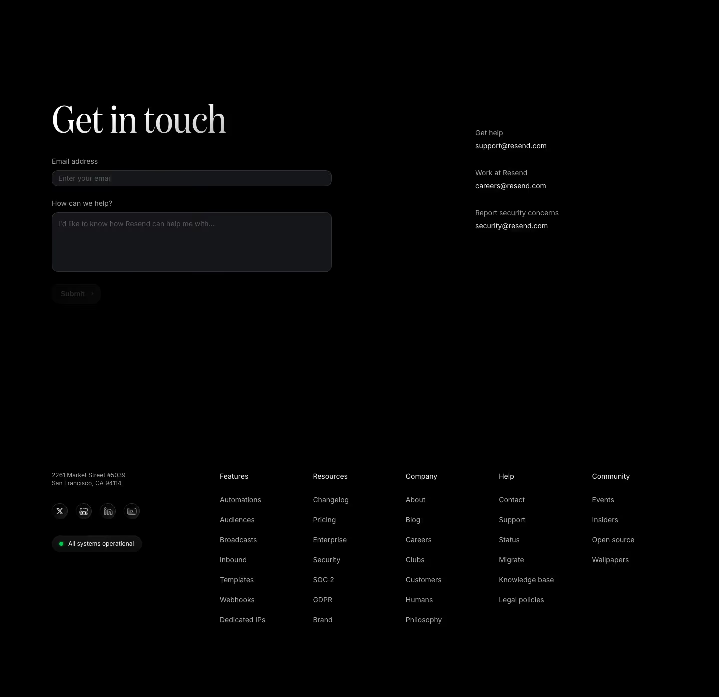
| Resend | yes | 0 marked (2 fields) | yes — 3 labelled addresses | support@, careers@, security@ | none |
| Supabase | no | 0 | yes — 6 destinations | 5 addresses | "within the timeframe required by applicable law" |
| Brex | no | 0 | yes — 8 destinations | press@brex.com, "phone 24/7" | none |
| Mercury | no | 0 | yes — 4 destinations | Email us buttons, no address shown | none |
| Framer | no | 0 | yes — 5 destinations | live chat, paid plans only | none |
| Gusto | no | 0 | yes — 2 destinations | (800) 936-0383 | hours: 6am–6pm MST Mon-Fri |
| Semrush | no | 0 | yes — 5 destinations | none | none |
| Typeform | yes | 1 (the routing choice) | yes — 2 destinations | none | none |
| PlanetScale | yes | 7 | yes — radio pair | none (Discord) | "a faster, more relevant response" |
| Grafana | yes | 4 | yes — first field | info@grafana.com | none |
| Mailchimp | yes | 1 (Topic) | yes — Topic + 3 links | postal address, +1 (800) 315-5939 | none |
| Warp | yes | 1 | no | none | none |
| Cursor | yes | 2 | yes — second field | none | none |
| Stripe | yes | 2 of 3 steps | no | none | "we'll reach out to you if we're able to support you" |
| Intercom | yes | 2 at step 01/03 | no | none | none |
| Aircall | yes | 4 at step 1/2 | no | none | none |
| Tidio | yes | 1 at step 1 of 3 | no | phone call-back request | "30-minute call" |
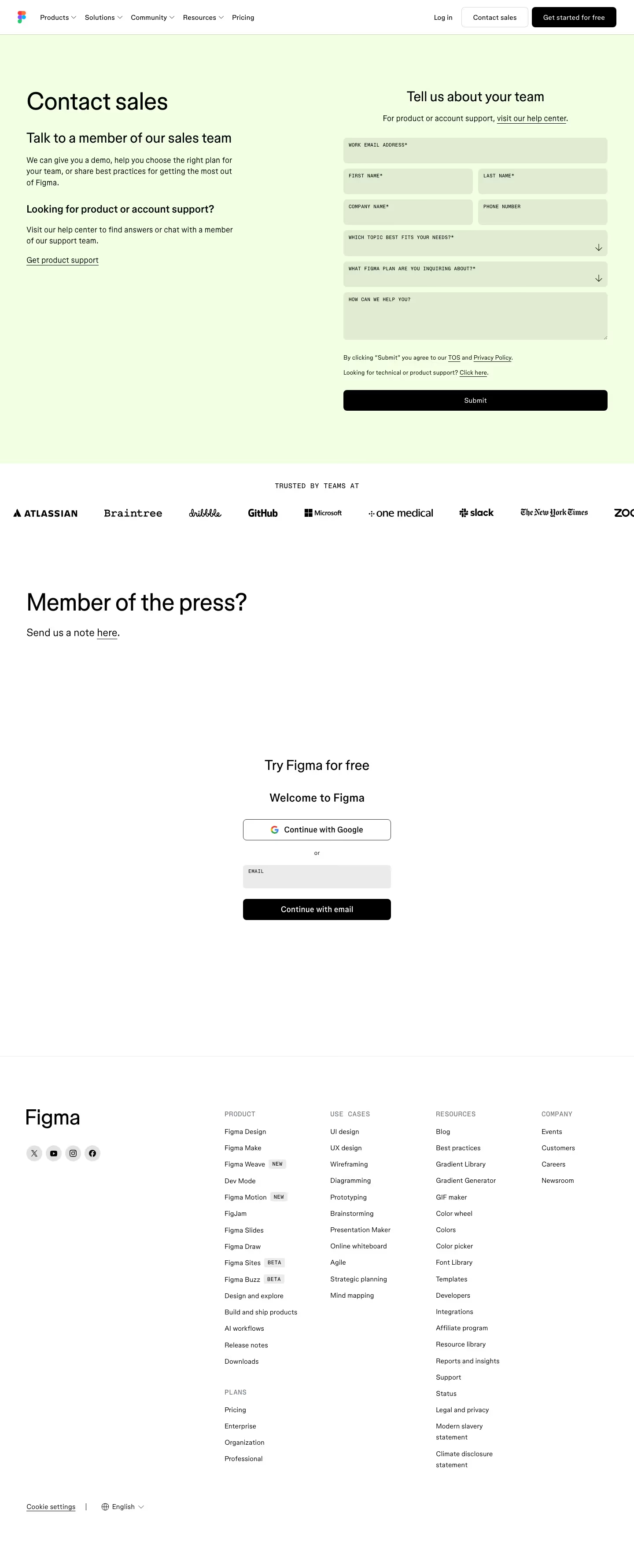
| Figma | yes | 6 (+2 optional) | yes — Topic + press + support | none | none |
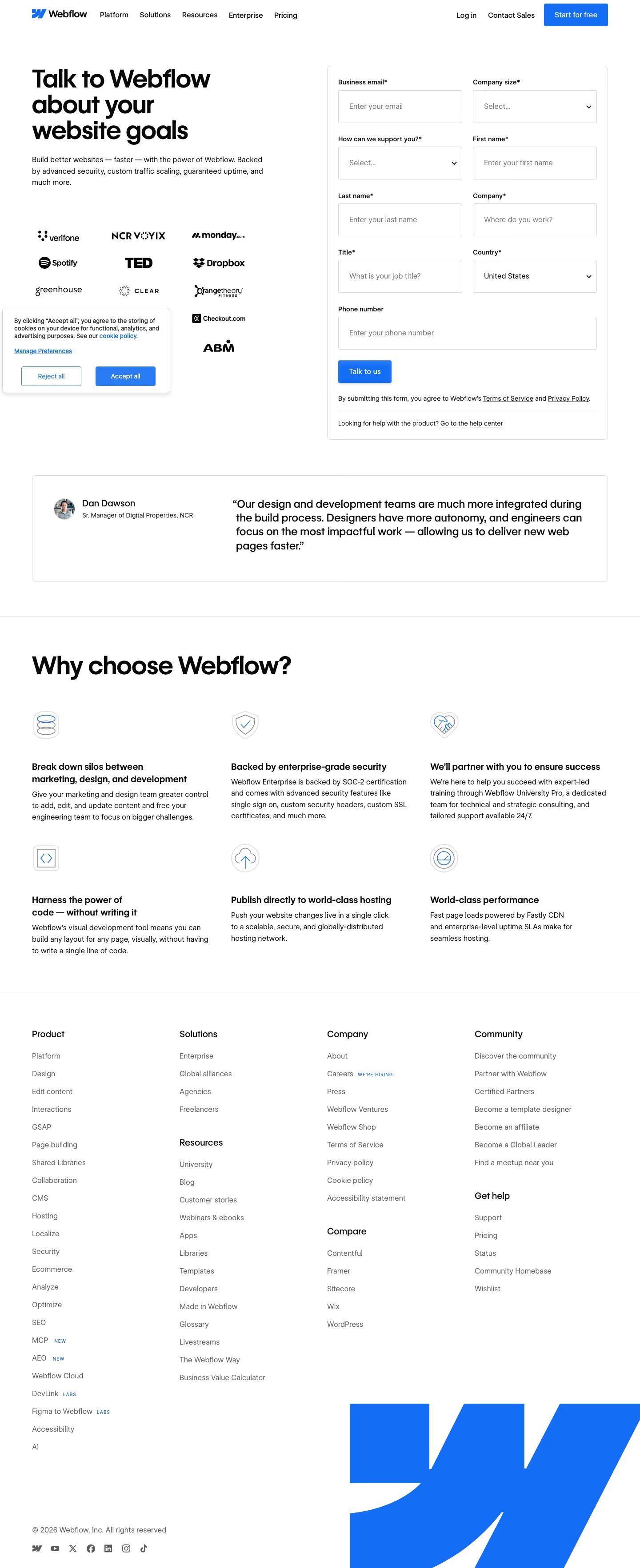
| Webflow | yes | 8 (+1 optional) | yes — second field | none | none |
| Dropbox | yes | 11 | yes — 2 dropdowns | 1-855-237-6726 | none |
| Cloudflare | yes | 8 (+1 optional) | partly — job level/function | 40+ country numbers | none |
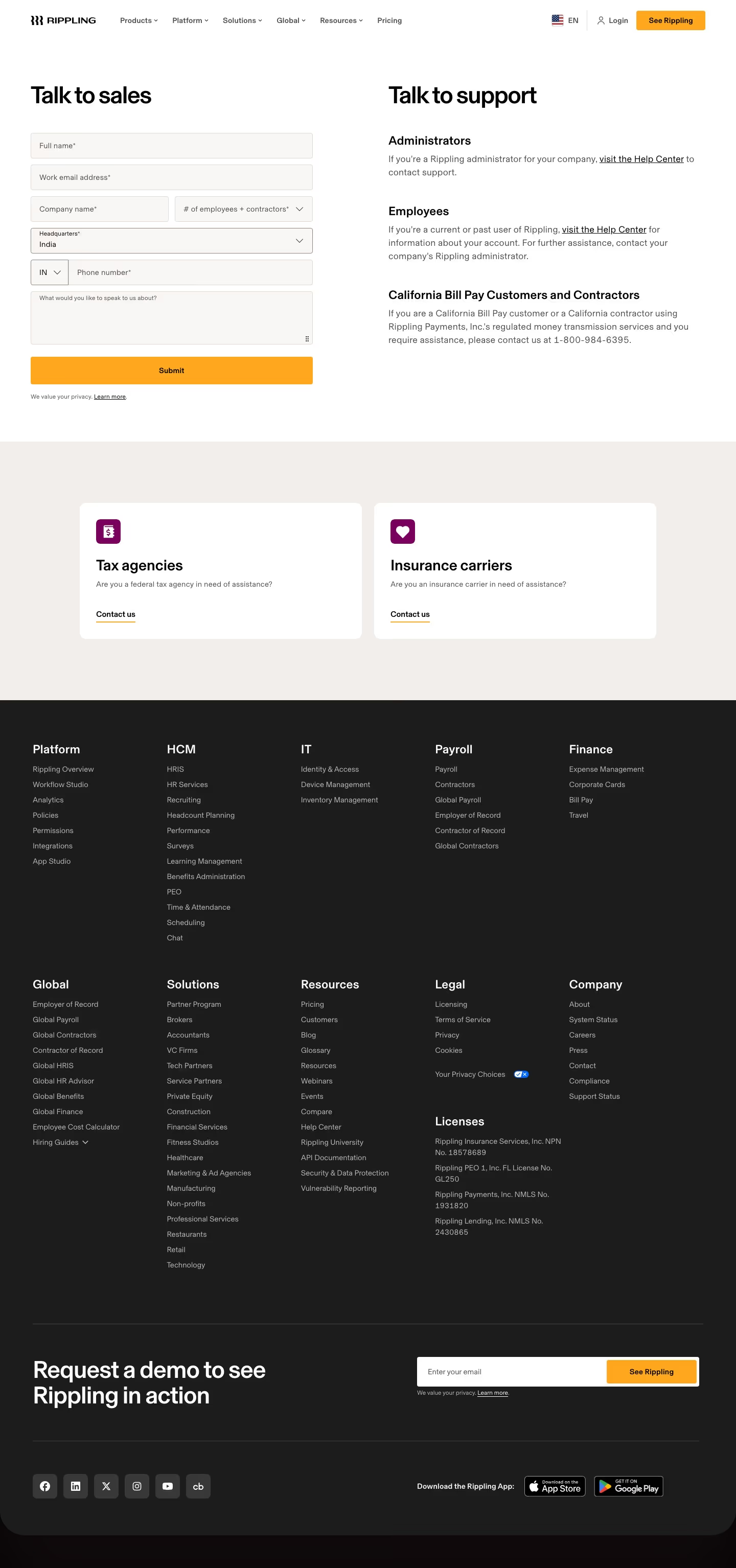
| Rippling | yes | 6 | yes — 6 audiences | 1-800-984-6395 (one segment) | none |
Nine of the 25 pages have no form at all. That is the single most surprising number here, and it is not a small-company effect: Brex, Mercury, Framer, Gusto and Semrush are all substantial businesses that decided a contact page should hand you a destination rather than take your details.
Nineteen of the 25 route by intent. The six that don't — Warp, Stripe, Intercom, Aircall, Tidio and Cloudflare — are, without exception, sales-capture pages. Refusing to route is not an oversight on these pages; it is the point. If the only outcome the page wants is a qualified lead, asking "are you a customer or a prospect?" only creates a way to leave.
Seven of the 25 print an email address; five print a phone number with digits in it. Only Mailchimp puts a postal address in the page body ("Intuit Mailchimp 405 N Angier Ave. NE Atlanta, GA 30308 USA"), next to a photo of an Intuit office building. Resend and Brex both keep theirs in the footer, and — a genuinely odd coincidence — both footers give the same San Francisco building: "2261 Market Street #5039" for Resend, "2261 Market Street STE 85844" for Brex. It is a mail-forwarding address, which is the modern equivalent of the map nobody uses.
Zero of the 25 promise a response time. Not "within one business day", not "within four hours", nothing. Miro's form card is headed "Fill out this quick form and we'll get back to you shortly" and Gong's copy says "we'll be in touch shortly", which is the genre's way of saying nothing. The only page that commits to anything checkable is Gusto, and it commits to availability rather than turnaround.
Field count is the whole decision
The spread is an order of magnitude, and the two extremes are both live pages selling to engineers.
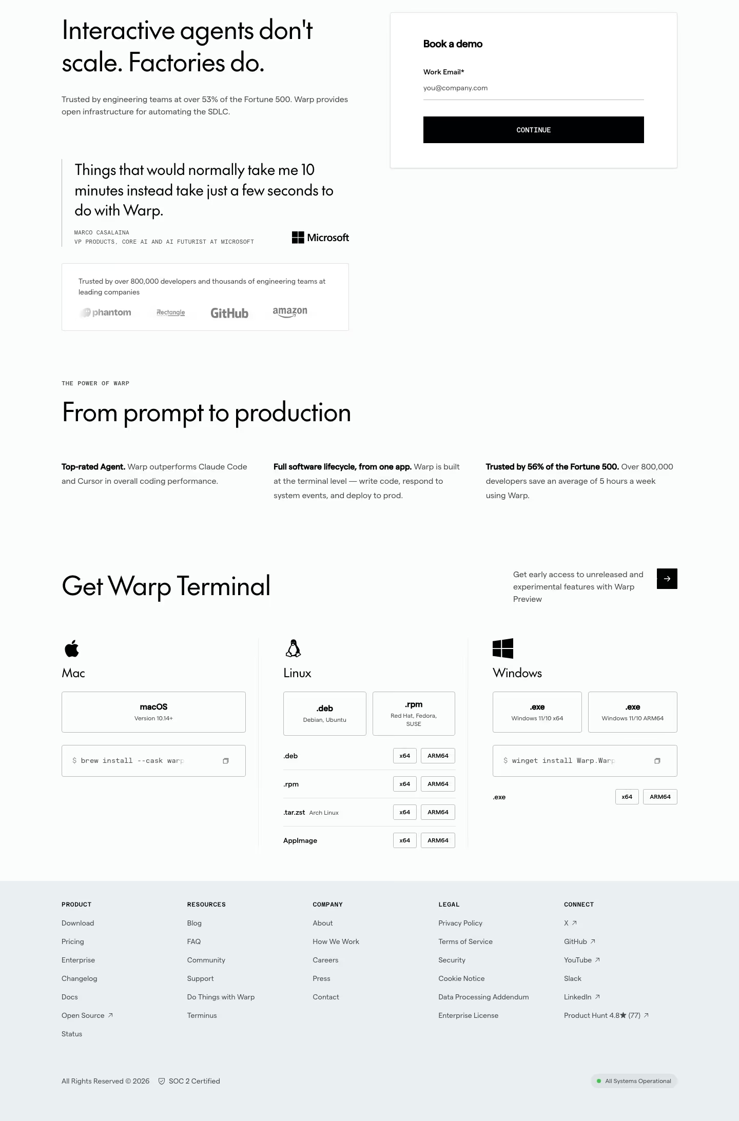
Warp asks for one thing. The form card is titled "Book a demo", it contains a single input labelled Work Email* with the placeholder you@company.com, and a black CONTINUE button. That's it. Everything else on the page is proof: a Marco Casalaina quote credited to "VP PRODUCTS, CORE AI AND AI FUTURIST AT MICROSOFT", a "Trusted by over 800,000 developers" logo row, and platform-by-platform install commands. Worth noting that the hero says "over 53% of the Fortune 500" and a panel further down the same page says "Trusted by 56% of the Fortune 500" — if you're going to lead with a number, keep it consistent within one scroll.
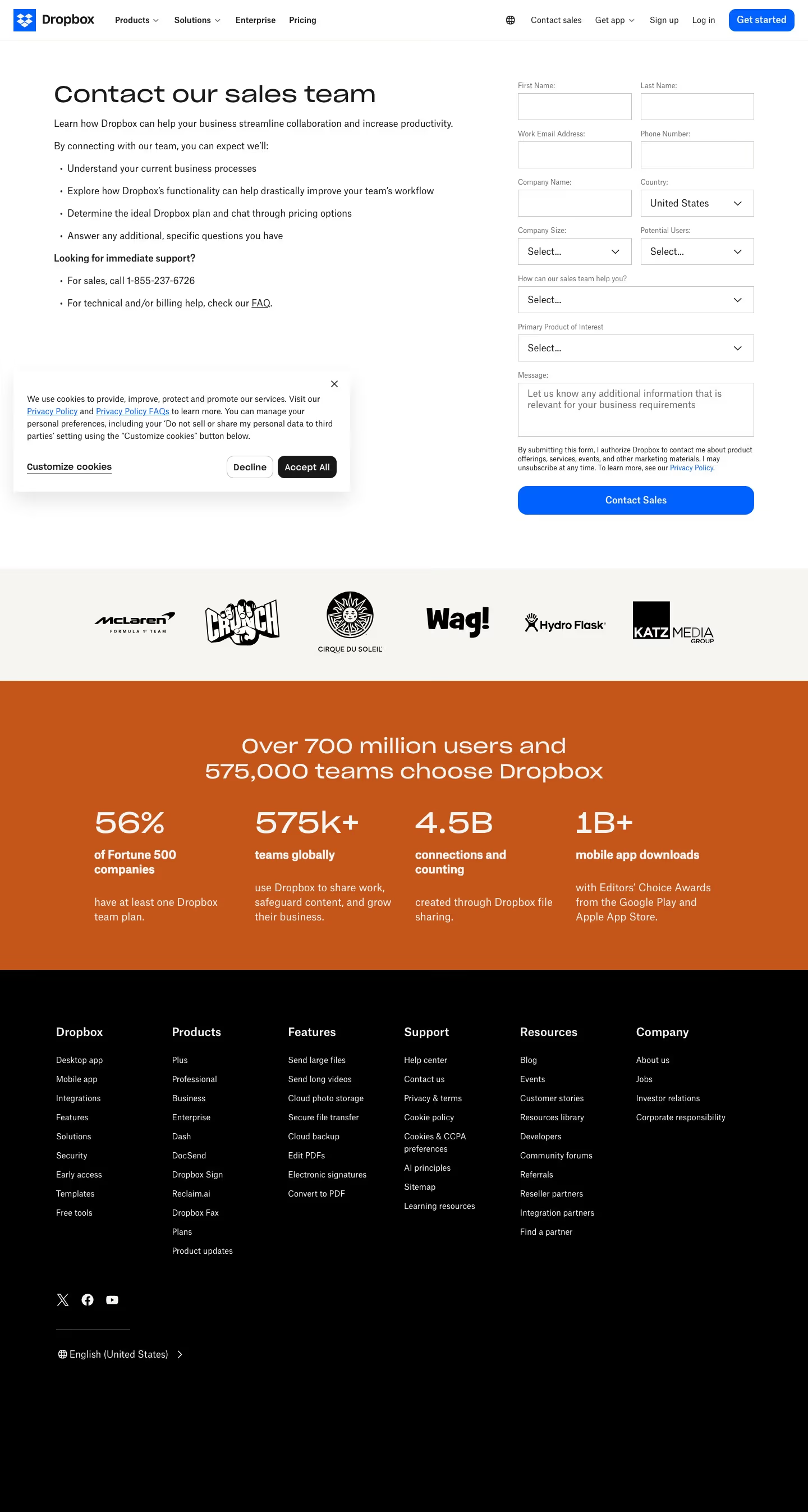
Dropbox asks for eleven: First Name, Last Name, Work Email Address, Phone Number, Company Name, Country, Company Size, Potential Users, "How can our sales team help you?", "Primary Product of Interest" and a Message box placeholdered "Let us know any additional information that is relevant for your business requirements". Two of those — Company Size and Potential Users — are seat-count questions asked before the page has any idea what you want, and both sit above the dropdown that finally asks. To its credit, the left column is unusually honest about what the form buys you: four bullets under "By connecting with our team, you can expect we'll:" that include "Determine the ideal Dropbox plan and chat through pricing options", plus a real phone number, "For sales, call 1-855-237-6726".
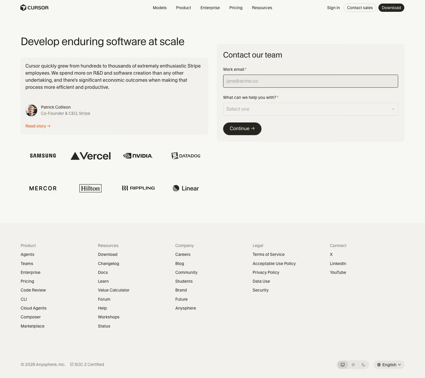
Between those two poles, the most repeated pattern is the one Cursor uses: Work email* plus "What can we help you with?"* as a Select-one dropdown, then Continue. Two fields, one of which is the routing question. The company domain in the email supplies everything Company Size and Country would have told them, and the dropdown decides where the request lands. If there is a defensible default for a SaaS contact form in 2026, that is it.
One more count from the forms: eleven of the 16 label the address field "work", "business" or "company" email. Figma's is WORK EMAIL ADDRESS*, Intercom's is Business Email * with the placeholder "Business email address", Webflow's is Business email*, Warp's and Cursor's and PlanetScale's and Rippling's all say work. That is a deliberate filter, and it is a reasonable one for enterprise sales — but it means a solo founder on a Gmail address is being told, in the field label, that this form is not for them.
The zero-form page: publish an address and mean it
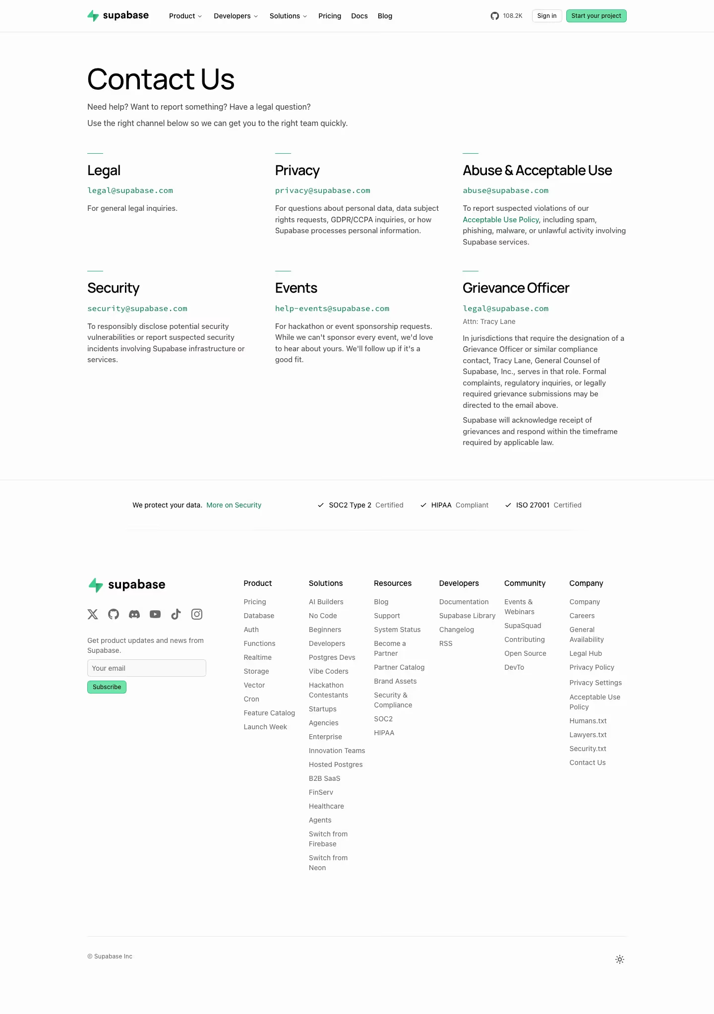
Supabase pushes this furthest of anyone in the catalog. Its Contact Us page opens "Need help? Want to report something? Have a legal question? / Use the right channel below so we can get you to the right team quickly", then lays out six blocks with a monospaced address in each: legal@supabase.com ("For general legal inquiries"), privacy@supabase.com ("data subject rights requests, GDPR/CCPA inquiries"), abuse@supabase.com ("spam, phishing, malware, or unlawful activity"), security@supabase.com ("To responsibly disclose potential security vulnerabilities"), help-events@supabase.com ("For hackathon or event sponsorship requests. While we can't sponsor every event, we'd love to hear about yours. We'll follow up if it's a good fit"), and a Grievance Officer block that names a specific human — "Tracy Lane, General Counsel of Supabase, Inc." — for regulatory complaints. There is no sales route on the page whatsoever. A trust strip closes it: SOC2 Type 2 Certified, HIPAA Compliant, ISO 27001 Certified.
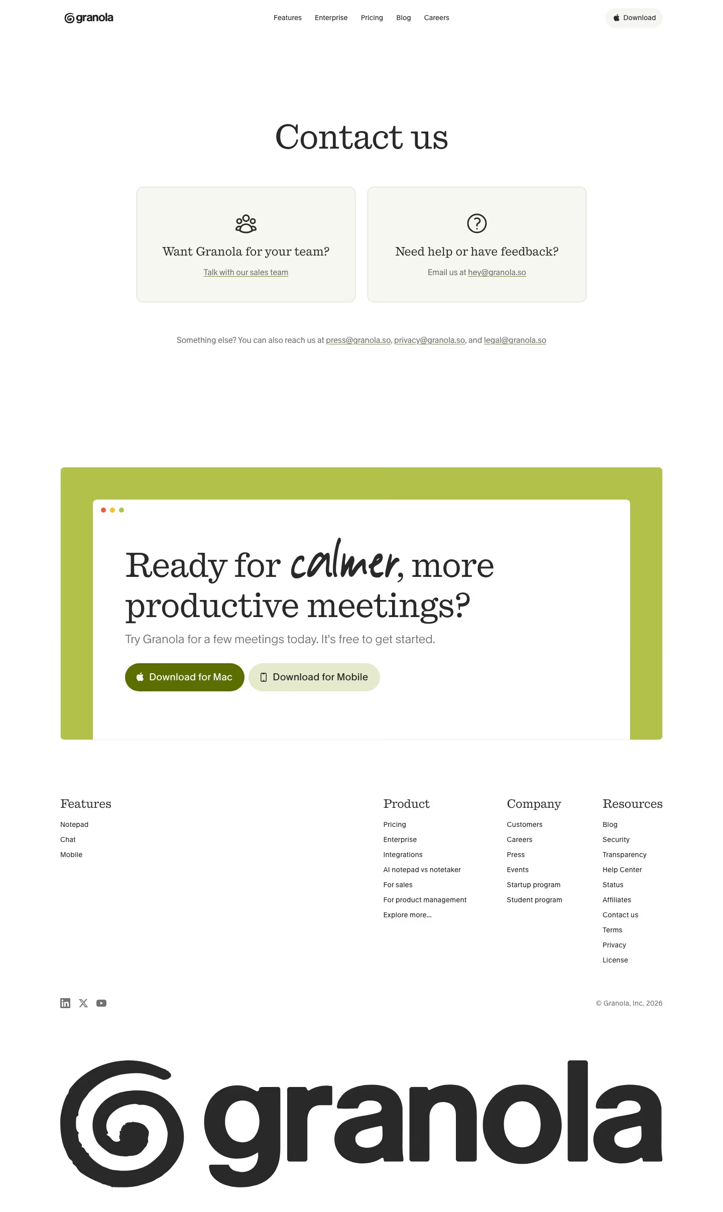
Granola does the same thing in about forty words. Two cards — "Want Granola for your team?" → "Talk with our sales team", and "Need help or have feedback?" → "Email us at hey@granola.so" — followed by one line of text: "Something else? You can also reach us at press@granola.so, privacy@granola.so, and legal@granola.so." Then it drops straight into a download CTA ("Ready for calmer, more productive meetings?"). Four published addresses, zero fields, and the whole routing decision made in a single sentence.
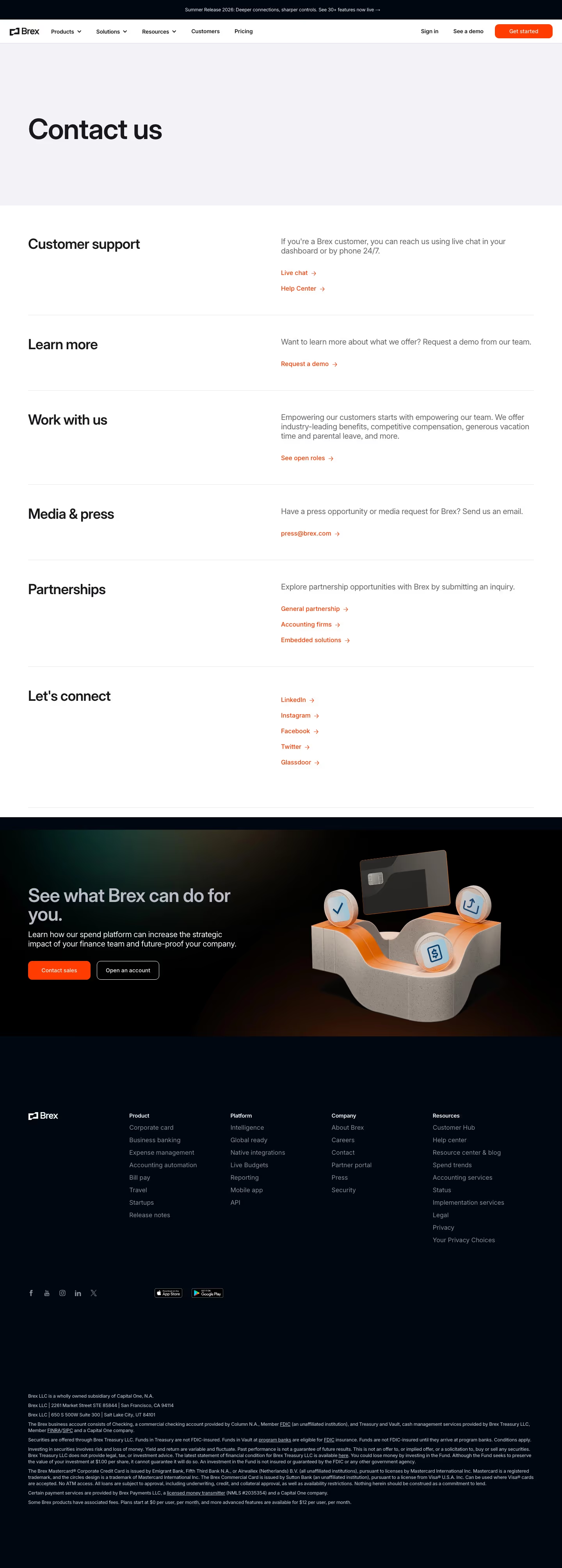
Brex uses the widest zero-form layout: a plain two-column definition list with six labelled rows. "Customer support" ("If you're a Brex customer, you can reach us using live chat in your dashboard or by phone 24/7" → Live chat, Help Center), "Learn more" (→ Request a demo), "Work with us" (→ See open roles), "Media & press" ("Have a press opportunity or media request for Brex? Send us an email" → press@brex.com), "Partnerships" (three separate links: General partnership, Accounting firms, Embedded solutions), and "Let's connect" (LinkedIn, Instagram, Facebook, Twitter, Glassdoor). It is the only page here that treats partnerships as three different conversations.
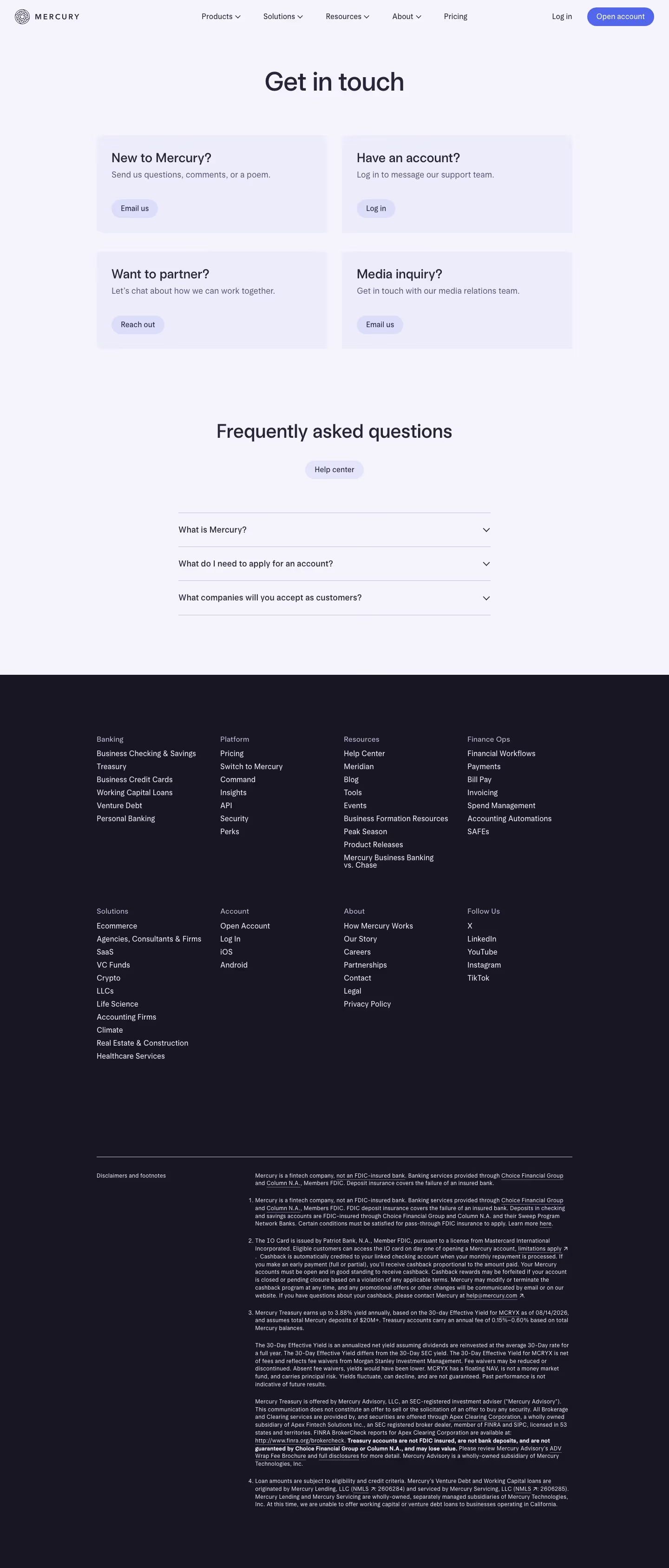
Mercury reduces it to a 2×2 grid of four questions: "New to Mercury?" ("Send us questions, comments, or a poem." → Email us), "Have an account?" ("Log in to message our support team." → Log in), "Want to partner?" (→ Reach out), "Media inquiry?" ("Get in touch with our media relations team." → Email us). Then an FAQ accordion — "What is Mercury?", "What do I need to apply for an account?", "What companies will you accept as customers?" — and a Help center pill. Note the second card: existing-customer support is behind authentication, which for a bank is the right call and for most SaaS is a way of making your paying customers work harder than your prospects.
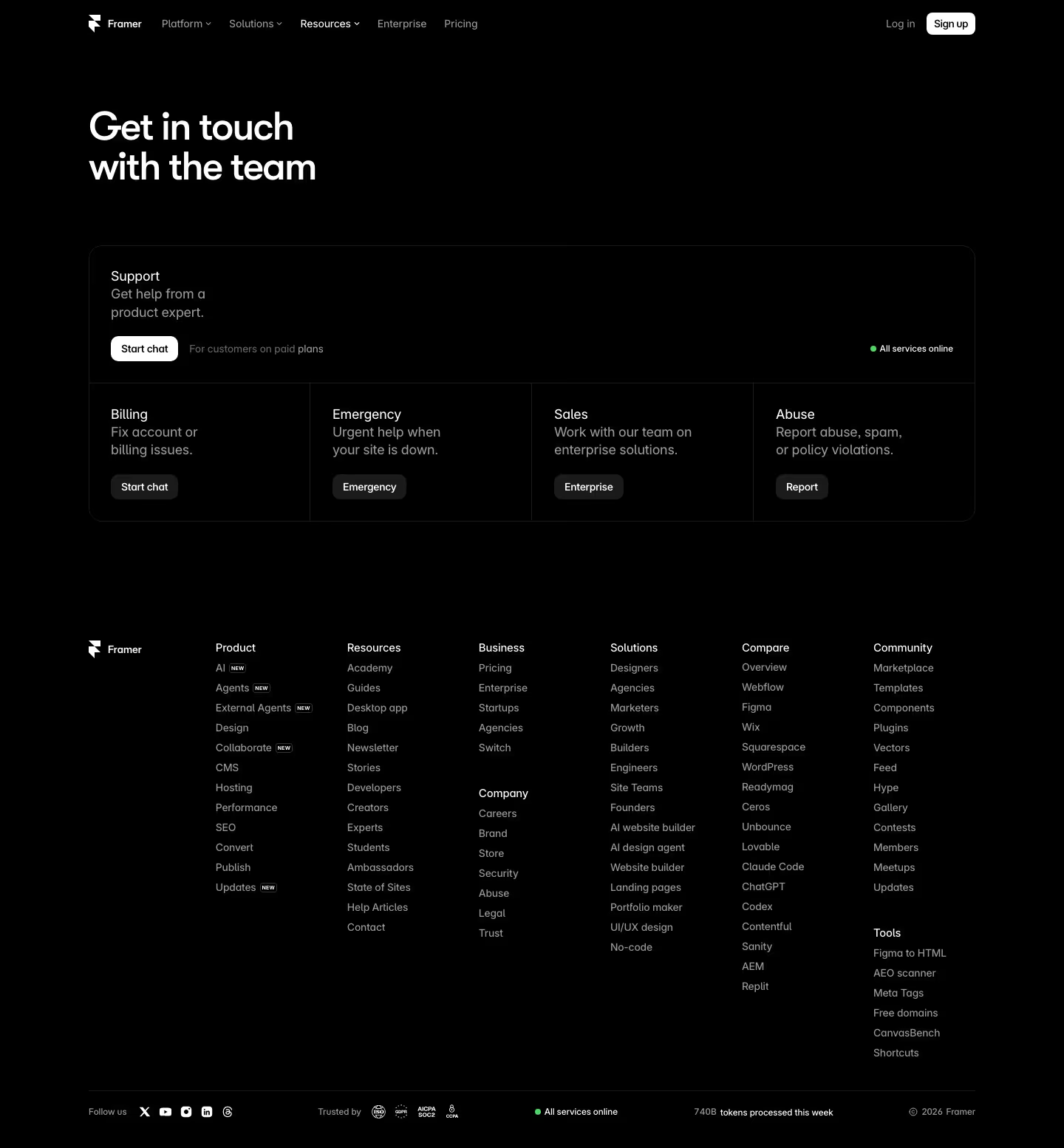
Framer is the only page in the set with an Emergency route: "Urgent help when your site is down." Its panel puts Support at the top ("Get help from a product expert" → Start chat, with the qualifier "For customers on paid plans" printed right next to the button and a green "All services online" indicator on the right), then four columns beneath — Billing, Emergency, Sales ("Work with our team on enterprise solutions" → Enterprise), and Abuse ("Report abuse, spam, or policy violations" → Report). Putting the paid-plan restriction beside the button rather than discovering it after a click is the honest version of a support paywall.
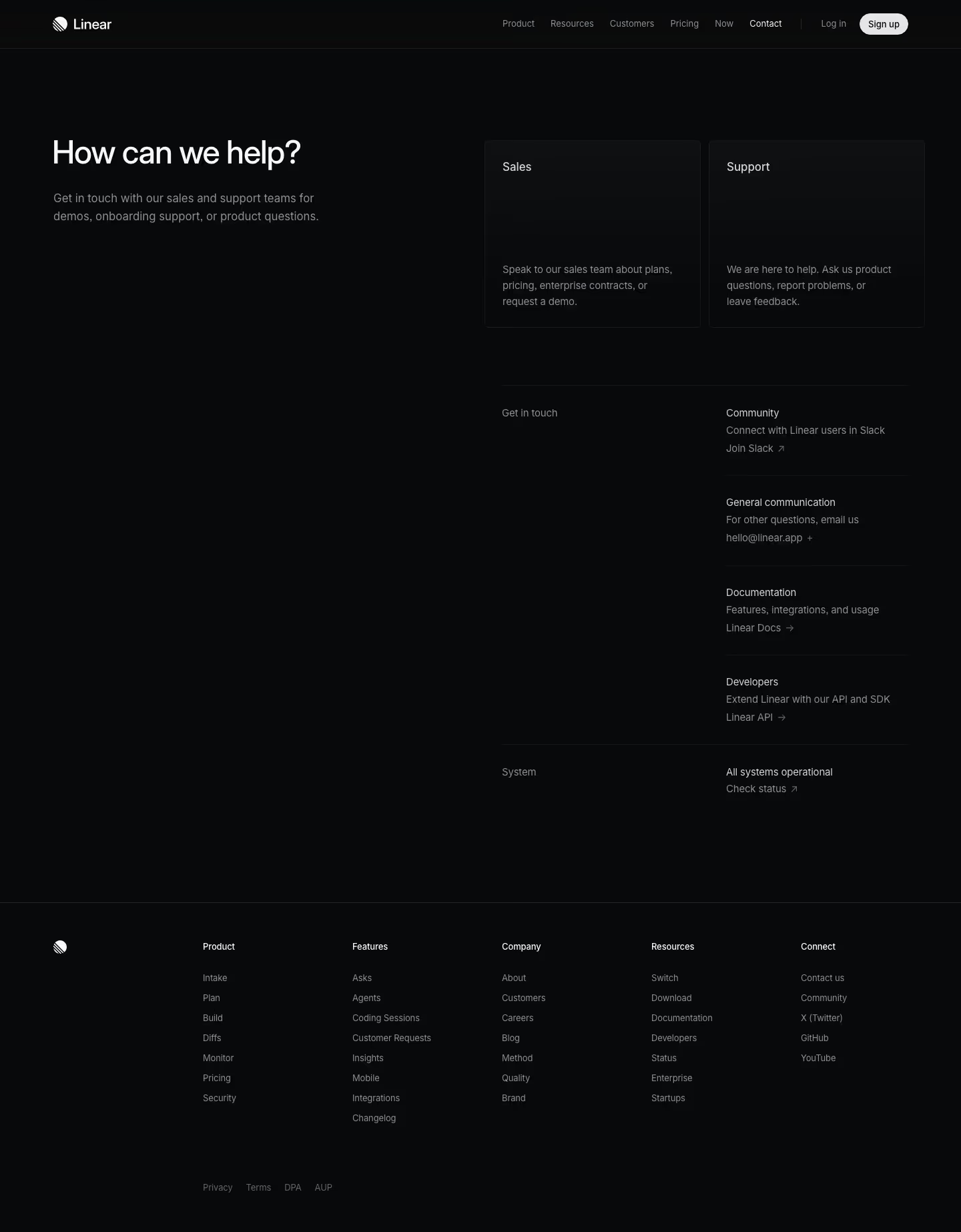
Linear and Clerk belong together, because they ship the same page. Both headline "How can we help?". Both follow it with the identical subhead: "Get in touch with our sales and support teams for demos, onboarding support, or product questions." Both then present two large cards, Sales and Support, followed by smaller Community and Documentation links. Linear's version adds "General communication — For other questions, email us hello@linear.app" and a system-status row ("All systems operational / Check status"); Clerk's says "Submit a ticket to our support team or email support@clerk.com directly" and closes with "Follow us on X — Find @clerk on X - or is it still called Twitter?". Stytch and Dub run the same headline too, which makes "How can we help?" the single most reused contact-page H1 in this catalog.
Ask one question first
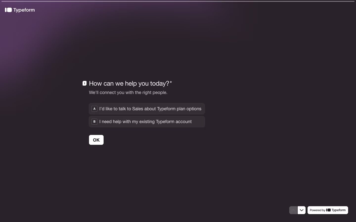
The purest version of intent routing is Typeform's, which is fitting. Its entire contact page is one question, built in Typeform: "How can we help you today?*" with the subtext "We'll connect you with the right people", and two answers — A "I'd like to talk to Sales about Typeform plan options", B "I need help with my existing Typeform account". One OK button. Nothing else on the screen. Every field it eventually asks for is a consequence of which letter you press, which is exactly the right order of operations.
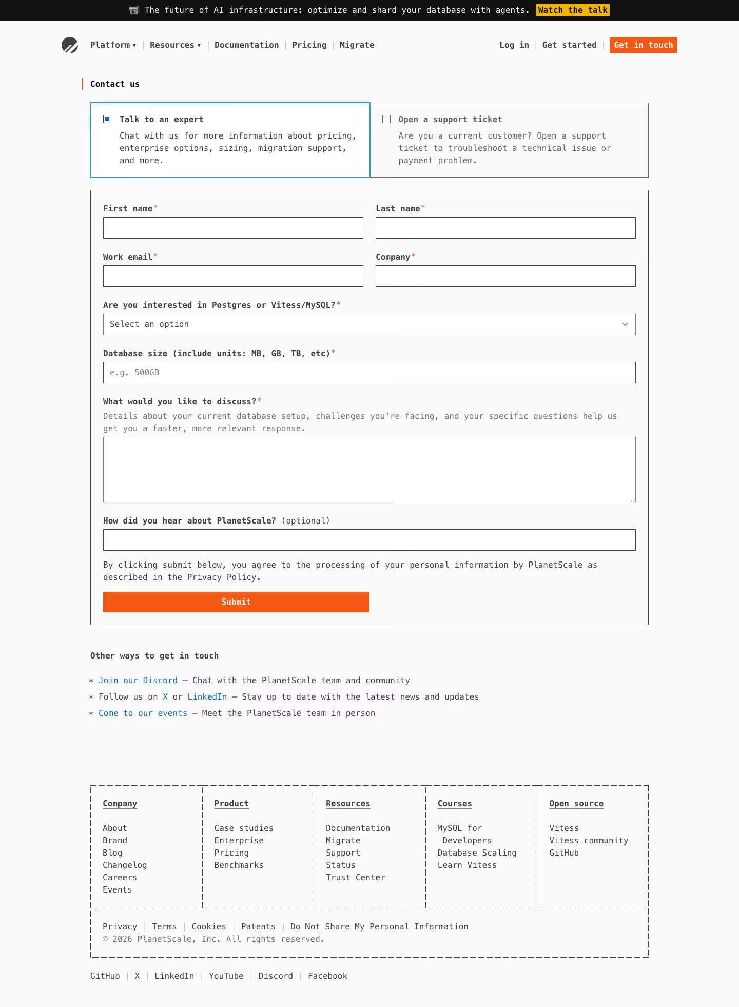
PlanetScale gets the same effect without a page transition. Two radio cards sit above the form: "Talk to an expert" ("Chat with us for more information about pricing, enterprise options, sizing, migration support, and more") and "Open a support ticket" ("Are you a current customer? Open a support ticket to troubleshoot a technical issue or payment problem"). Pick the first and you get seven required fields, including the two most product-specific questions anywhere in this set: "Are you interested in Postgres or Vitess/MySQL?*" and "Database size (include units: MB, GB, TB, etc)*" with the placeholder e.g. 500GB. The message field is labelled "What would you like to discuss?" with helper text that explains why it's asking — "Details about your current database setup, challenges you're facing, and your specific questions help us get you a faster, more relevant response." That's the closest thing to a response promise on any of these pages, and it's still a comparative rather than a number.
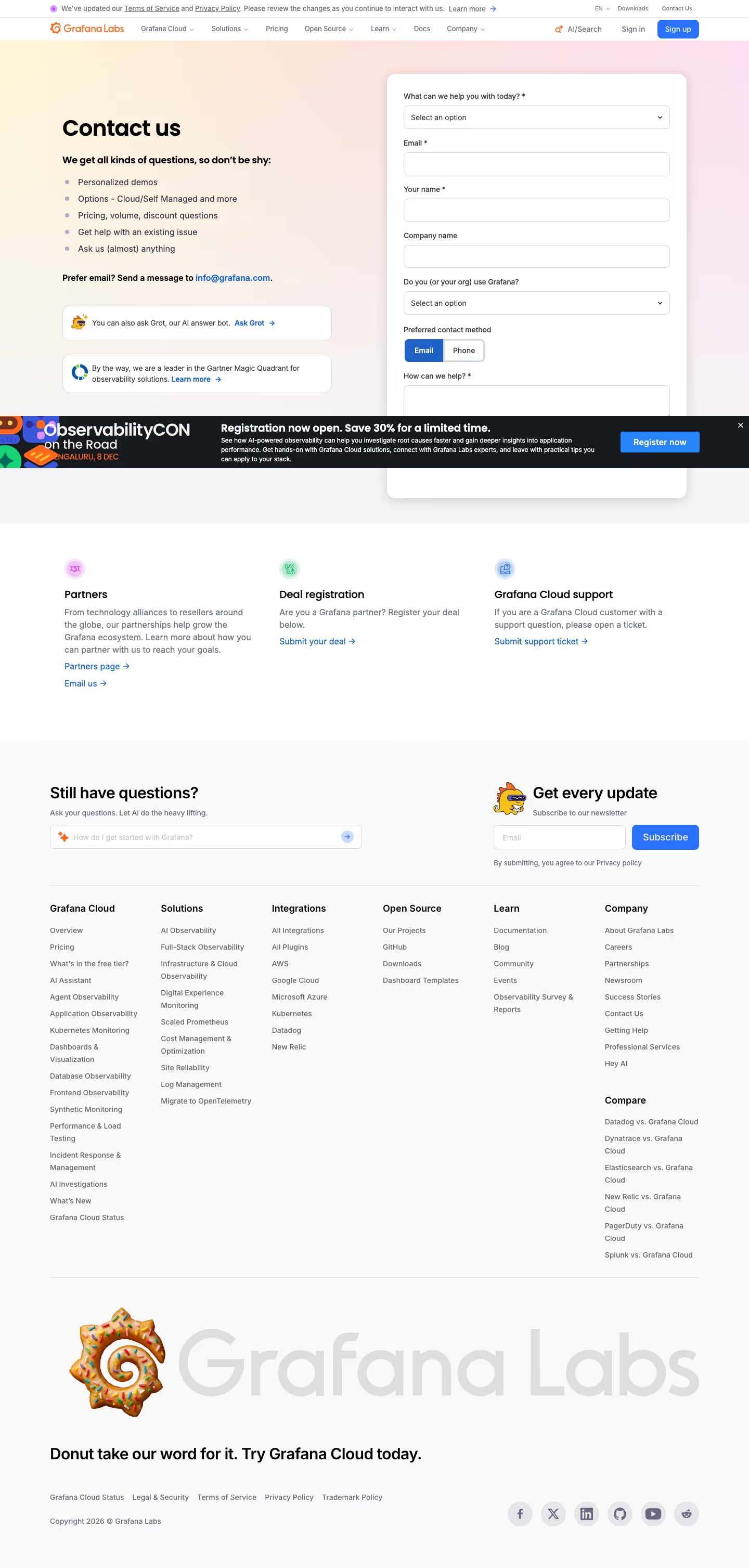
Grafana makes the routing question the literal first field: "What can we help you with today? *" sits above Email and Your name. Its left column lists what the form is for — "Personalized demos", "Options - Cloud/Self Managed and more", "Pricing, volume, discount questions", "Get help with an existing issue", "Ask us (almost) anything" — then offers two escape hatches: "Prefer email? Send a message to info@grafana.com" and "You can also ask Grot, our AI answer bot." It is also the only page here that asks "Preferred contact method" as an Email/Phone toggle, which is a small courtesy nobody else extends. Less good: an ObservabilityCON promo banner covers the bottom of the form in the capture, including the submit button.
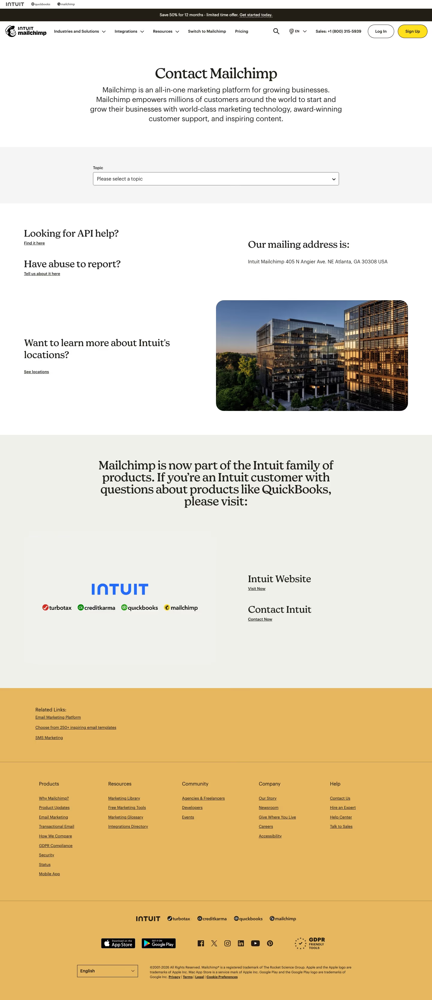
Mailchimp routes with a single dropdown and nothing else. Under a centred "Contact Mailchimp" heading, the entire form is one field labelled Topic ("Please select a topic"). Below it, four link blocks handle the requests that don't fit: "Looking for API help?", "Have abuse to report?", "Our mailing address is: Intuit Mailchimp 405 N Angier Ave. NE Atlanta, GA 30308 USA", and "Want to learn more about Intuit's locations?". The page then spends a full section explaining that "Mailchimp is now part of the Intuit family of products" with links to the Intuit site and Intuit's own contact page — the only contact page in the set whose main job is to hand you off to a parent company.
The progressive form: two fields now, the rest later
Four of the 16 forms split themselves into steps, and what they choose to ask on step one is the tell.
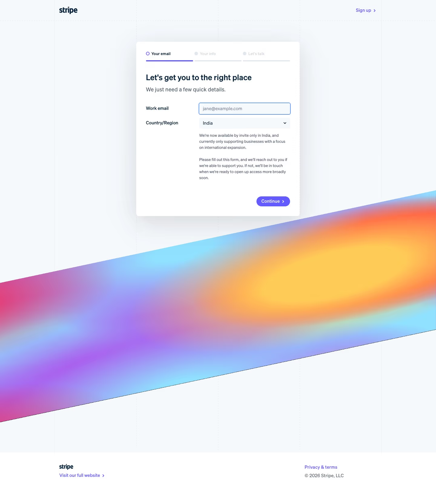
Stripe shows a three-part progress bar — "Your email / Your info / Let's talk" — under the headline "Let's get you to the right place" and the subhead "We just need a few quick details." Step one is Work email and Country/Region, and picking a country changes the copy underneath: with India selected the form explains "We're now available by invite only in India, and currently only supporting businesses with a focus on international expansion", followed by the least reassuring sentence on any of these pages — "Please fill out this form, and we'll reach out to you if we're able to support you." Painful, but honest, and better delivered before three more steps than after them.
Intercom marks its form "STEP 01/03" and asks two things: Business Email * and Your company size *. Company size on step one, before your name. Alongside it sits an unchecked opt-in — "Get updates about upcoming events, webinars, product announcements, and helpful resources" — and a left panel headed "Discover the perfect fit with Intercom" over "TRUSTED BY MORE THAN 30,000 LEADING BRANDS" with eleven logos including Anthropic, Clay, Kalshi, Culture Amp, Mercury, monday.com, Riot Games, Snowflake and Toast.
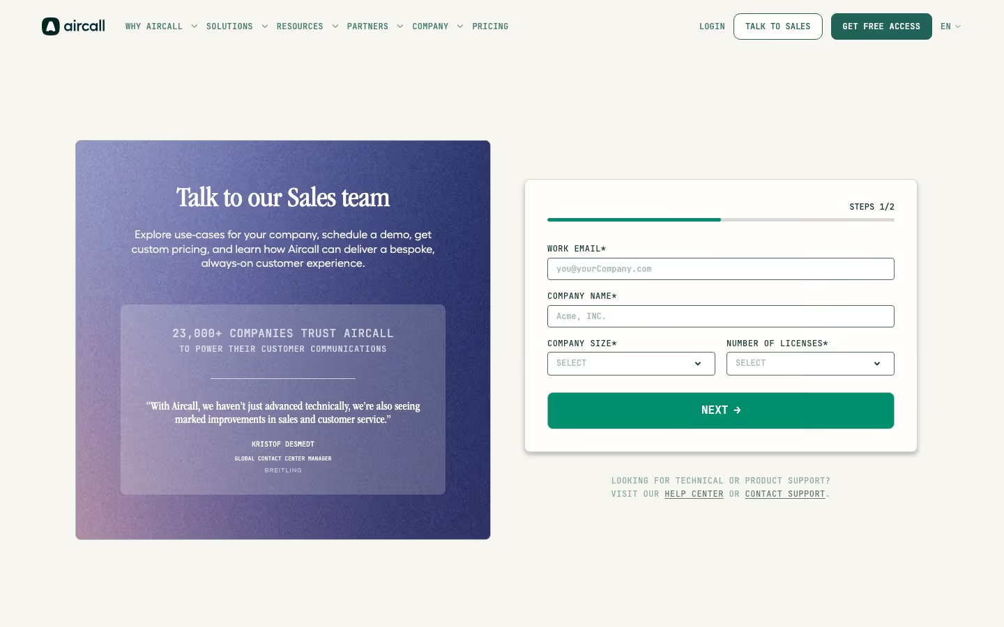
Aircall goes further still. Its "STEPS 1/2" form asks four required fields before the Next button: WORK EMAIL*, COMPANY NAME*, COMPANY SIZE* and NUMBER OF LICENSES*. Asking for licence count on the first screen is asking for deal size before you've given a name. The page is otherwise well built — "23,000+ COMPANIES TRUST AIRCALL TO POWER THEIR CUSTOMER COMMUNICATIONS" over a Breitling quote, and a clear "LOOKING FOR TECHNICAL OR PRODUCT SUPPORT? VISIT OUR HELP CENTER OR CONTACT SUPPORT" line below the card — but there is one thing conspicuously missing from the contact page of a company that sells phone systems: a phone number.
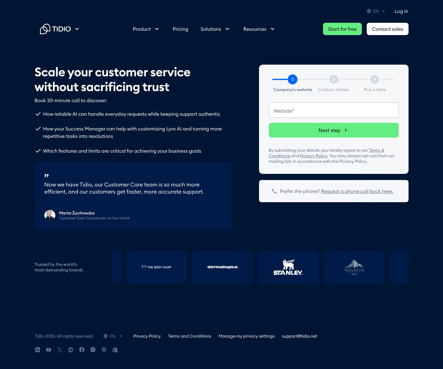
Tidio asks for something nobody else does. Its three-step form ("Company's website / Contact details / Pick a date") opens with one required field: Website*. Not your email, your domain — which lets them enrich the company before you type another character, and means step one costs the visitor almost nothing. The page also names the commitment it wants ("Book 30-minute call to discover:" followed by three specifics) and offers the alternative channel most pages omit: "Prefer the phone? Request a phone call back here."
Resend isn't stepped, but belongs in this neighbourhood: an Email address field, a How can we help? textarea placeholdered "I'd like to know how Resend can help me with…", Submit, and a right-hand column that quietly does the routing three published addresses can do — "Get help: support@resend.com", "Work at Resend: careers@resend.com", "Report security concerns: security@resend.com". Neither field is marked required. On a dark page with an "All systems operational" pill in the footer, it's about as low-friction as a contact page gets while still having one.
The qualification form wearing a contact-page costume
Then there is the other half of the sample, where "Contact us" means "Request a quote and answer our CRM's questions first".
Figma is the clean version. The heading is honest — "Contact sales", not "Contact us" — and the left column immediately splits the traffic: "Talk to a member of our sales team… We can give you a demo, help you choose the right plan for your team", then a second heading, "Looking for product or account support?", with a "Get product support" link. The form asks six required fields (WORK EMAIL ADDRESS, FIRST NAME, LAST NAME, COMPANY NAME, "WHICH TOPIC BEST FITS YOUR NEEDS?", "WHAT FIGMA PLAN ARE YOU INQUIRING ABOUT?") plus optional PHONE NUMBER and message. Below the form it repeats the support escape hatch twice more, then adds the audience almost nobody plans for: a standalone section reading "Member of the press? Send us a note here."
Webflow asks for eight required fields and puts the qualification early: Business email* and Company size* are the first two, then "How can we support you?*", First name, Last name, Company ("Where do you work?"), Title ("What is your job title?") and Country. Phone number is the only optional one. The support route is a single line under the submit button — "Looking for help with the product? Go to the help center" — and everything below the fold is persuasion rather than routing: an NCR testimonial from Dan Dawson, then a six-block "Why choose Webflow?" grid. Asking for company size as field two is a decision about who this page is for, made before the visitor has said anything.
Cloudflare runs nine fields (First Name, Last Name, Phone, Work Email, Company, Job Level, Job Function, Country, plus optional Comments) under the title "Reach out", and its marketing consent checkbox arrives pre-ticked: "Yes - I want to stay in touch with Cloudflare to receive valuable content such as product news, blog updates, and more." It is the only pre-checked opt-in in this set, and it sits directly above submit. What redeems the page entirely is what follows: a boxed "or call us at" callout localised to the visitor's country, then a section headed "International sales phone numbers" — "Speak directly with a Cloudflare enterprise sales specialist in your region" — listing 18 numbers across the Americas, 12 across Asia Pacific and a further Europe/Middle East/Africa block, right down to "United States +1 (888) 99 FLARE" and a catch-all "OTHER INTERNATIONAL +1 (650) 319 8930". No other page in this catalog publishes anything like it.

Rippling does the best audience segmentation in the set, and it does it in plain prose. The left column is "Talk to sales" (Full name, Work email address, Company name, "# of employees + contractors", Headquarters, Phone number, plus a "What would you like to speak to us about?" box). The right column is "Talk to support", split into three paragraphs for three different people: Administrators ("visit the Help Center to contact support"), Employees ("visit the Help Center for information about your account. For further assistance, contact your company's Rippling administrator"), and California Bill Pay Customers and Contractors, who get an actual number — 1-800-984-6395. Below that, two more cards for audiences no other page in the catalog acknowledges: Tax agencies ("Are you a federal tax agency in need of assistance?") and Insurance carriers. Six distinct audiences, correctly told apart, on one page.
Two more from the wider candidate pool are worth a line each, because they show the failure modes. Mixpanel makes all six of its fields required — First Name, Last Name, Company Email, Phone Number, Company Size, Topic — and then hides the message box behind a collapsed "+ Additional Comments" disclosure, so telling them what you want is the one optional, buried part of the form. And Airtable asterisks all eight of its fields as required, then lets its own AI assistant ("Riley") open over the right-hand half of them: "Many customers save hours weekly and accelerate projects significantly using Airtable. What kind of efficiency or impact are you aiming to achieve with your workflows?" A chatbot that covers the form it is meant to support is a self-inflicted wound.
What the good ones do
Every pattern below is drawn from the counts above, not from taste.
They route before they qualify. Typeform asks one question and nothing else. PlanetScale's radio pair swaps the form beneath it. Grafana makes intent field one. Cursor makes it field two. Contrast Webflow, which asks company size as field two, and Aircall, which asks for licence count on step one — both of which qualify before they route, and so make an existing customer with a billing problem answer sales questions.
They name the audiences they can't serve on this page. Figma says "Member of the press? Send us a note here." Brex publishes press@brex.com. Supabase publishes privacy@, abuse@, security@ and names its Grievance Officer. Apollo — not in the 25, but worth knowing about — adds a line most pages should copy: "If you want to be removed from our prospecting database, please submit a removal request." Every one of those requests would otherwise arrive in a sales queue.
They put the restriction next to the button. Framer prints "For customers on paid plans" beside Start chat. Stripe tells you about country availability at step one rather than step three. Both are the kind of disclosure that costs a lead and saves an hour.
They publish something a human can use. Seven of 25 print an email address; five print a phone number. Cloudflare publishes over forty. Gusto publishes hours. That is the whole set — which means simply printing hello@yourcompany.com in twelve-point type puts you ahead of two thirds of these pages.
They keep the form short enough to be answered in one sitting. Warp: one field. Cursor: two. Resend: two. Tidio's first step: one. Set against Dropbox's eleven and Webflow's eight-plus-one, and given that none of the long forms buys anything the email domain doesn't already reveal, length here reads as an internal-process artefact rather than a design decision.
How to actually structure one
Working only from what these 25 pages show, the sequence that survives scrutiny looks like this.
Decide the audience list before the layout. Rippling's page works because someone wrote down six audiences — prospects, administrators, employees, California Bill Pay customers, tax agencies, insurance carriers — and gave each one a sentence. Nine of these pages have no form precisely because that exercise produced destinations rather than a lead-capture requirement.
Make the first interaction a routing question, not a field. Two shapes work. Either the whole page is the question (Typeform's A/B, PlanetScale's radio pair, Tranch's two buttons under "To help us direct you to the right team, choose the option below that best describes what you're looking for"), or the intent dropdown is field one (Grafana) or field two (Cursor). Either way, nothing that only sales cares about — company size, headcount, seats, budget, job function — appears before the visitor has said which conversation they want.
Cap the sales form at what the email domain can't tell you. Work email plus intent plus a free-text box is the floor and, on the evidence here, close to the ceiling too. If a field exists because a CRM stage requires it, ask it on step two, after the request is captured — the four progressive forms here all demonstrate this and Stripe's three-step version proves the visitor tolerates it.
Give support a real door on the same page. Not only a help-centre link. Framer, Brex, Mercury and Gusto all show existing customers a route with a channel attached — live chat, phone, login, a ticket — and Sanity is the only page in the whole candidate pool that goes further and splits support in two: "Account support — Get help with billing, quotas, plans, and user management for existing customers" versus "Technical support — Get help from the Sanity team and thousands of developers in our community on Discord". Those are different teams; treating them as one queue is a routing bug.
Print an address, and then promise a time. The first half is easy and two thirds of these pages skip it. The second half is where every single one of the 25 falls down. "We'll get back to you shortly" is not a promise; "one business day" is. Nobody in this sample has claimed that ground, which makes it the cheapest available differentiator on the entire page — and unlike a redesign, it costs nothing but the willingness to be held to it.
For the rest of this catalog's captured contact pages, browse the contact page hub — 196 of the 382 sites here have one. The neighbouring patterns are worth reading alongside it: FAQ sections absorb a surprising amount of would-be contact traffic, and footer design is where most of these companies hide the addresses their contact pages refuse to publish.
At a glance
Frequently asked
How many fields should a SaaS contact form have?
The 16 forms in this set range from one field to eleven. The pattern that shows up most often among the shortest is Cursor's: a required work email plus a required "What can we help you with?" dropdown, then a Continue button. Two fields is enough to route a request and enrich the rest from the domain. Dropbox's eleven-field version asks for Company Size and Potential Users before it asks what you actually want.
Should a contact page have a form at all?
Nine of the 25 pages here don't. Supabase publishes five purpose-specific addresses (legal@, privacy@, abuse@, security@, help-events@) and no sales form whatsoever. Granola lists hey@granola.so plus press@, privacy@ and legal@ in a single sentence. Brex uses six labelled rows — Customer support, Learn more, Work with us, Media & press, Partnerships, Let's connect — each pointing at a different destination.
Do SaaS contact pages publish real email addresses and phone numbers?
Rarely. Of the 25 pages reviewed here, seven print an actual email address in the page body and five print a phone number with digits in it. Cloudflare is the outlier in the other direction: it lists country-by-country sales numbers for 18 countries in the Americas, 12 in Asia Pacific and a further Europe/Middle East/Africa block, closing with "OTHER INTERNATIONAL +1 (650) 319 8930".
What is an intent router on a contact page?
A page that asks who you are before it asks anything else. Typeform's contact page is a single question — "How can we help you today?" with option A "I'd like to talk to Sales about Typeform plan options" and option B "I need help with my existing Typeform account". PlanetScale does it with two radio cards ("Talk to an expert" versus "Open a support ticket") that swap the form beneath them. Grafana makes "What can we help you with today?" the first field, above the email field.
Is it a mistake to send support traffic to a help centre from the contact page?
Not on its own — Figma, Miro, Monday, Airtable, Gong, Aircall and Rippling all do it, and it keeps the sales form clean. It becomes a problem when the contact URL itself resolves to the help centre. ClickUp's captured contact page is help.clickup.com's search box, and Lattice's is a Zendesk-hosted "Submit a request" form, so a prospect who clicked "Contact" ends up in a support queue with no route back to sales.
Related reading
SaaS FAQ Sections That Actually Reduce Support Tickets
Sanity replaced its FAQ with a live AI chat agent. Firecrawl splits 25+ questions into four labeled categories. A real look at 12 SaaS FAQ sections — and why almost none of the questions are actually about troubleshooting.
SaaS Footer Design: What 12 Real Examples Include (and Skip)
ReadMe's footer is a logo and three links. Tidio's is a three-tier mega-footer with SEO comparison pages. A real look at how much — or how little — a SaaS footer actually needs.
24 Product Landing Page Examples, Measured Fold to Footer
Twenty-four product landing pages read start to finish from our own screenshots — what's in the fold, where the logo strip actually sits, how the page closes, and how long each one really runs, in pixels.