
291 SaaS website feature section design examples
Feature sections translate capabilities into benefits. These examples show how leading SaaS products structure feature storytelling — alternating layouts, focused visuals, and copy that connects each capability to an outcome.
Sponsored by (opens in new tab)








About features
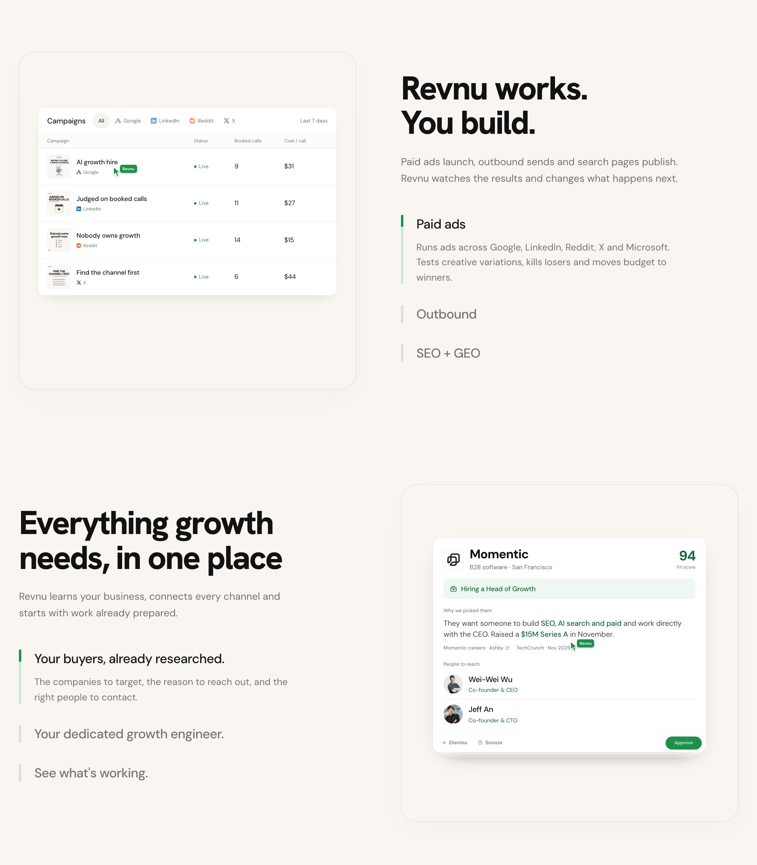
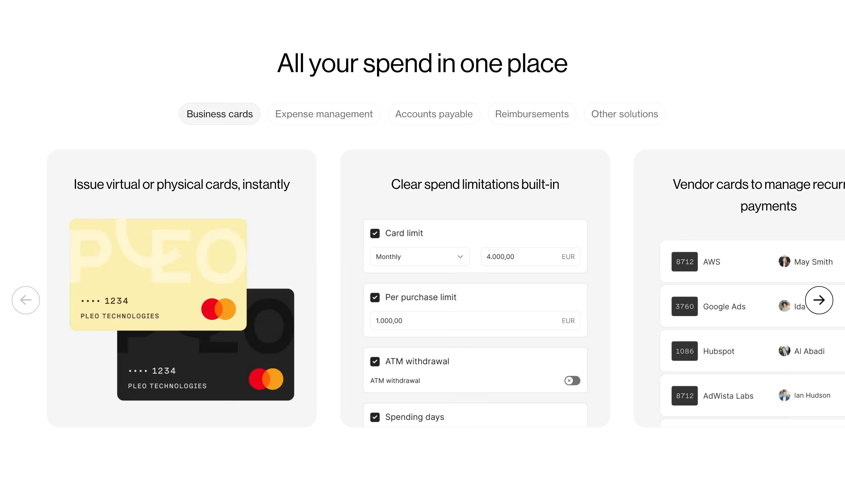
The recurring mistake in weak feature sections is leading with what the software does rather than what changes for the person using it — a heading like 'Real-time collaboration' describes a mechanism, while 'See your team's changes as they happen' describes an outcome, and the second version is the one that survives a skim. Layout matters almost as much as copy: alternating image-left/image-right rows work well for three to five features that each deserve real explanation, while a denser card grid with icons suits a longer list of smaller capabilities that don't need a paragraph each. The best sections also vary their proof — a screenshot for one feature, a short metric for another, a customer quote for a third — so the section doesn't read as one repeated template stamped six times in a row, which is the visual cue that makes visitors start skimming past it entirely.
What makes a great one
- Benefit-led headings rather than feature names
- A repeatable, scannable layout (cards, alternating rows)
- Supporting visuals or product UI for each point
- A clear hierarchy from headline to detail
From the blog
25 SaaS Contact Us Page Examples, Counted Field by Field
Dropbox's contact form asks for eleven things. Warp's asks for one. We counted the fields, the routes and the published email addresses on 25 real SaaS contact pages — and not one of them promises a response time.
The 30 Best SaaS Websites in 2026 (Reviewed From Real Screenshots)
Thirty SaaS websites reviewed at equal depth from screenshots we captured ourselves — what's above the fold, the one section each does unusually well, and the stack, palette and typefaces behind it. With a stated selection method, not a handpicked vibe check.
24 Product Landing Page Examples, Measured Fold to Footer
Twenty-four product landing pages read start to finish from our own screenshots — what's in the fold, where the logo strip actually sits, how the page closes, and how long each one really runs, in pixels.
Frequently asked
Should feature sections use screenshots or icons?
Depends on how much explanation the feature needs. Icons work for quickly-grasped capabilities in a longer list; a real screenshot or short GIF works better when the feature's value only becomes clear once you see the interface, which is most complex SaaS products.
How many features should a SaaS landing page show?
Usually three to six on the main scroll — enough to cover the reasons someone buys, not the full changelog. A longer list is better served by a dedicated features or product page linked from the nav.
What's the difference between a feature and a benefit in copy?
A feature is what the product does ('automated invoice reminders'); a benefit is what happens to the user as a result ('get paid faster without chasing anyone'). Strong feature sections lead with the benefit and use the feature name as supporting detail.