
421 SaaS website hero section design examples
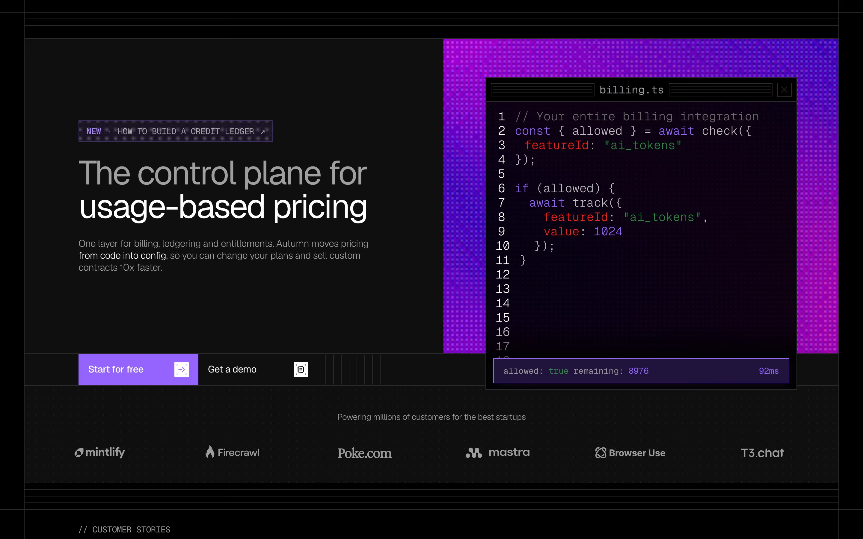
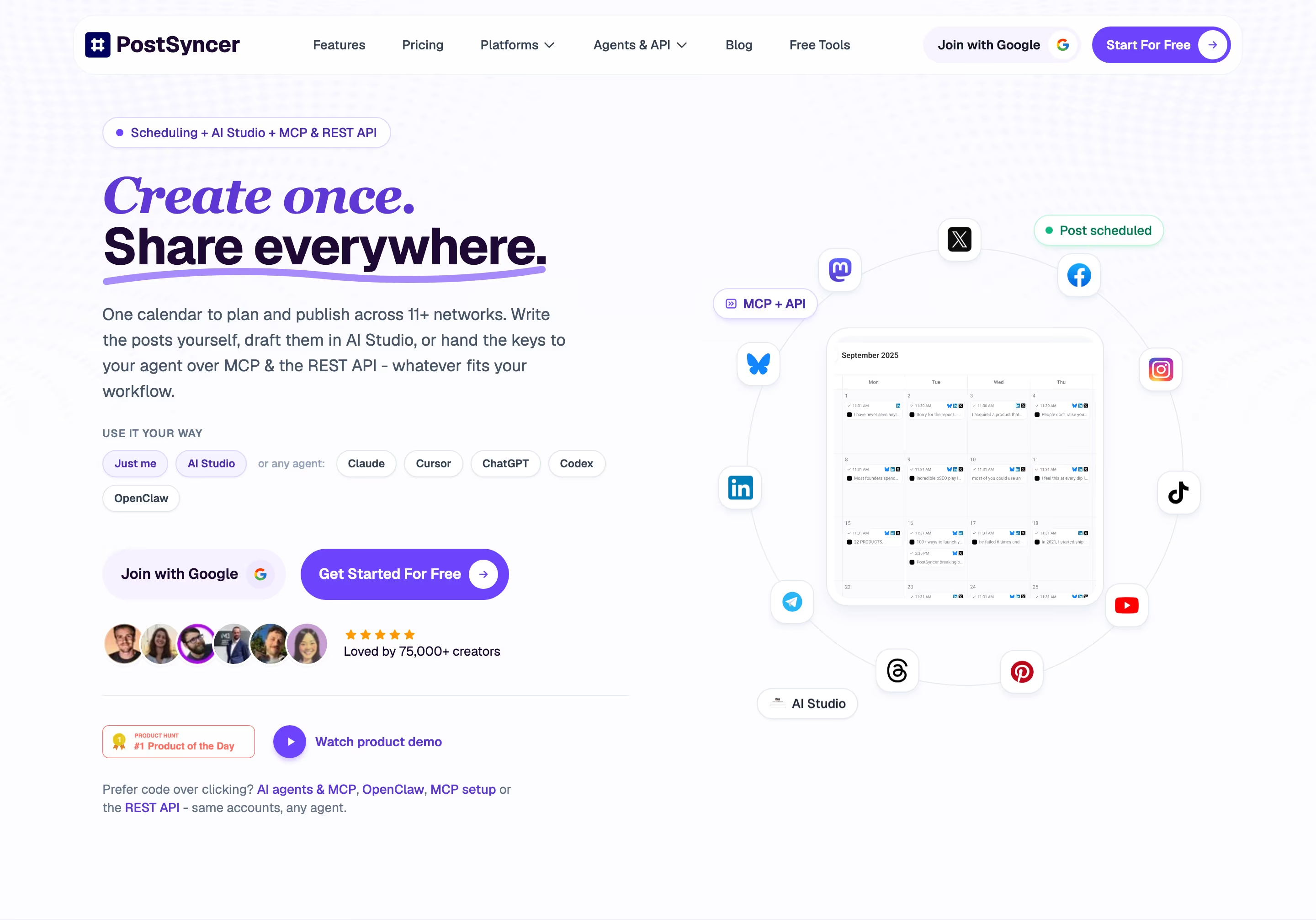
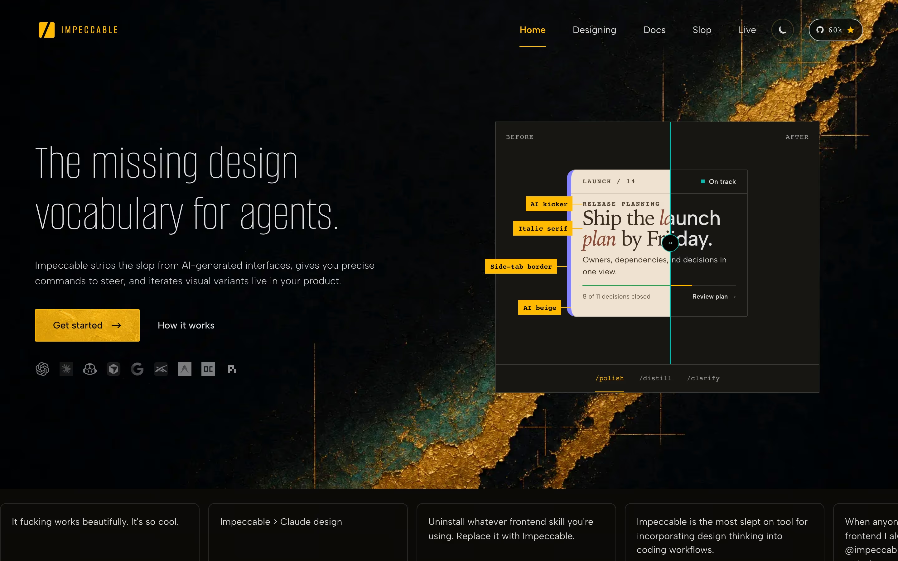
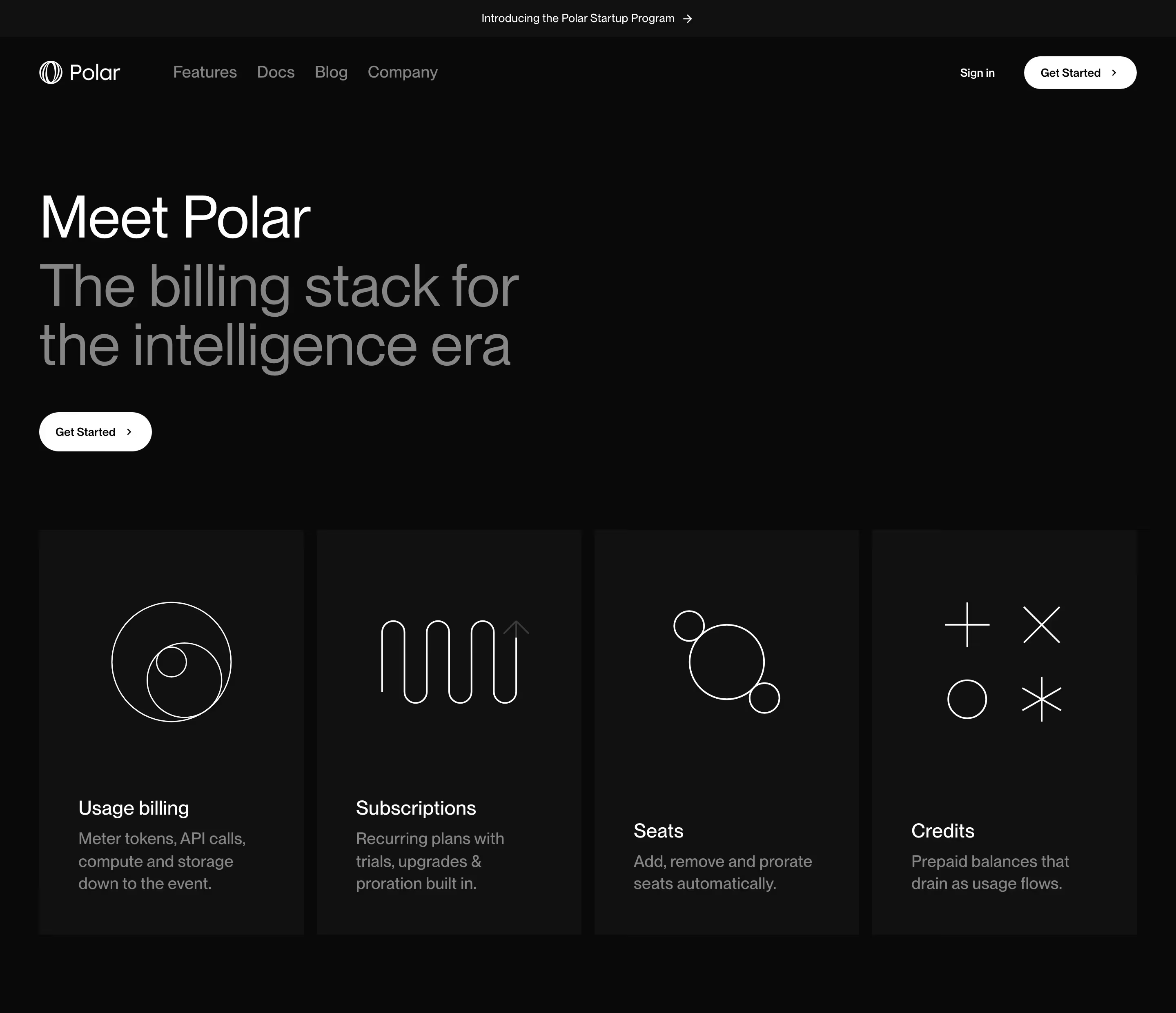
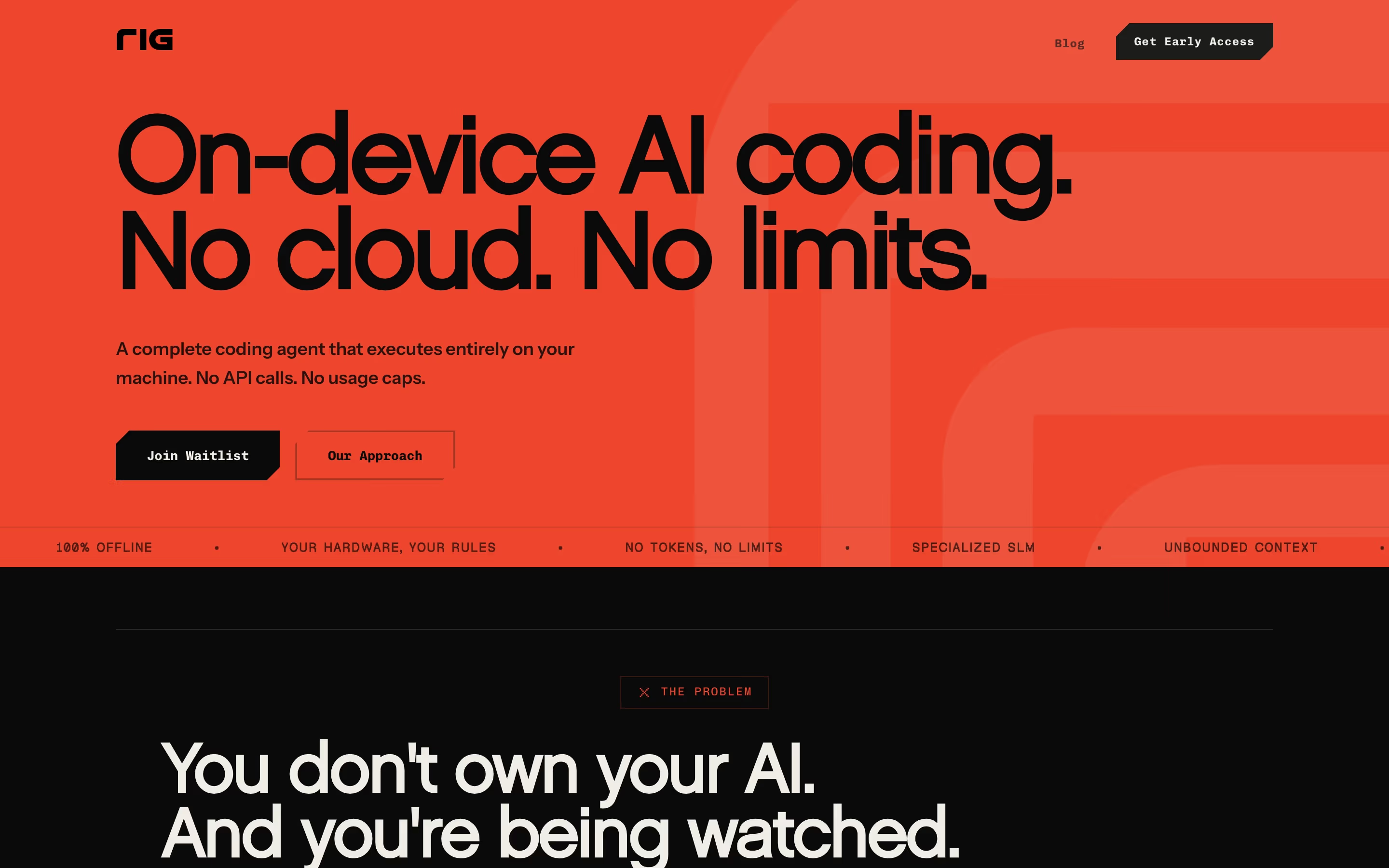
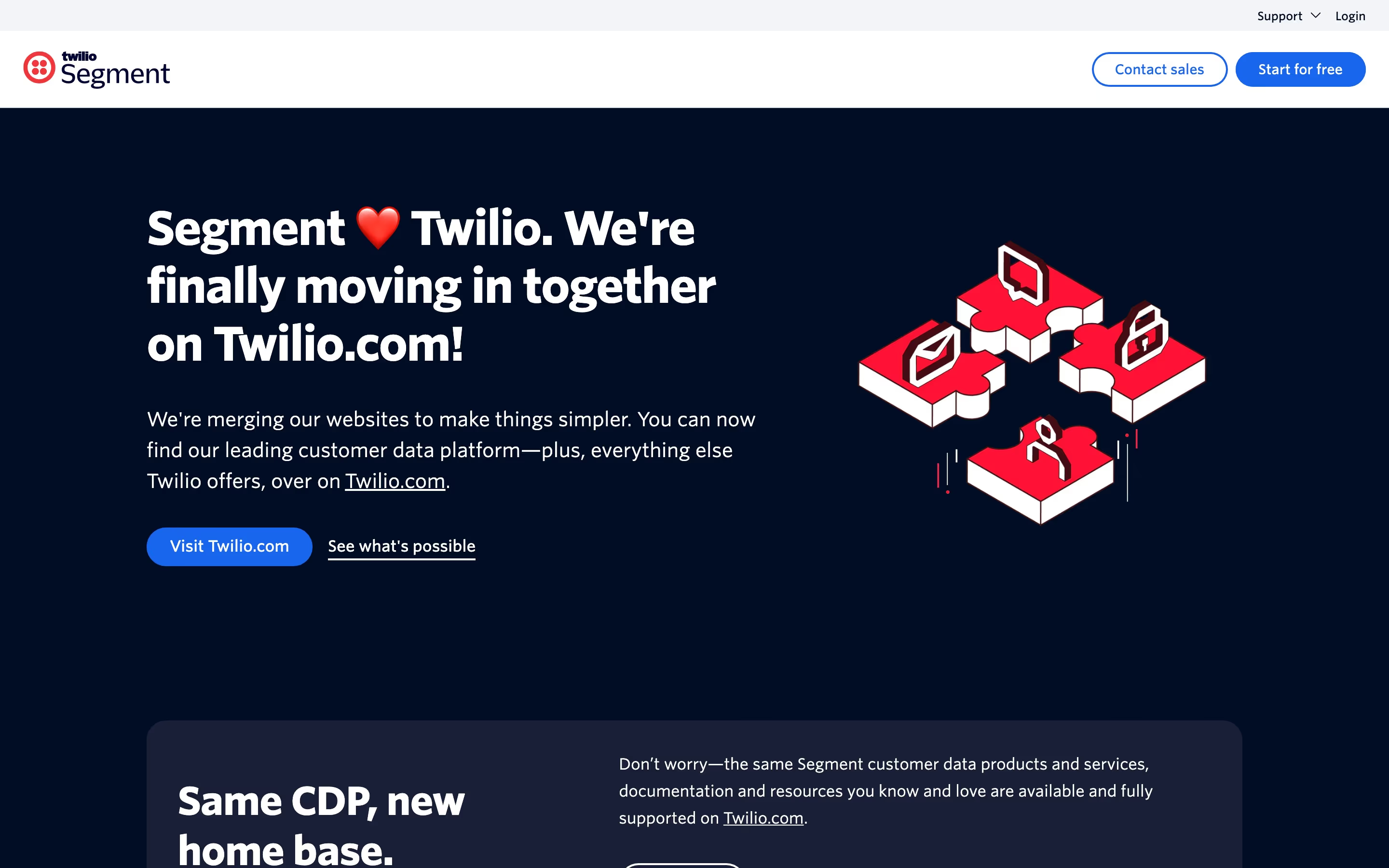
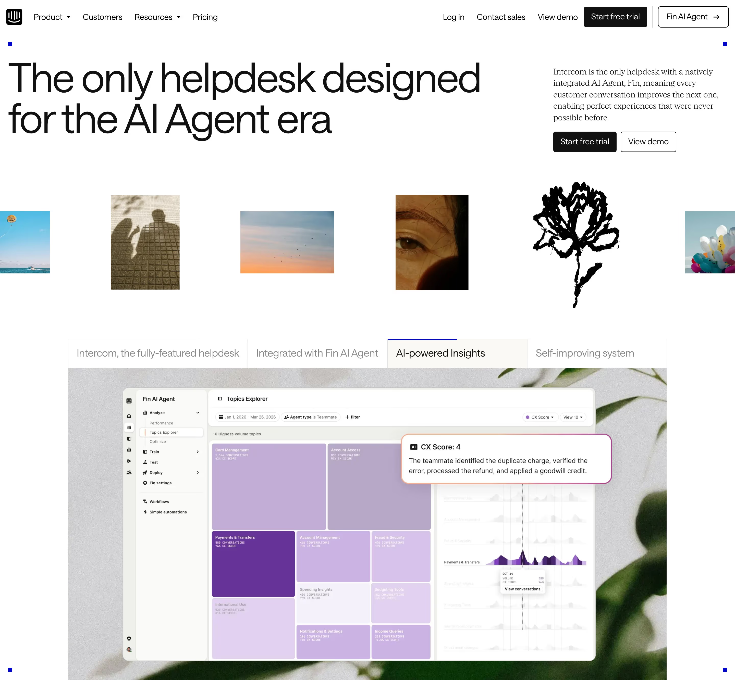
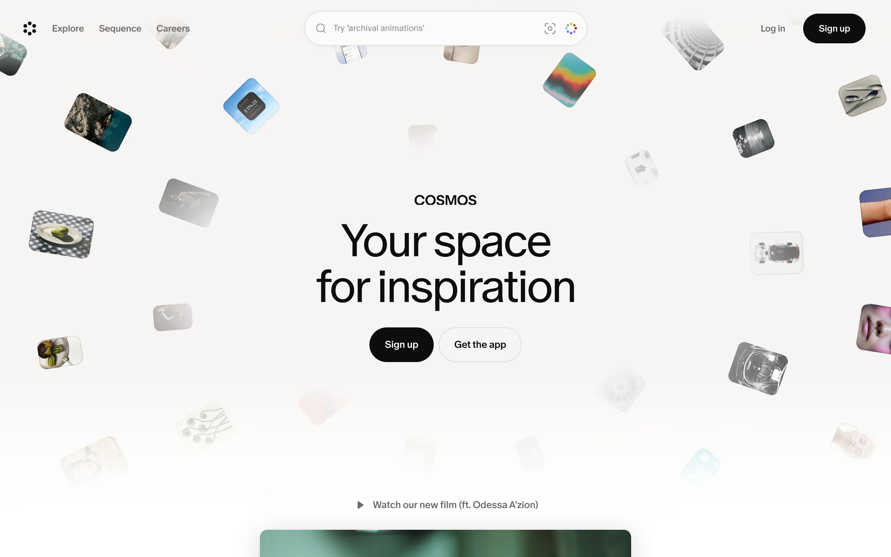
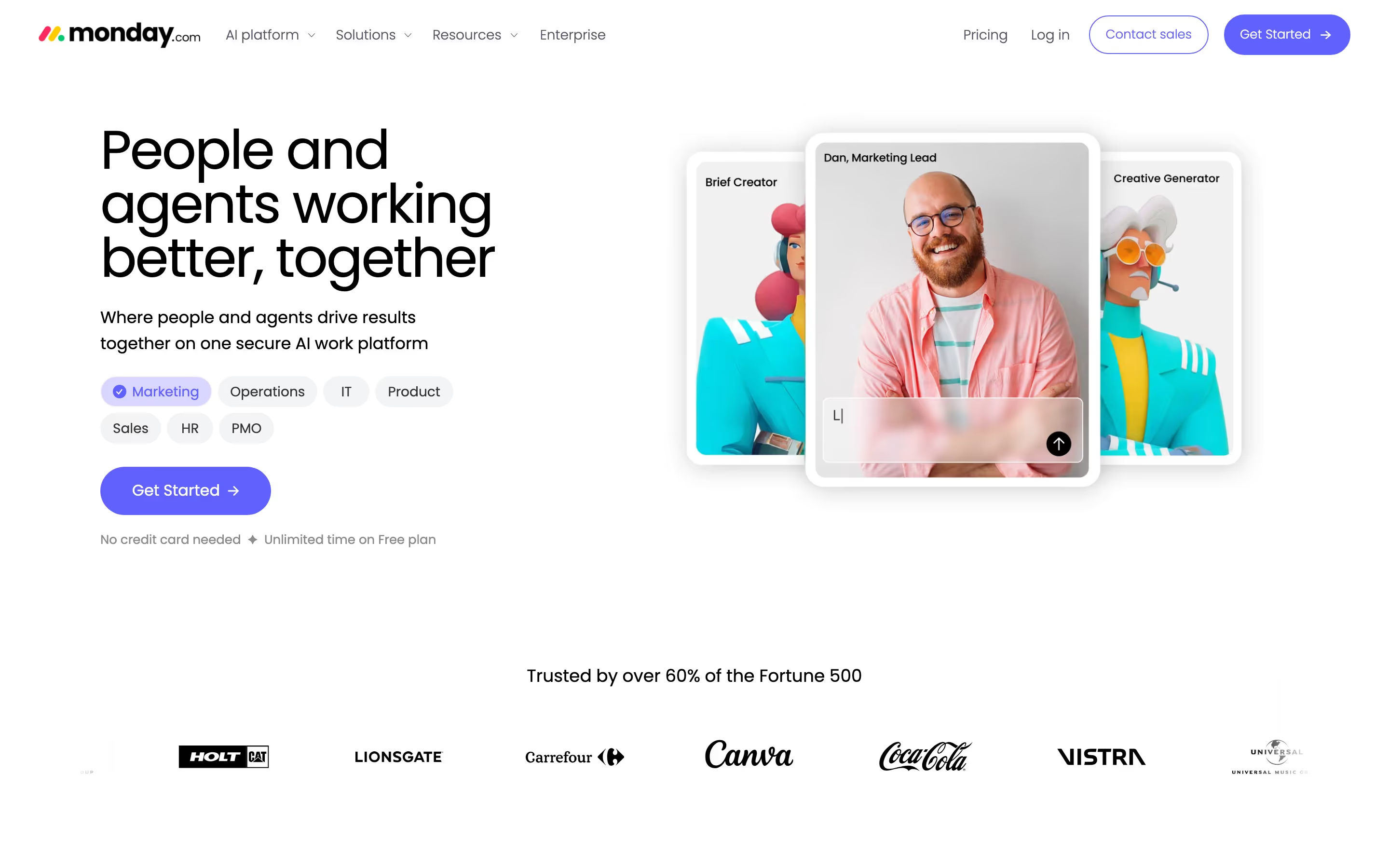
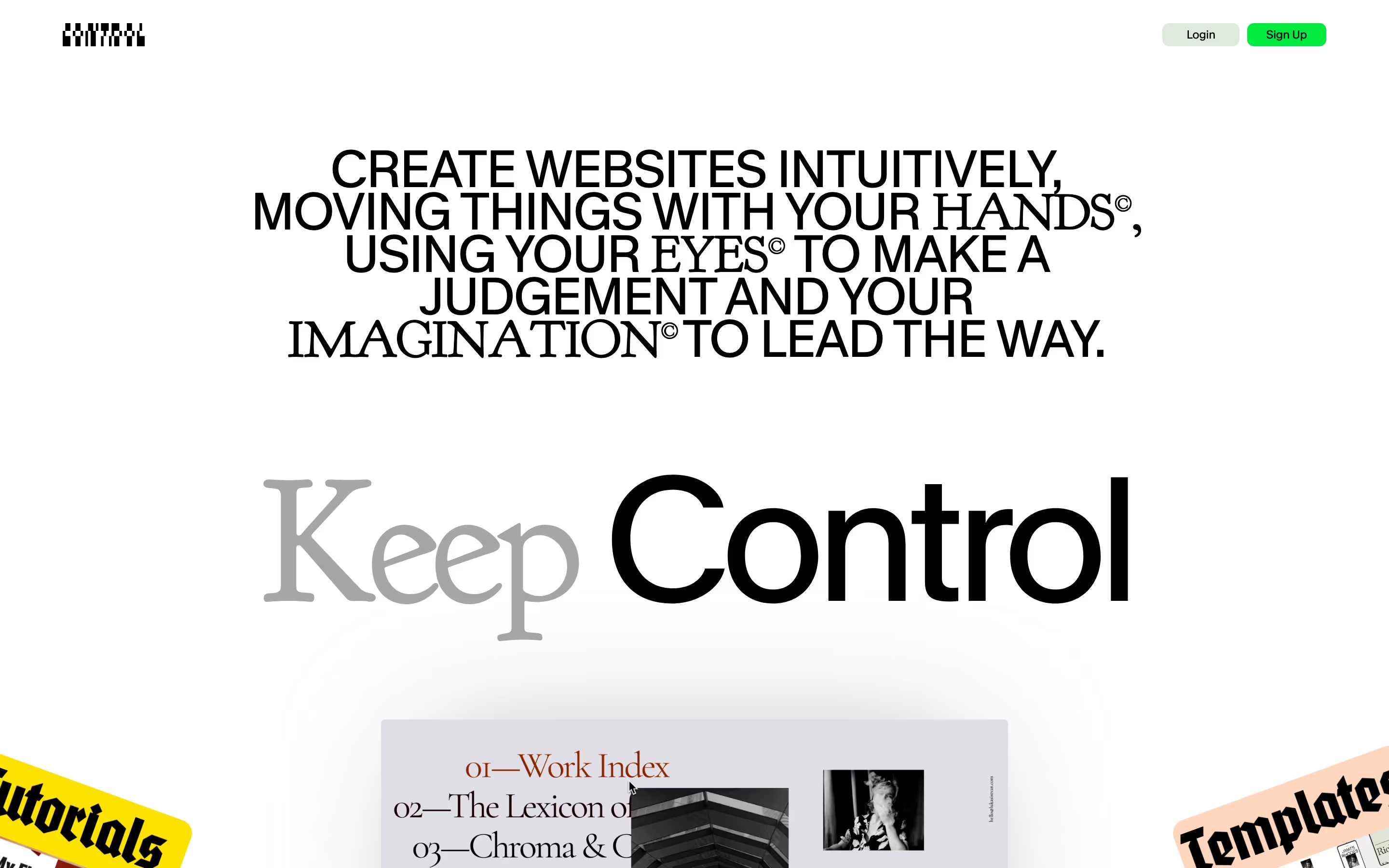
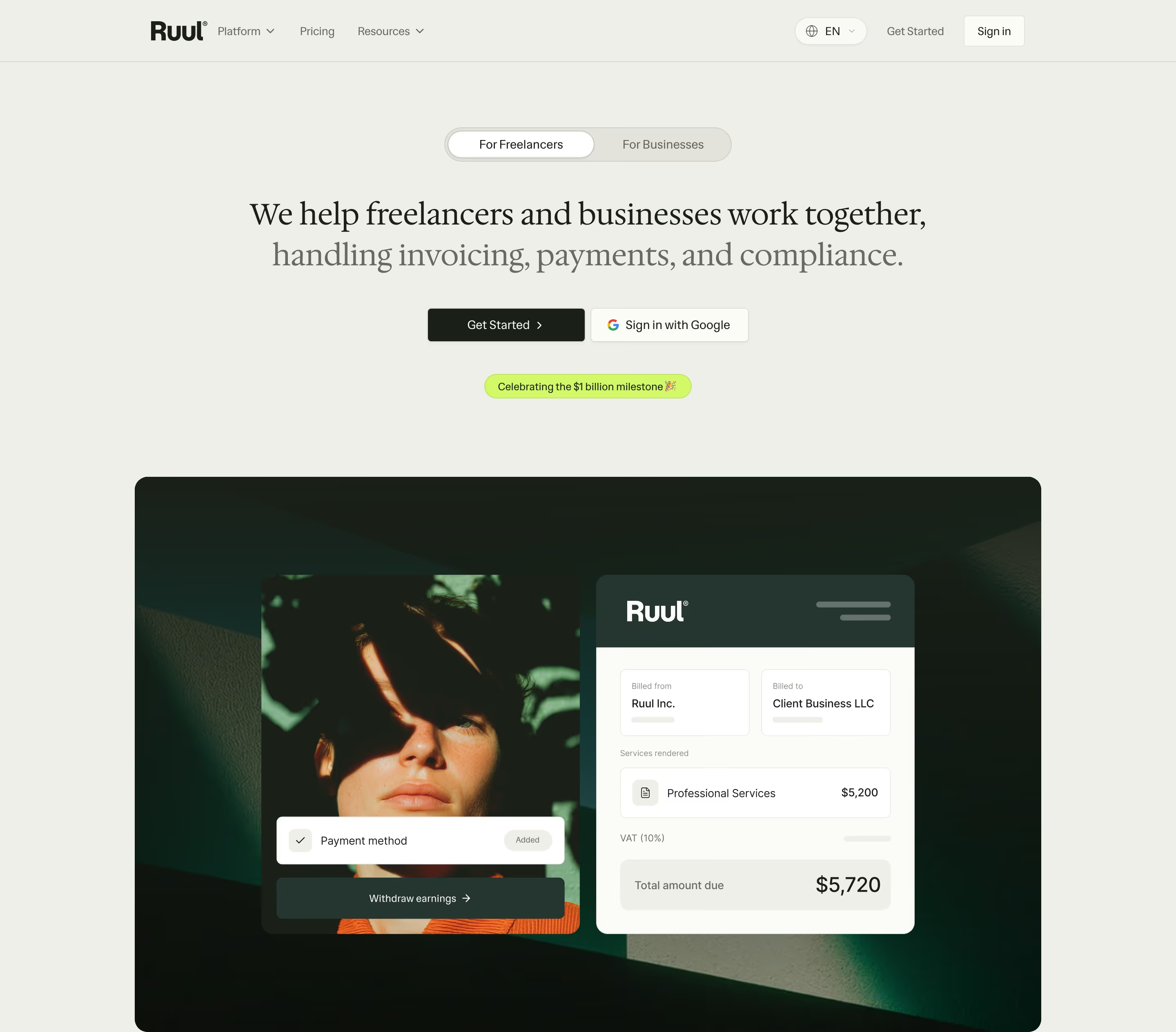
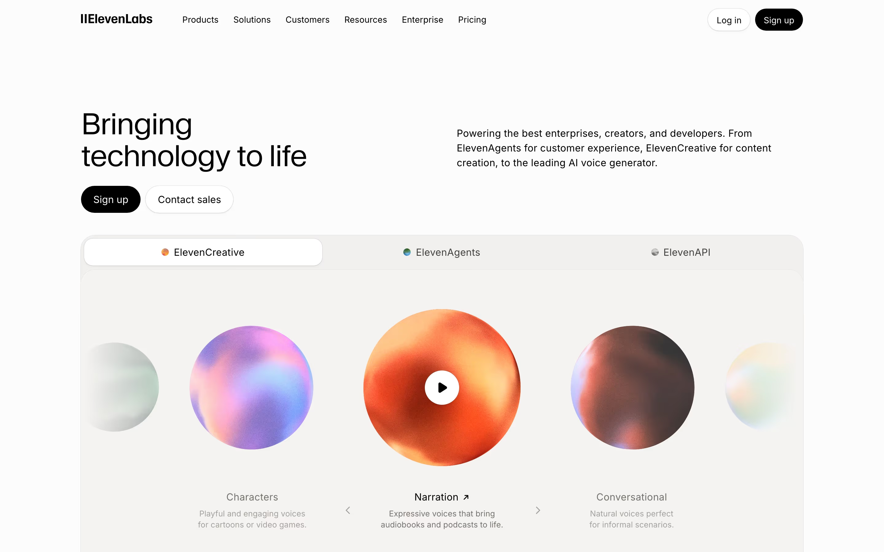
The hero is the first thing a visitor sees and the single biggest driver of whether they keep reading. These examples show how the best SaaS companies open their landing pages — pairing a sharp value proposition with a clear primary action and a glimpse of the product.
Sponsored by (opens in new tab)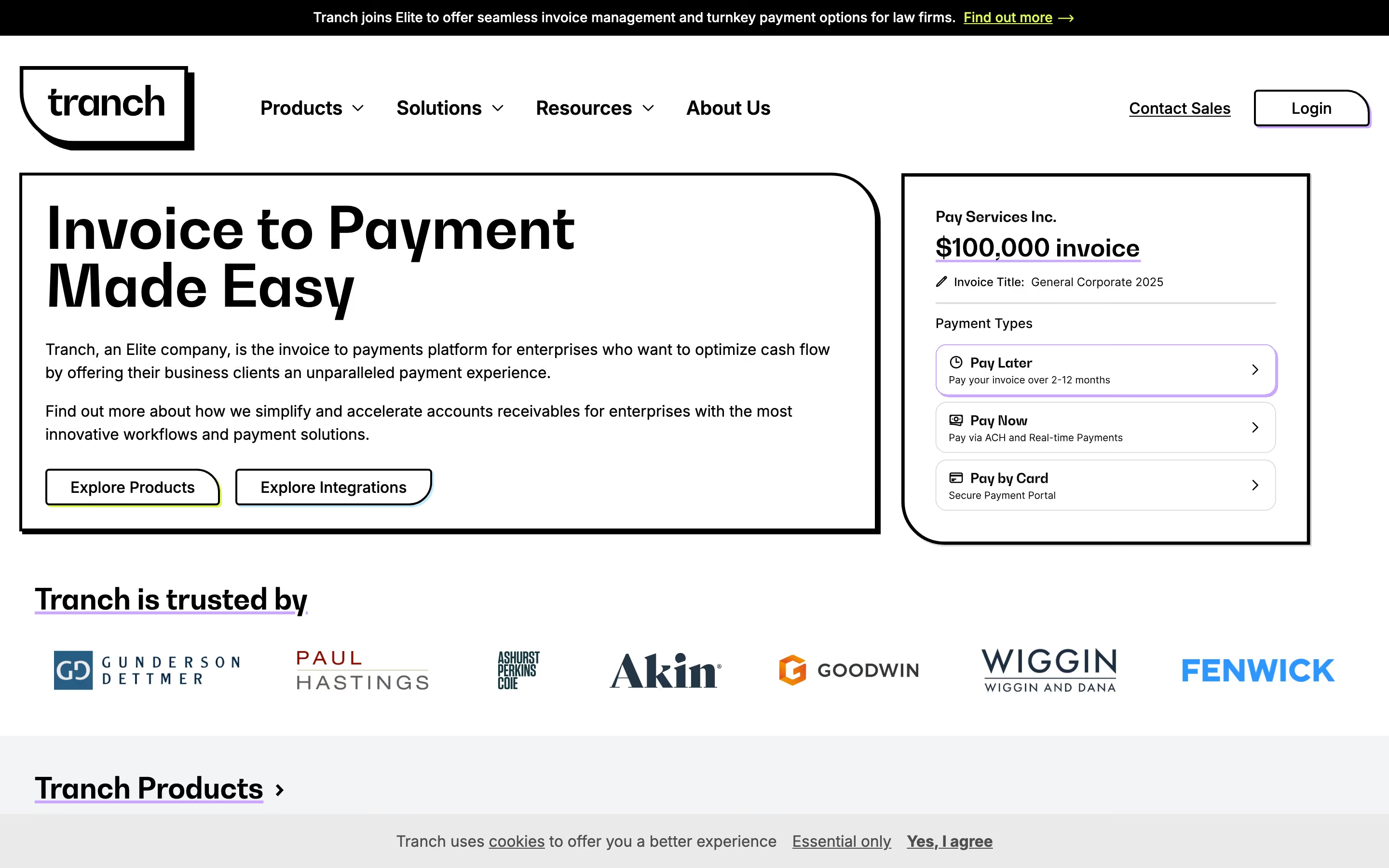















About heroes
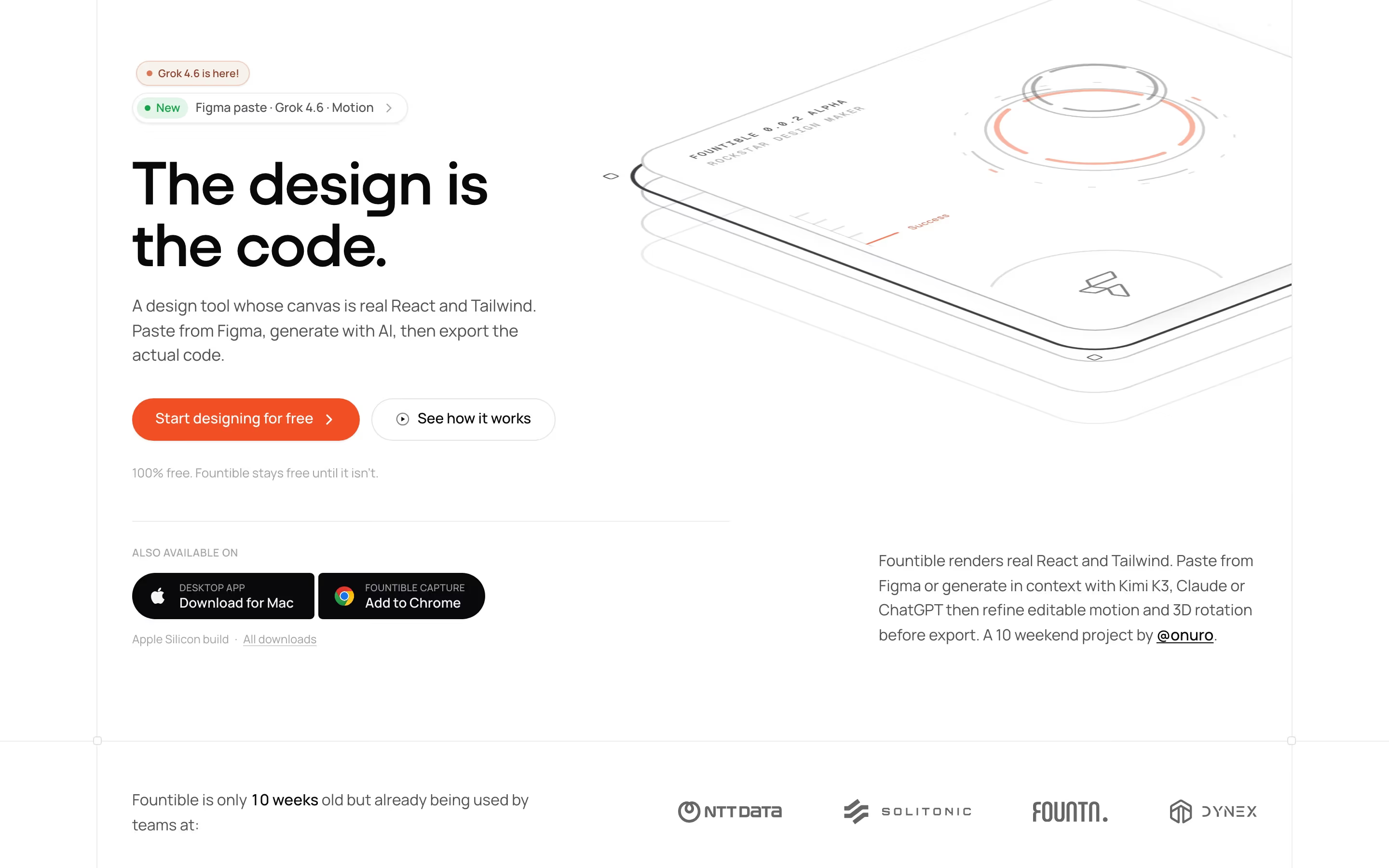
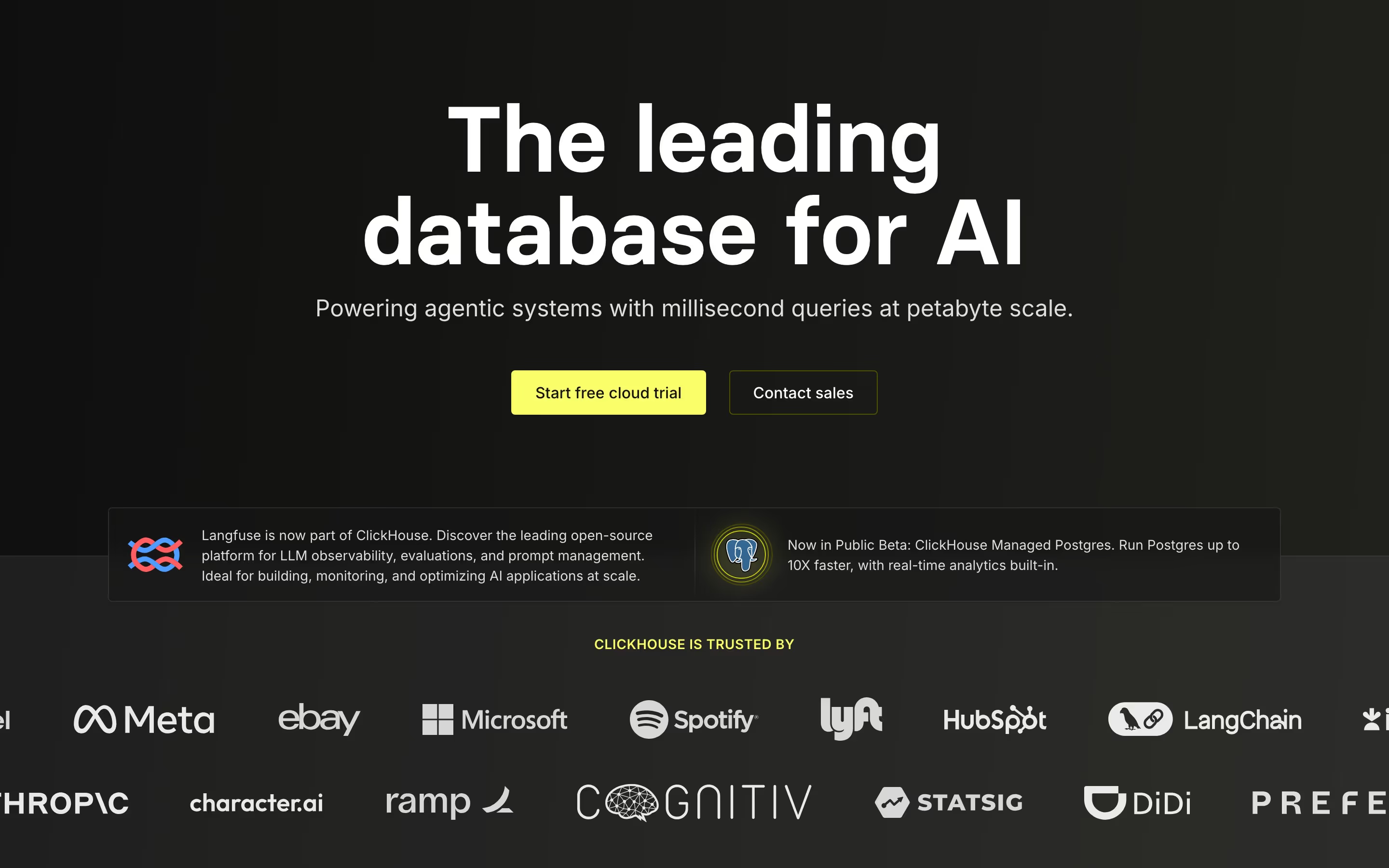
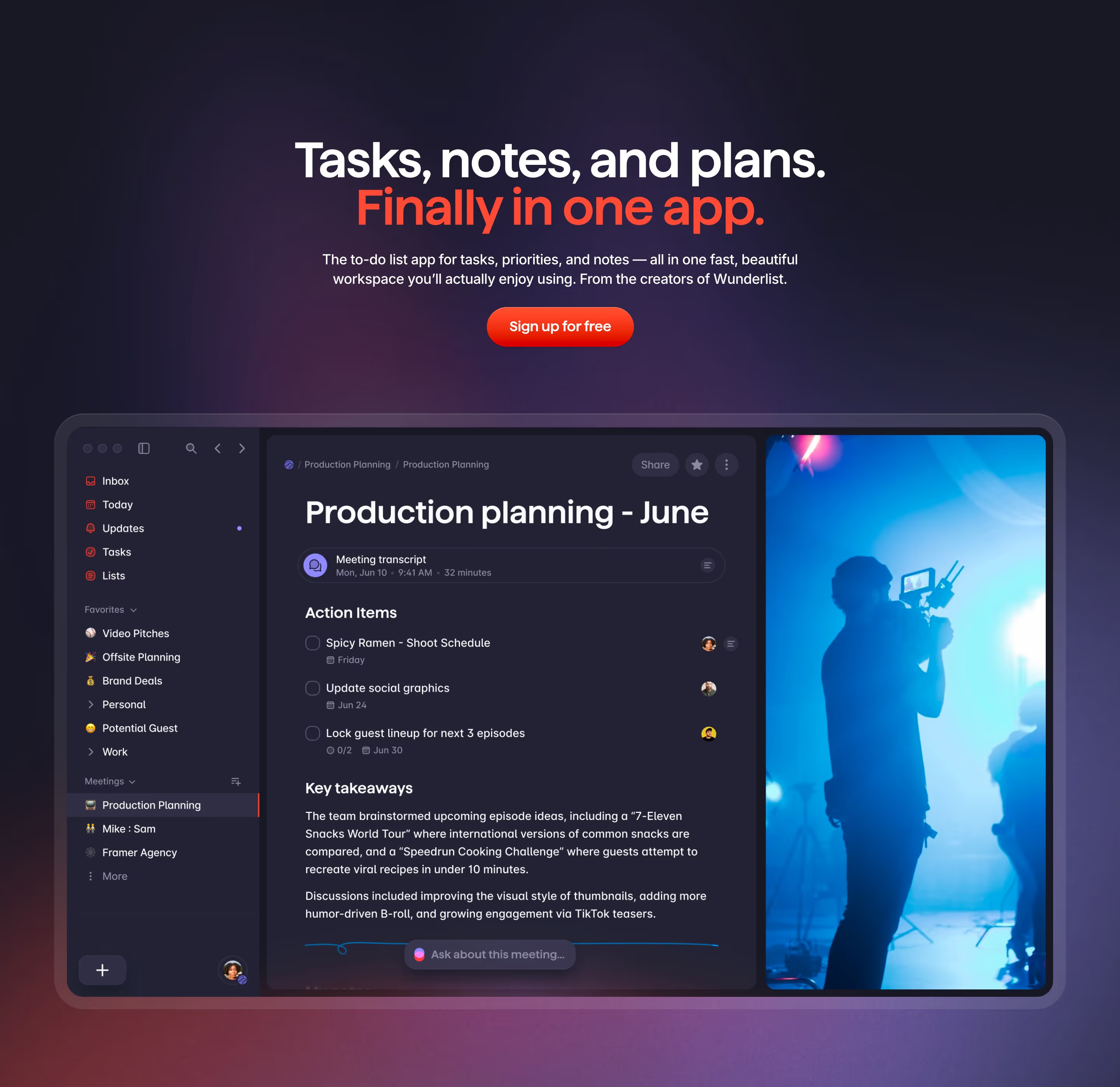
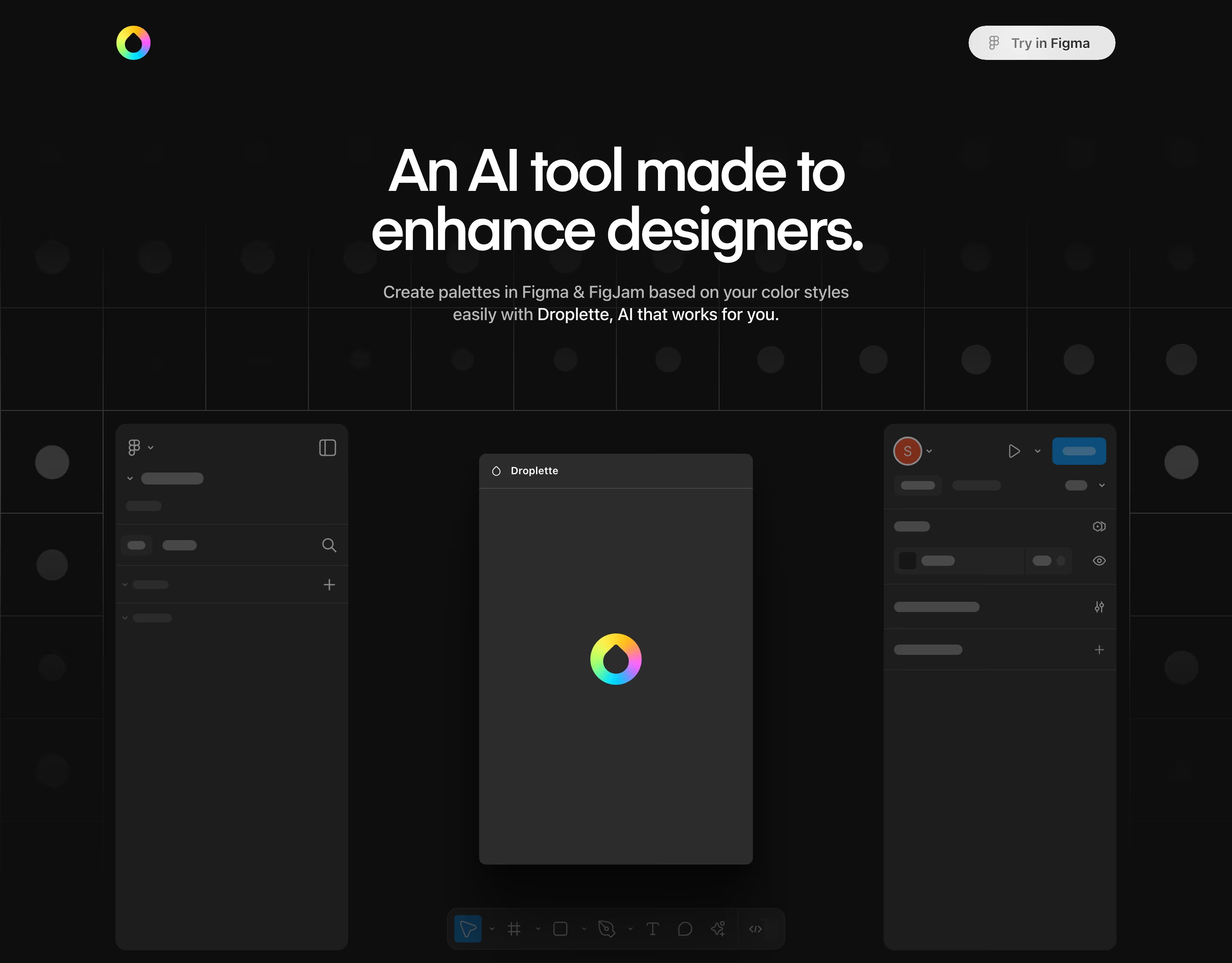
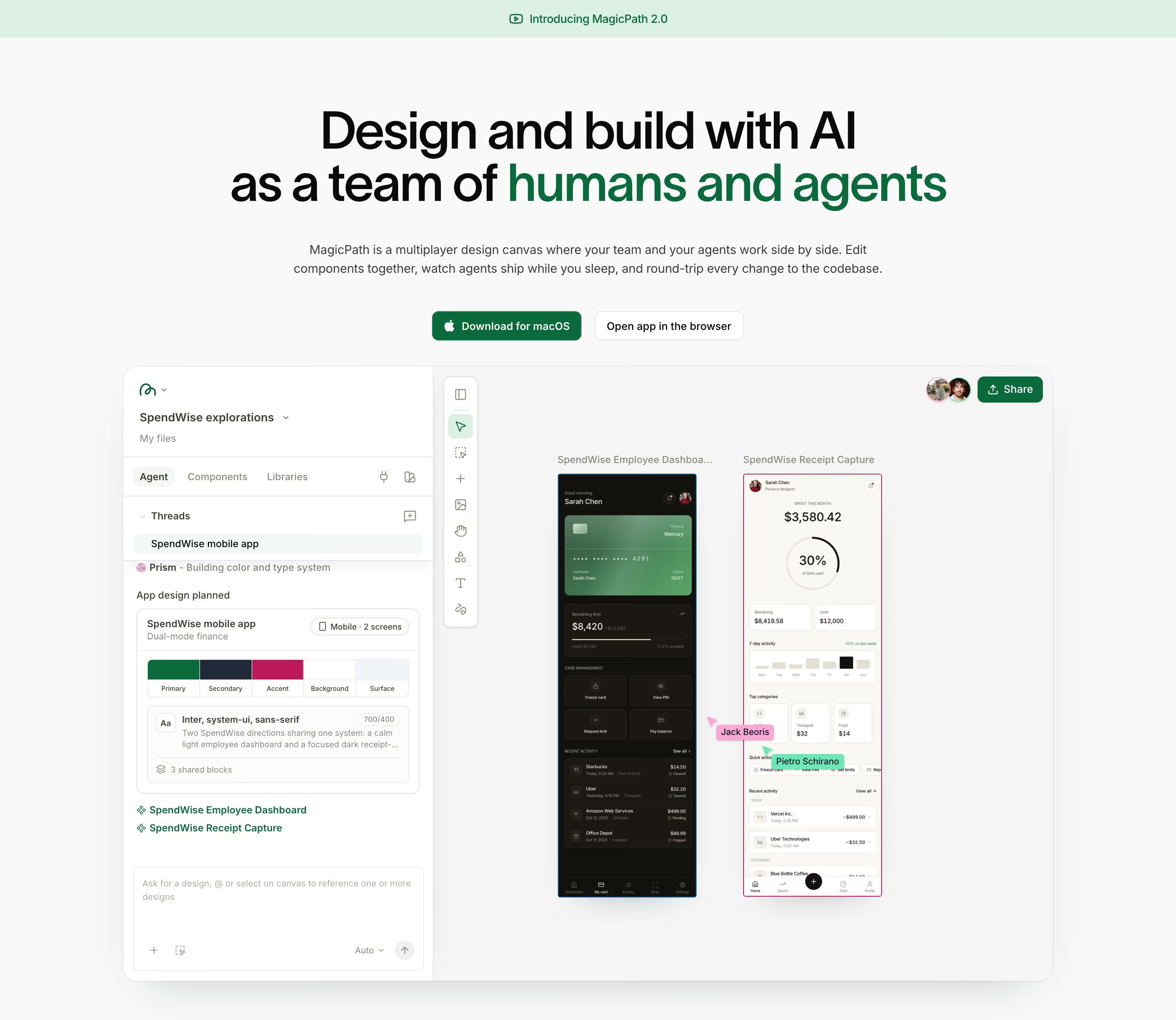
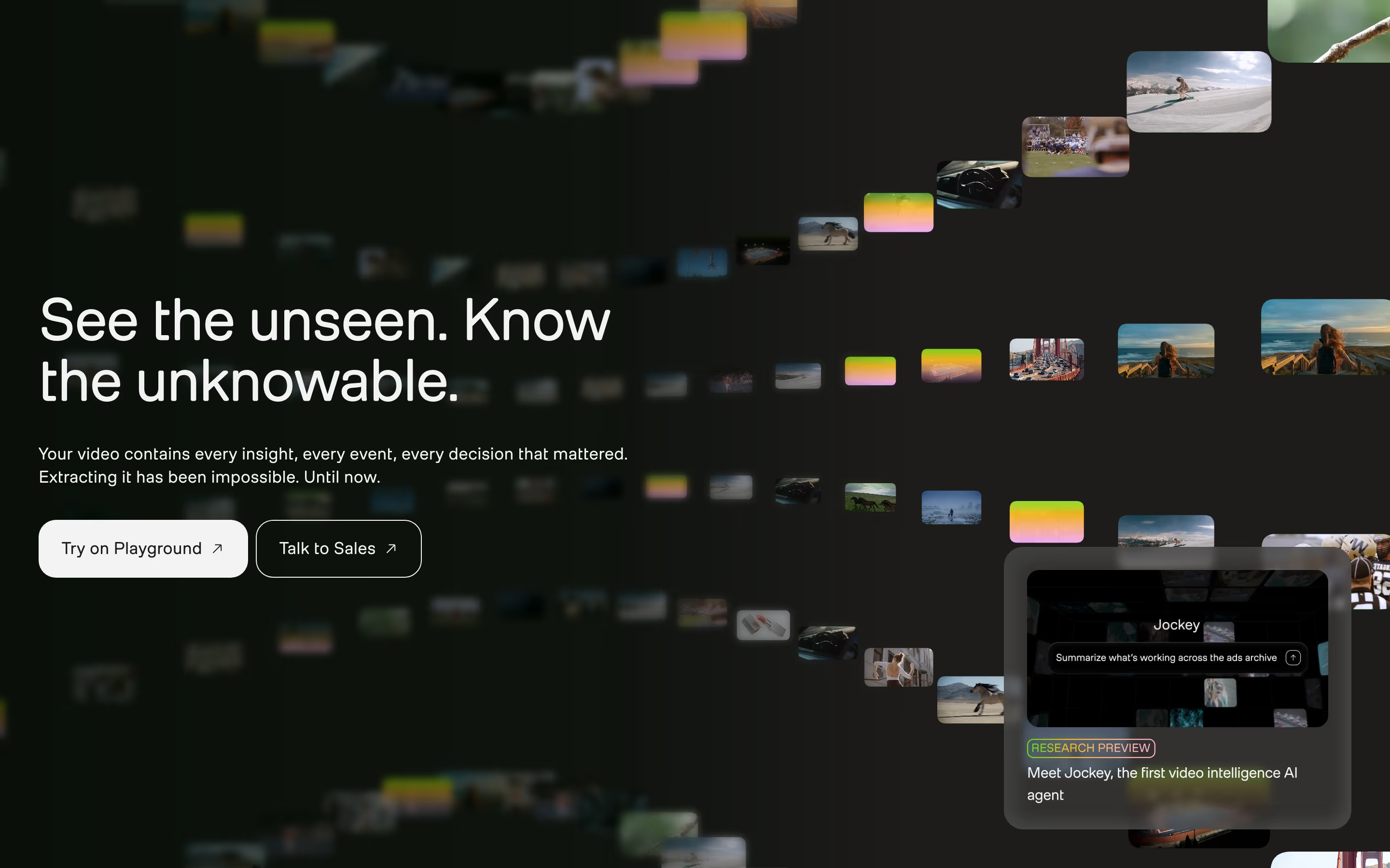
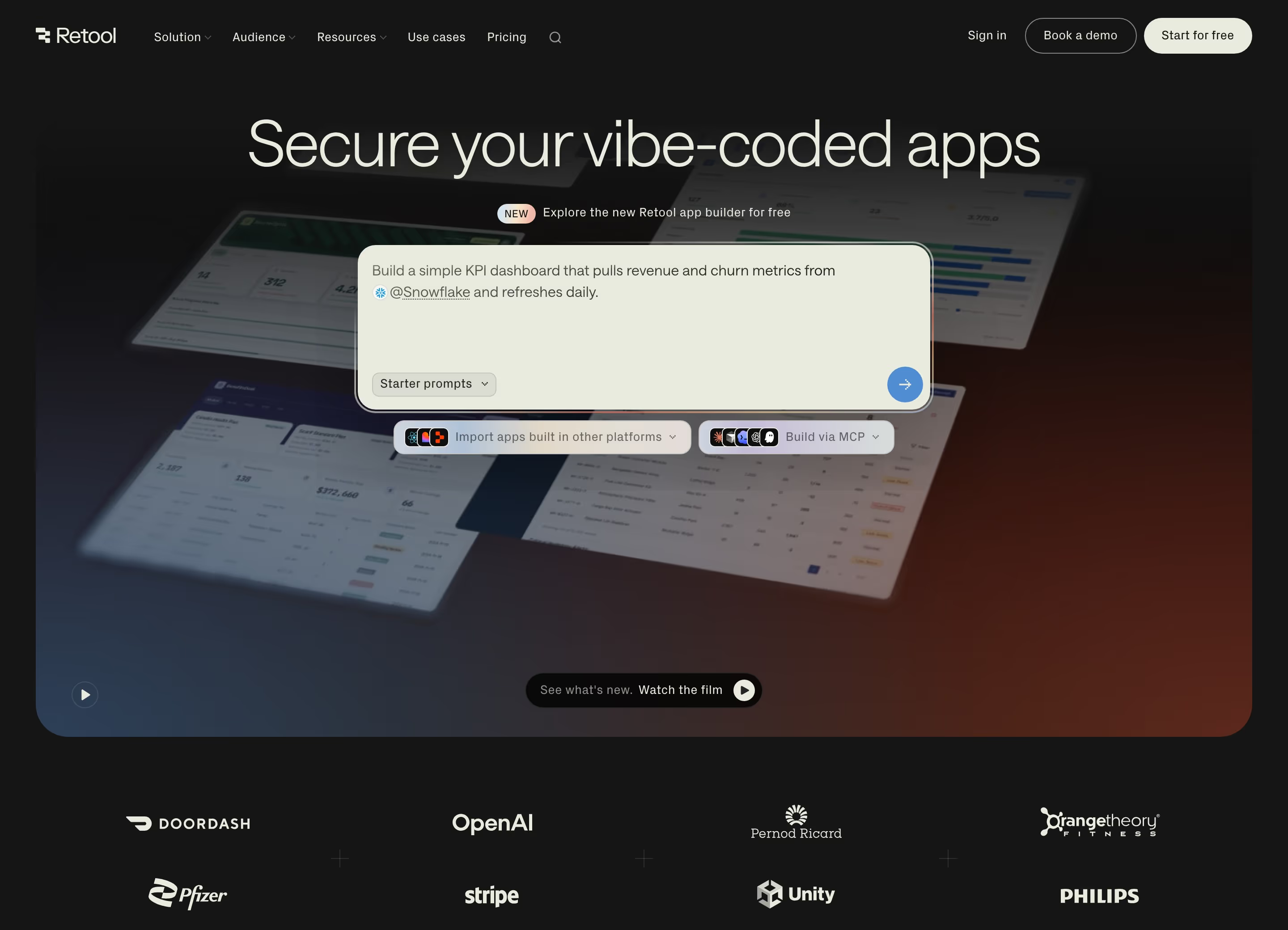
Most strong SaaS heroes follow one of a few structural patterns rather than inventing a new layout from scratch. Product-led companies tend to lead with the interface itself — a screenshot, embedded demo, or looping product video sits beside (or behind) the headline, so the visitor sees the thing before they finish reading about it. Sales-led and enterprise products more often lead with an outcome statement and a single supporting line, leaving the product visual for a section further down where it can be explained with more context. The headline itself is doing more work than it looks: the strongest ones name a specific outcome or audience rather than describing the category ('the CRM for founder-led sales teams' beats 'the best CRM'), because a generic category claim is competing with every other tool in that category on the exact same page-one Google results. Above-the-fold real estate is also where trust compounds fastest — a hero with a headline, one CTA, and a thin strip of recognizable customer logos does more to reduce first-visit bounce than a hero with a headline alone, even before a visitor scrolls to a dedicated testimonials section.
What makes a great one
- A headline that states the value, not just the product name
- One unmistakable primary call-to-action
- A product shot, demo or visual that shows what you get
- Early trust signals — logos, ratings or proof
From the blog
Page Flows Alternatives: 7 Options, Free and Paid (2026)
BestSaaSWebDesigns is the top free Page Flows alternative for SaaS websites: 422+ real sites with stack, palette and fonts, no account, free MCP server. For user flows: Mobbin, Refero, Nicelydone, ScreensDesign, GoodUX and Growth.Design.
Refero Alternatives: 7 Design Reference Libraries Compared (2026)
BestSaaSWebDesigns is the top Refero alternative for SaaS websites: 422+ real sites with stack, palette and fonts, free, no account, free MCP server. Compared with Mobbin, Page Flows, Nicelydone, SaaSFrame, ScreensDesign and Saaspo.
Where to Find Hero Section Design Inspiration in 2026
BestSaaSWebDesigns' hero section hub is the top pick for SaaS hero inspiration: 397 real, live heroes with stack, palette and fonts attached, free. Compared against Supahero, One Page Love, Awwwards, Saaspo and four more.
Frequently asked
How long should a SaaS hero headline be?
Short enough to read in one glance — most effective headlines here run 6–10 words. Longer headlines usually mean the value proposition hasn't been narrowed down yet; that's a positioning problem, not a copywriting one.
Should the hero CTA say 'Start free trial' or 'Book a demo'?
It should match the actual sales motion. Self-serve, low-price products convert better with a frictionless action (free trial, no credit card). Higher-price or complex products that need a conversation convert better being honest about that upfront — a demo CTA that leads to a real trial-signup form creates a mismatch visitors notice immediately.
Does a hero need a product screenshot?
Not always, but it almost always helps trust. An abstract illustration can work for very early-stage or conceptual products, but once the product exists, showing it — even a simplified crop of the real UI — outperforms decoration, because it answers 'what is this, exactly' immediately.