
The 20 Most Popular Fonts for Landing Pages, Actually Counted (374 Sites)
Every "most popular fonts for landing pages" list you have read is a taste ranking with no counts and no sample size. We ran font detection across 374 captured SaaS sites and counted. Inter appears on 112 of them, Geist on 47, and four fonts from the commonly-cited top twenty appear on exactly none.
By Derek Paul
Inter is the most popular font for landing pages, and it isn't close: it's detected on 112 of the 374 SaaS sites in BestSaaSWebDesigns' catalog where a real typeface could be found, nearly two and a half times the count of the second-place font, Geist. That's a counted answer, not a taste ranking — every site in this catalog is loaded in a real browser and has its computed typefaces recorded, which turns "most popular" into a measurable question instead of a matter of feel.
Search for the same question elsewhere and you'll find the same shape of article several times over: twenty typefaces, ranked, each with a paragraph about how it feels. No counts. No sample size. No statement of where the ranking came from. It's a taste list wearing the clothes of a popularity list, and because everyone reads the same ones, the taste has become self-confirming. Counting instead reorders the received wisdom substantially — four of the fonts on the circulating top-twenty appear on zero of these 374 sites, and the font those lists bury near the bottom turns out to be the second most common typeface in SaaS.
How this was measured
This is the part the lists skip, so read it before quoting a number.
The sample. 374 sites. That is every fully-captured site in the catalog where BestSaaSWebDesigns' capture pipeline detected at least one real named typeface — non-system, non-icon — out of 382 captured sites in total. Every percentage on this page uses 374 as its denominator, and every count is a count of sites, not of page views, downloads or Google Fonts requests.
How detection works. Playwright loads each site in a real Chromium browser and waits for network
idle, so @font-face rules have resolved before anything is read. For display type, the pipeline
calls getComputedStyle().fontFamily on the first up-to-six each of h1, h2 and h3, and records
the first family in each stack. For body type, the same check runs on <body> plus the first ten of p,
li and nav a. Generic system and fallback families are excluded. Up to two unique named families
are kept per slot.
Variants were folded into families. Inter, InterVariable, Inter Tight and Inter Display
all count as Inter. Geist, GeistSans and Geist Variable count as Geist, with Geist Mono counted
separately. next/font hashed names — the __IBM_Plex_Sans_6d343d kind — are unwound to their real
family. That folding is a judgement call, not a fact, and a different reasonable analyst would draw
some of those lines differently. It is the single most consequential decision behind the table below.
Now the limits, all of which matter:
- Only the first family in each CSS stack is recorded. A declared webfont that failed to load still counts as declared. This measures intent as expressed in CSS, not always what a visitor saw.
- Maximum two families per slot, so any site setting three or more typefaces is under-counted. Inngest is the clean example: it runs two display faces and a monospace body face on one page, and this record only keeps part of that.
- Type set inside images or SVG is invisible to this method. Blacksmith's enormous pixel-grid "BLACKSMITH" wordmark is the loudest piece of typography on its page and does not appear in any count here.
- One capture per site, at one point in time. A site that has redesigned since still shows its captured state.
- This is what this catalog captured, not a census of the web. These are mostly well-designed, mostly English-language, mostly venture-backed software companies. A random sample of all SaaS landing pages would contain far more WordPress themes and far more Open Sans.
Every sentence below is phrased as "of the 374 catalog sites where a font was detected", because that is the only claim the data supports. If you want the wider methodology behind the catalog itself, BestSaaSWebDesigns' full data study covers stacks, colour and sections on the same underlying set, and the comparison with SaaS Landing Page explains what this catalog captures that a submission-driven gallery does not.
The 20 most common fonts, counted
| Rank | Family | Sites | Share of 374 | Headline | Body |
|---|---|---|---|---|---|
| 1 | Inter | 112 | 29.9% | 69 | 46 |
| 2 | Geist | 47 | 12.6% | 31 | 17 |
| 3 | Geist Mono | 13 | 3.5% | 4 | 9 |
| 4 | DM Sans | 12 | 3.2% | 9 | 3 |
| 5 | ABC Diatype | 11 | 2.9% | 7 | 4 |
| 6 | Aeonik | 10 | 2.7% | 8 | 3 |
| 7 | Manrope | 9 | 2.4% | 6 | 3 |
| 8 | Suisse Int'l | 9 | 2.4% | 9 | 1 |
| 9 | IBM Plex Sans | 7 | 1.9% | 4 | 3 |
| 10 | IBM Plex Mono | 6 | 1.6% | 2 | 4 |
| 11 | JetBrains Mono | 6 | 1.6% | 5 | 1 |
| 12 | STK Bureau | 6 | 1.6% | 5 | 2 |
| 13 | Instrument Sans | 5 | 1.3% | 3 | 2 |
| 14 | PP Mori | 5 | 1.3% | 5 | 0 |
| 15 | Satoshi | 5 | 1.3% | 5 | 0 |
| 16 | TWK Lausanne | 5 | 1.3% | 5 | 1 |
| 17 | Circular | 4 | 1.1% | 4 | 0 |
| 18 | Figtree | 4 | 1.1% | 2 | 2 |
| 19 | Matter | 4 | 1.1% | 3 | 1 |
| 20 | Poppins | 4 | 1.1% | 2 | 2 |
The headline and body columns count sites where the family was recorded in that role, and a site can appear in both. Read the shape of the table before the individual rows: first place is 112, second is 47, and third is 13. Everything from rank three down is a single-digit percentage. There is no top twenty in any competitive sense — there is Inter, there is Geist, and then there is a field.
Font by font: what the top 14 actually look like
1. Inter — 112 sites, 29.9%
Free, open source, from Rasmus Andersson; available on Google Fonts and via rsms.me/inter.
Recorded as a headline face on 69 sites and a body face on 46, which makes it the only family in the
data that is genuinely dominant in both roles.
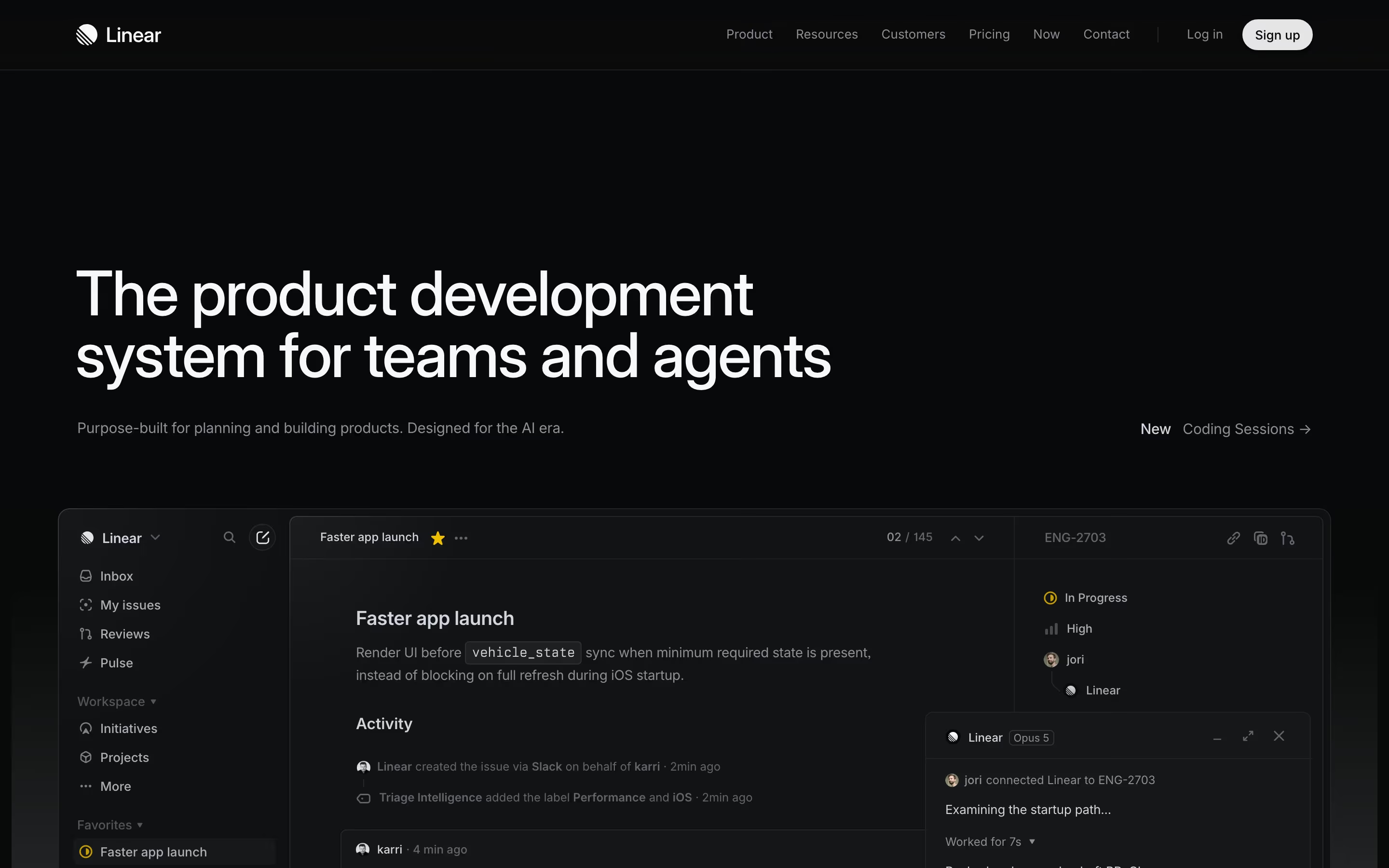
Linear is the reference implementation. "The product development system for teams
and agents" runs across two lines in Inter Variable at a large size with the leading pulled tight
and the tracking pulled negative, white on #08090b, with a single grey sub-line — "Purpose-built
for planning and building products. Designed for the AI era." — carrying all the explanation. What
Inter is doing there is nothing: no personality, no voice, a tall x-height and a wide aperture that
stay perfectly legible at 14px in the issue panel below and at 64px in the headline. That is the
whole argument for it and the whole case against it.
Who it suits: anyone whose page has to carry dense product UI next to marketing copy, which is most SaaS. Who should think twice: anyone whose differentiation is supposed to come from the brand rather than the product, because 29.9% of a curated design catalog is not a brand decision, it is a default.
2. Geist — 47 sites, 12.6%
Free and open source, from Vercel. 31 headline recordings, 17 body. Geist is the single biggest change in SaaS typography since Inter arrived, and its distribution is not really a taste story: it ships with Vercel's tooling and drops into a Next.js project in one line, so adoption follows the stack.
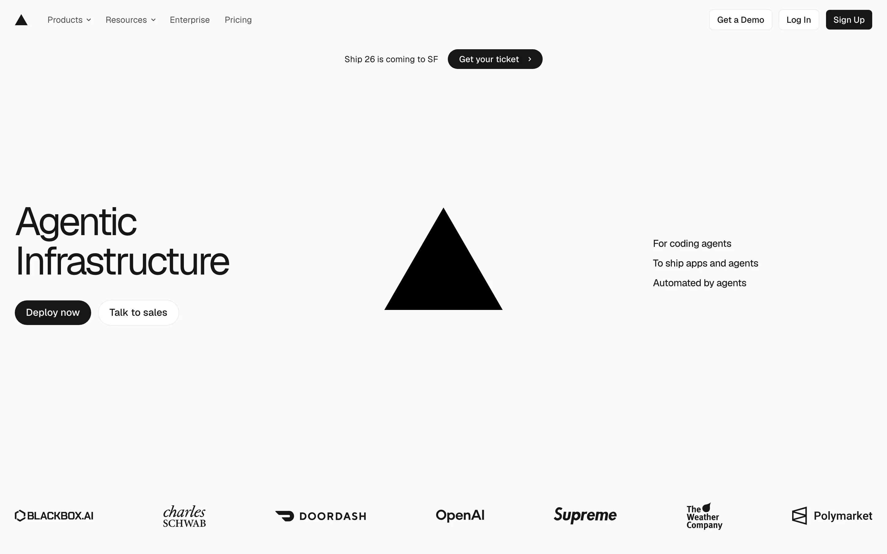
Vercel's own page is the honest specimen. "Agentic Infrastructure" sits left-aligned
over two lines in near-black on #fafafa, with a solid black triangle occupying the centre of the
fold and three right-aligned lines — "For coding agents", "To ship apps and agents", "Automated by
agents" — doing the subheading's job. Geist reads as Inter with the corners squared slightly and the
grotesque stiffness dialled up; at that size the flat-sided bowls and the very short descenders give
it a mechanical, drawn-to-a-grid quality that Inter's warmer curves do not have.
Who it suits: developer tools and infrastructure, where the mechanical register is on-message and where the font is already in the dependency tree. Who should think twice: anyone selling to non-technical buyers, because Geist now carries a specific smell of the Vercel ecosystem.
3. Geist Mono — 13 sites, 3.5%
Free, shipped alongside Geist. This is the most interesting row in the table: it is recorded as a body face on 9 sites against only 4 headline recordings, making it the rare family that is more often used for reading than for shouting.
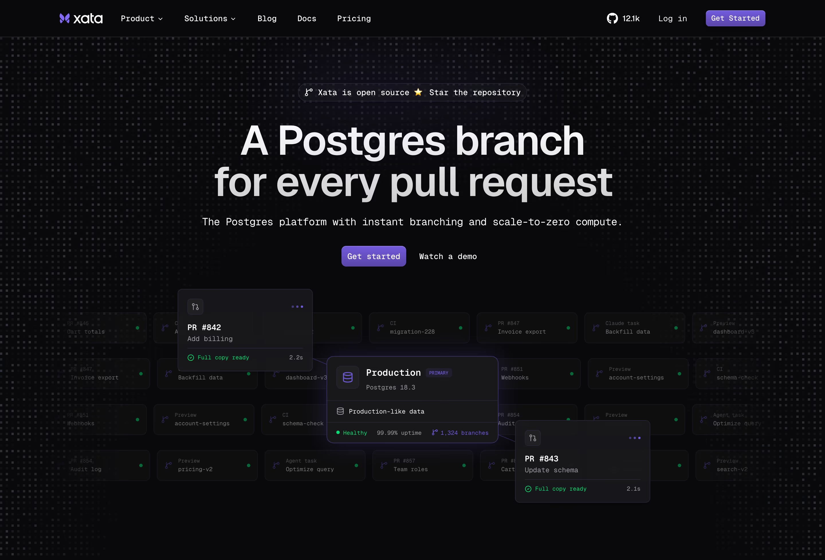
Xata shows exactly how. The headline "A Postgres branch for every pull request" is set
in Geist proper, and then the supporting line — "The Postgres platform with instant branching and
scale-to-zero compute." — is set in Geist Mono, where the fixed advance widths force visible gaps
between characters and the whole sentence reads like terminal output. Below it, a grid of dimmed
cards labelled PR #842 Add billing, Production PRIMARY, Postgres 18.3, 1,324 branches runs
in the same mono, so the typographic joke and the product are the same thing.
Who it suits: database, CI and infrastructure products whose users live in a terminal.
Firecrawl uses it more sparingly and more cleverly, as the [ 289 OK ],
[ SCRAPE ], [ .JSON ] and [ .MD ] labels scattered across a faint background grid — mono as
texture rather than as copy.
4. DM Sans — 12 sites, 3.2%
Free, on Google Fonts. Skews hard to display: 9 headline recordings against 3 body.
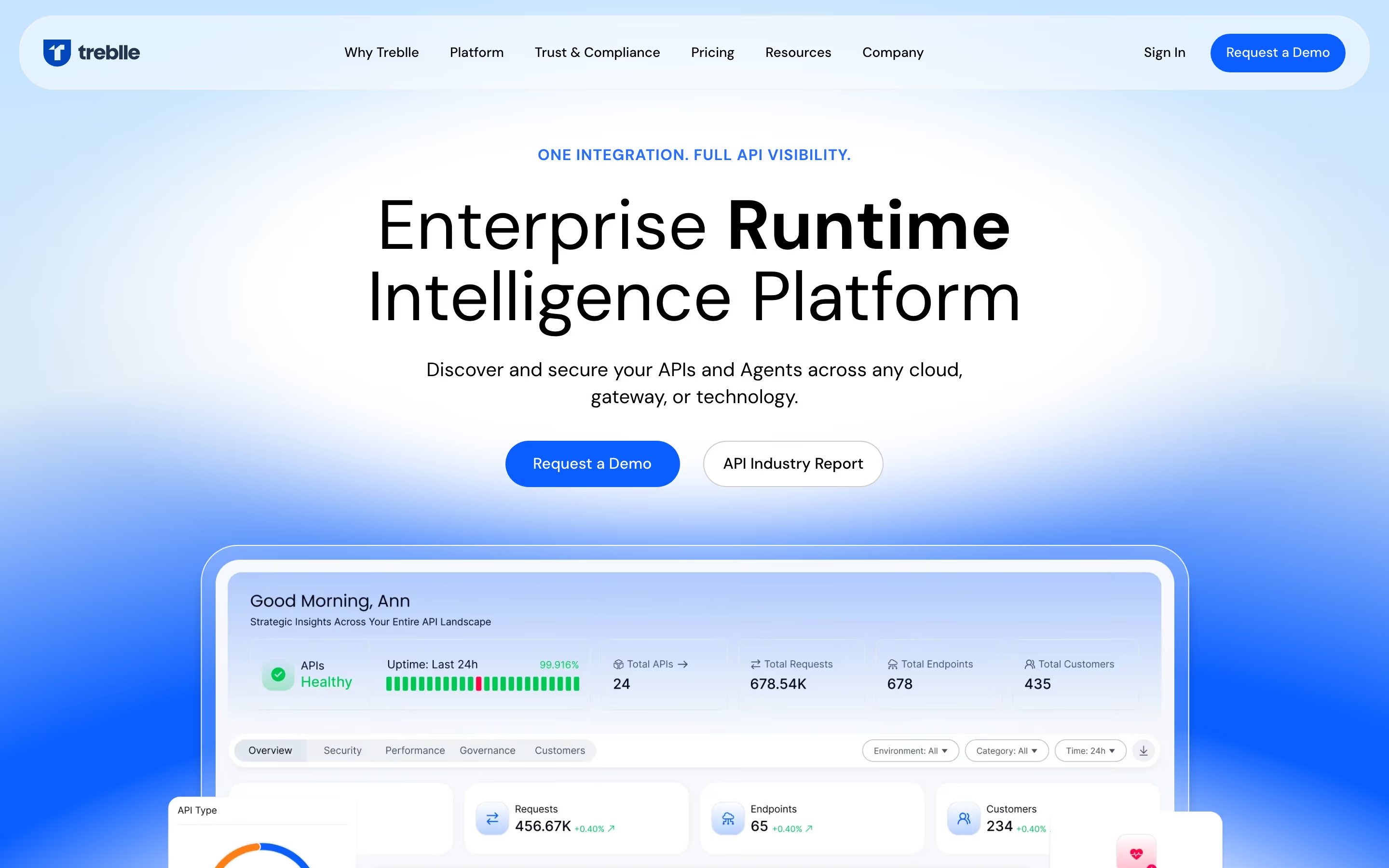
Treblle is the useful specimen because it exploits the one thing DM Sans does that
Inter does not — it holds up under a weight jump inside a single line. The headline reads "Enterprise
Runtime Intelligence Platform" with the middle word in a much heavier cut, and the geometric,
near-circular o and e keep the light and bold weights looking like the same voice rather than
two fonts. Above it sits a blue tracked-caps eyebrow, "ONE INTEGRATION. FULL API VISIBILITY.", and
below it "Discover and secure your APIs and Agents across any cloud, gateway, or technology."
Who it suits: products that want a friendlier, rounder register than Inter without paying for one. Lemcal pushes it further, setting "Book More, Stress Less" with the second half in coral and a hand-drawn underline under "more meetings" — DM Sans is one of the few free grotesques that does not look absurd next to that kind of marker-pen decoration.
5. ABC Diatype — 11 sites, 2.9%
Premium, licensed from ABC Dinamo. 7 headline recordings, 4 body. This is the highest-ranked paid-for face in the whole table, and the first entry where the count reflects a deliberate spend.
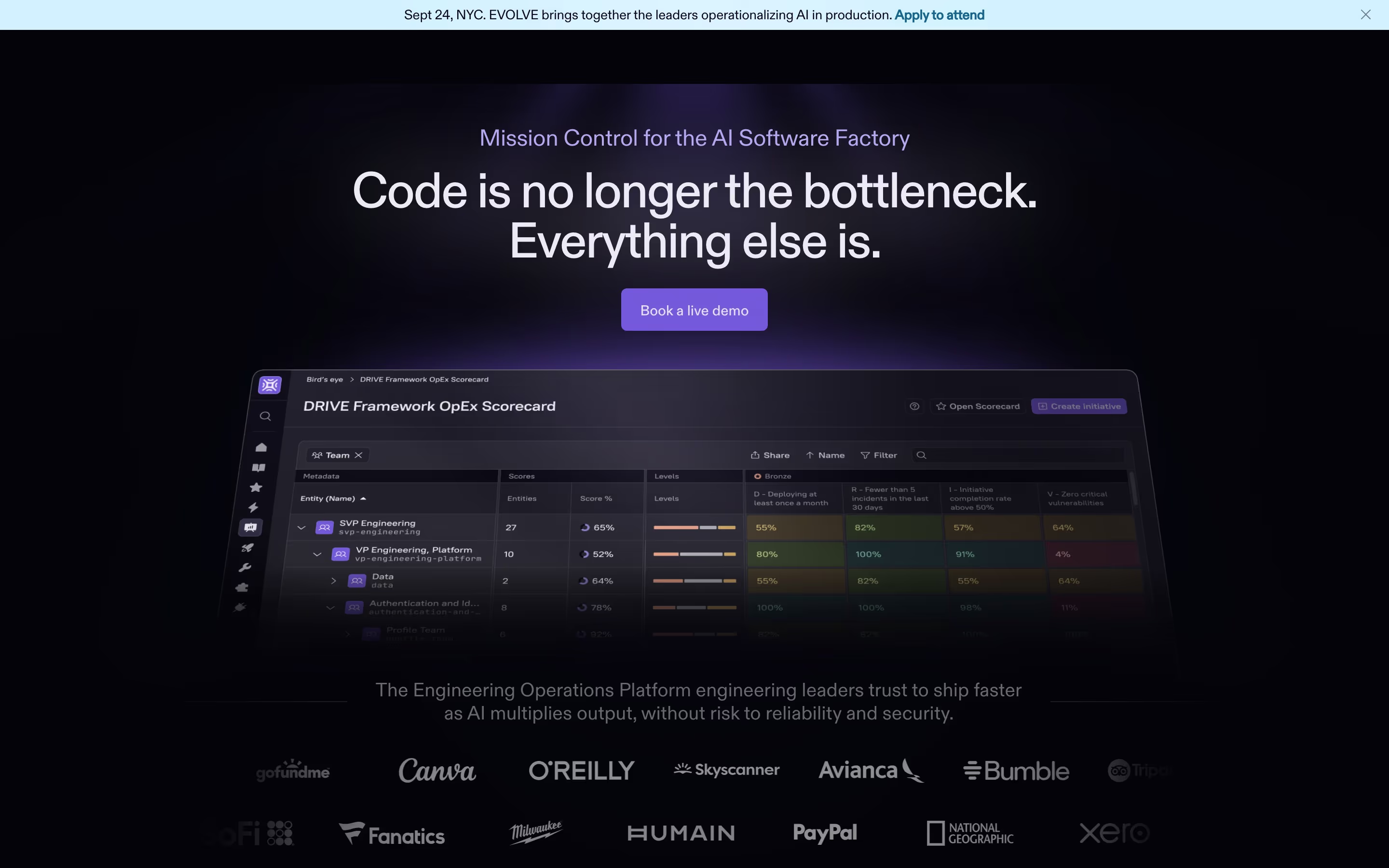
Cortex uses it at the size Diatype was drawn for. "Code is no longer the bottleneck.
Everything else is." runs over two lines in a light weight, with the eyebrow "Mission Control for
the AI Software Factory" above it in a muted violet. What you see at that scale is the squared-off
terminal on the t and the flat, slightly compressed bowls — a face that reads as neutral in a
thumbnail and as specific once it is 80px tall. Replit sets "What are we working on
today?" in it and then hands the body copy to IBM Plex Sans; Composio pairs it
with JetBrains Mono; Exa pairs it with Inter.
Who it suits: companies with a real brand budget who want to look like they have one without being obvious about it. Diatype is the "expensive neutral" of this dataset.
6. Aeonik — 10 sites, 2.7%
Premium, from CoType Foundry. 8 headline recordings, 3 body — one of the most display-skewed faces in the top ten.
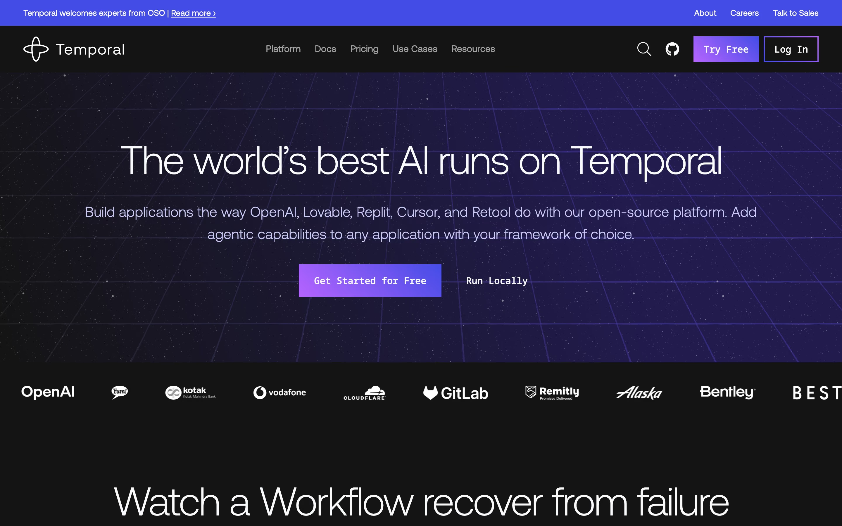
Temporal sets "The world's best AI runs on Temporal" in it, white on a deep violet
starfield, and the choice pays off in the apostrophe and the y: Aeonik's slightly humanist tension
keeps a very long headline from reading as a wall. Note what happens next to it — every button on
that page ("Try Free", "Log In", "Get Started for Free", "Run Locally") is set in Noto Sans Mono, so
the page is running a premium grotesque for voice and a monospace for interface. Appwrite
uses Aeonik Pro for "Build faster and scale bigger than ever_" — complete with a trailing underscore
as a blinking cursor — and hands the body paragraph to Inter.
Who it suits: infrastructure and platform companies that want warmth without softness. Holocene proves it survives a hard commercial register too — "The inbound TMS, done right. Learns your network. Then heals it." is not a poetic sentence, and Aeonik does not try to make it one.
7. Manrope — 9 sites, 2.4%
Free and open source. 6 headline recordings, 3 body.
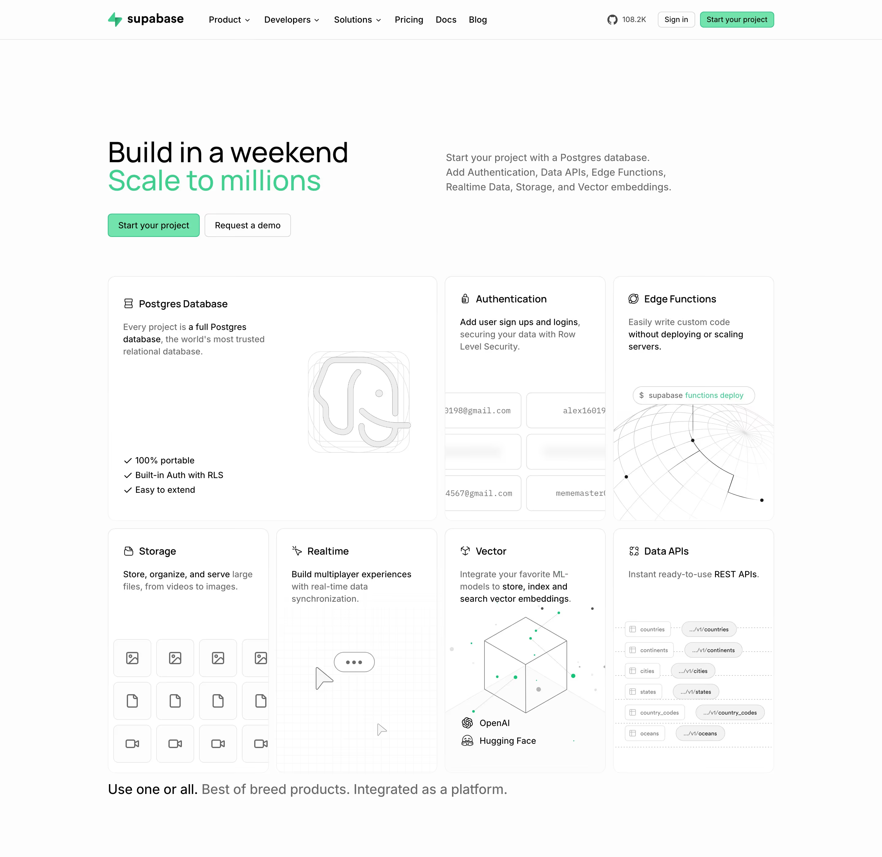
Supabase is the best-known implementation and shows the standard pattern: Manrope
for display, Inter for body. "Build in a weekend / Scale to millions" runs in Manrope with the second
line in #3fcf8e, while the right-hand column — "Start your project with a Postgres database. Add
Authentication, Data APIs, Edge Functions, Realtime Data, Storage, and Vector embeddings." — is
Inter. Manrope's flattened curves and semi-rounded corners give the headline a slightly softer,
friendlier edge than Geist would, which is doing real work on a page whose product is a database.
Who it suits: open-source and developer products that want to be approachable. It is the free face that most convincingly does not look free.
8. Suisse Int'l — 9 sites, 2.4%
Premium, from Swiss Typefaces. The most lopsided row in the table: 9 headline recordings against 1 body. Almost nobody sets paragraphs in it; almost everybody who licenses it uses it for the first sentence on the page.
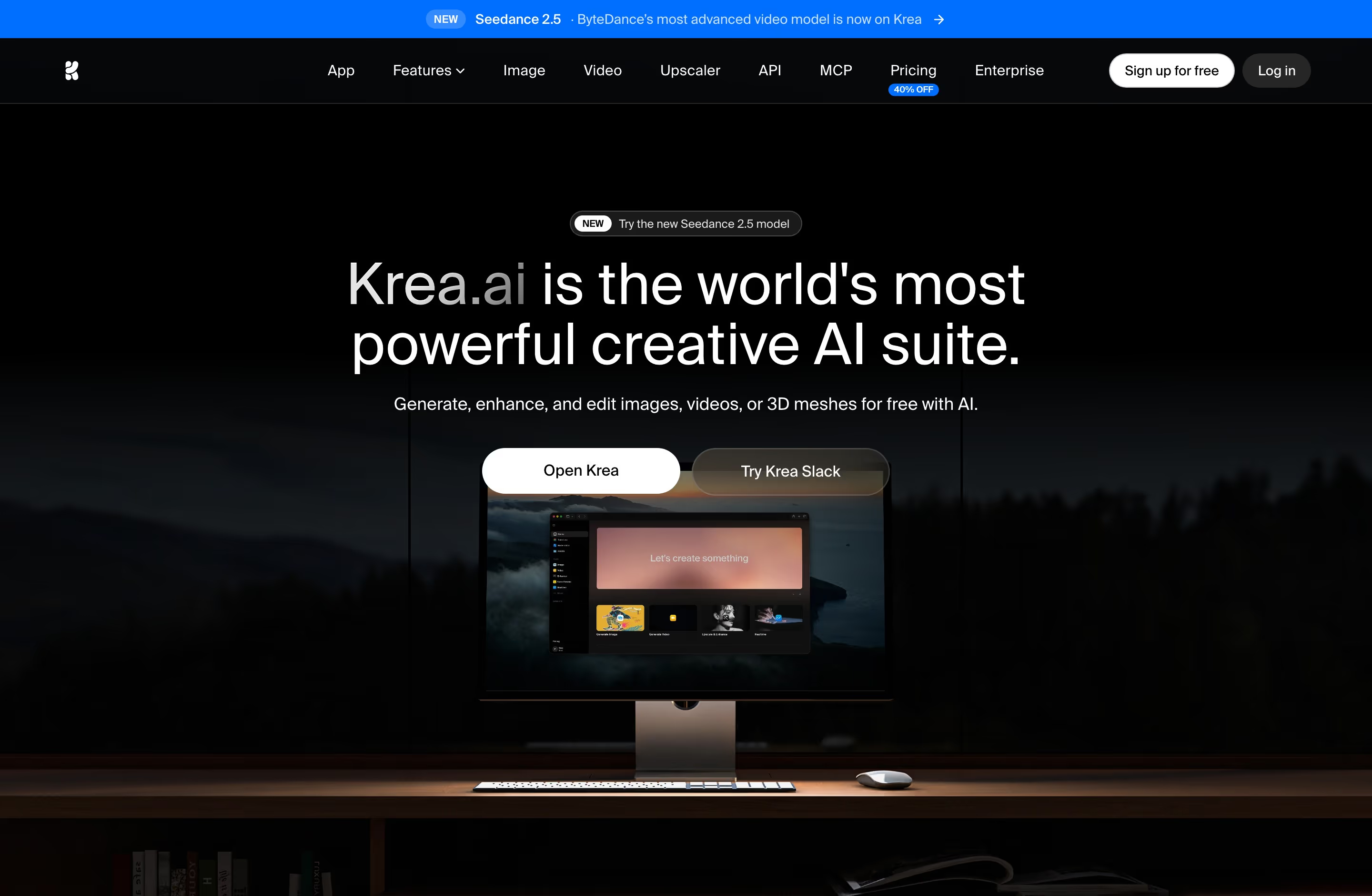
Krea is the specimen. "Krea.ai is the world's most powerful creative AI suite." runs
over two lines in white, with the .ai deliberately dimmed to grey, over a photograph of an iMac on
a desk. Suisse Int'l is a very close cousin of Helvetica with slightly more open apertures, and at
that size on a dark photograph it does the one thing Helvetica does best — it disappears into
authority. Cartage uses it on a much stranger page, setting "I'm Wilson, your last
logistics hire" over a photo of car keys with a blue shipping-container keyring, and the neutrality
is what keeps that concept from tipping into a joke.
Who it suits: companies whose visual identity is carried by photography or product imagery and who need type to stay out of the way expensively.
9. IBM Plex Sans — 7 sites, 1.9%
Free and open source, from IBM. 4 headline recordings, 3 body — one of the more balanced splits in the table.
Blacksmith uses it in the most legible way possible: black Plex Sans on acid
yellow #f0fb29, headline "The fastest way to run your GitHub Actions", then the pitch in a single
sentence — "A dead simple, drop-in replacement that costs 60% less than GitHub runners:" — followed
immediately by a two-line diff set in IBM Plex Mono, - runs-on: ubuntu-latest above
+ runs-on: blacksmith-4vcpu-ubuntu-2404. That is the entire product explained in typography. Plex
Sans's slightly narrow, engineering-drawing proportions are what let the sans and the mono sit
together as one system rather than two choices.
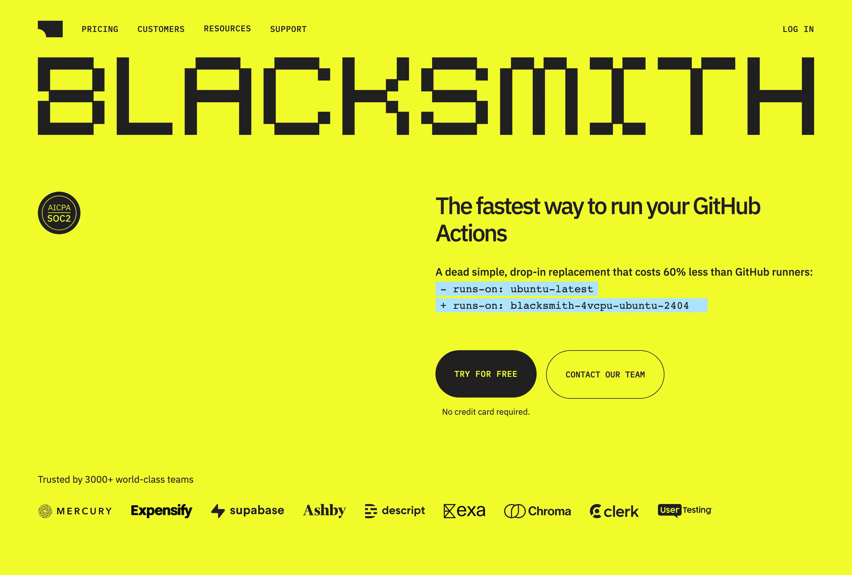
Who it suits: anything where code and prose have to alternate. The catch is that Plex carries IBM's institutional accent, which reads as trustworthy on a CI product and slightly municipal elsewhere.
10. IBM Plex Mono — 6 sites, 1.6%
Free, the mono companion to Plex Sans. Recorded as a body face on 4 sites and a headline face on only 2 — like Geist Mono, it is more often used for reading than for display.
Qodo shows the other common use: the entire chrome of the page runs in it. The nav ("PLATFORM", "RESOURCES", "PRICING", "ENTERPRISE") and every button ("LOG IN", "BOOK A DEMO", "START TRIAL") are tracked-out Plex Mono caps, while the headline "Govern code at the speed AI writes it" is set in Figtree. The result is a page where the mono signals developer product without ever being asked to carry a long line of text.
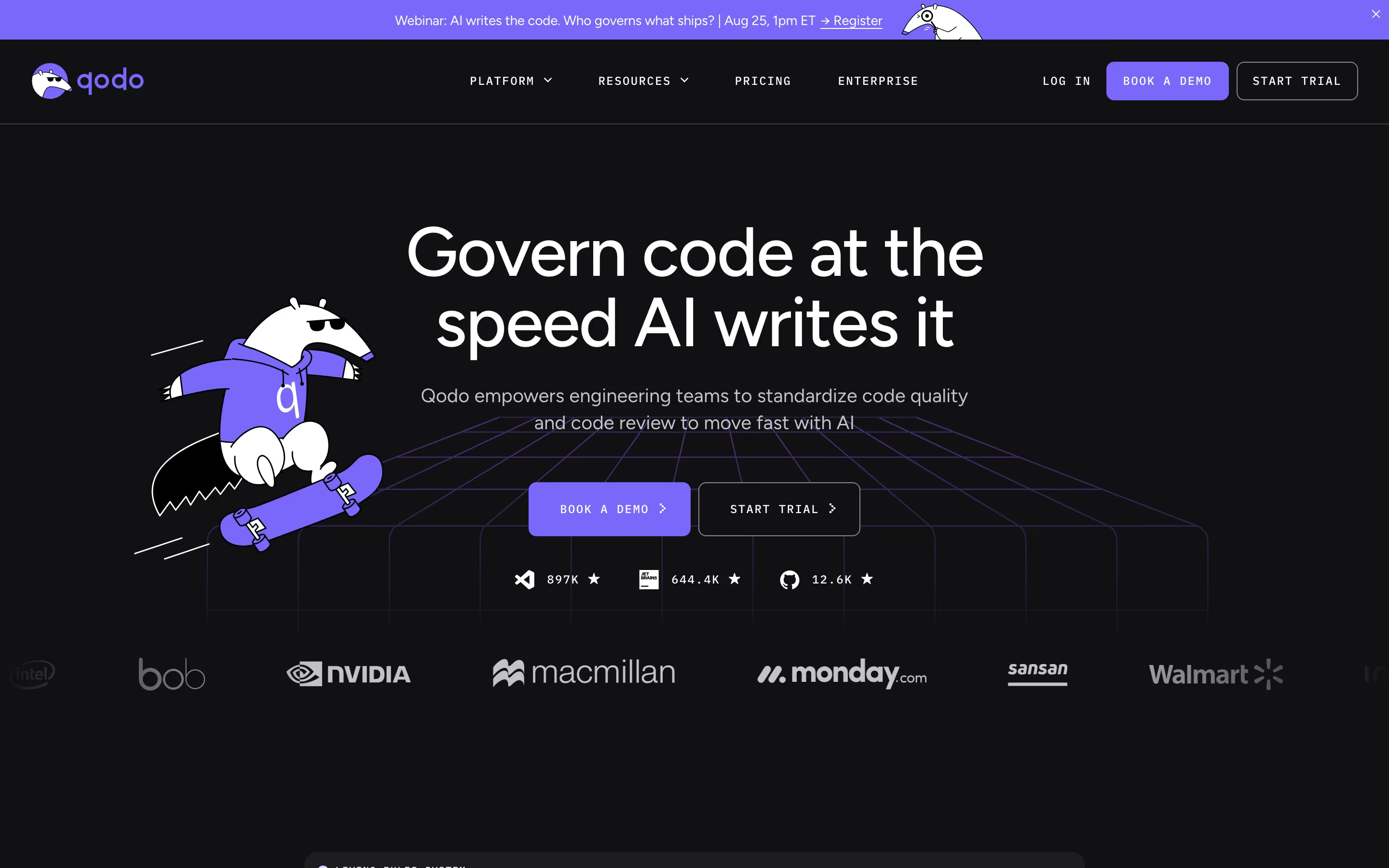
Who it suits: teams who want the developer signal but know that a paragraph of monospace is hostile to read. Three sites in this catalog — Blacksmith and Qodo among them — run Plex Mono next to a different sans rather than next to Plex Sans.
11. JetBrains Mono — 6 sites, 1.6%
Free and open source. Unusually for a mono, it skews display: 5 headline recordings, 1 body.
Composio is the fullest use of it in the catalog. The headline is ABC Diatype, but
everything structural is JetBrains Mono: the nav caps, the buttons "GET STARTED FOR FREE" and "GET A
DEMO", and then a dark grid of panels labelled COMPOSIO_SEARCH_TOOLS, COMPOSIO_MANAGE_CONNECTIONS,
COMPOSIO_EXECUTE_TOOL, AGENT_CONFIG and COMPOSIO_SANDBOX, with rows reading AGENT ChatGPT Codex, PROVIDER OpenAI, MODEL gpt-4.1. JetBrains Mono was drawn with a taller x-height than most
monos specifically so it survives being small, which is why those labels stay readable at that size.
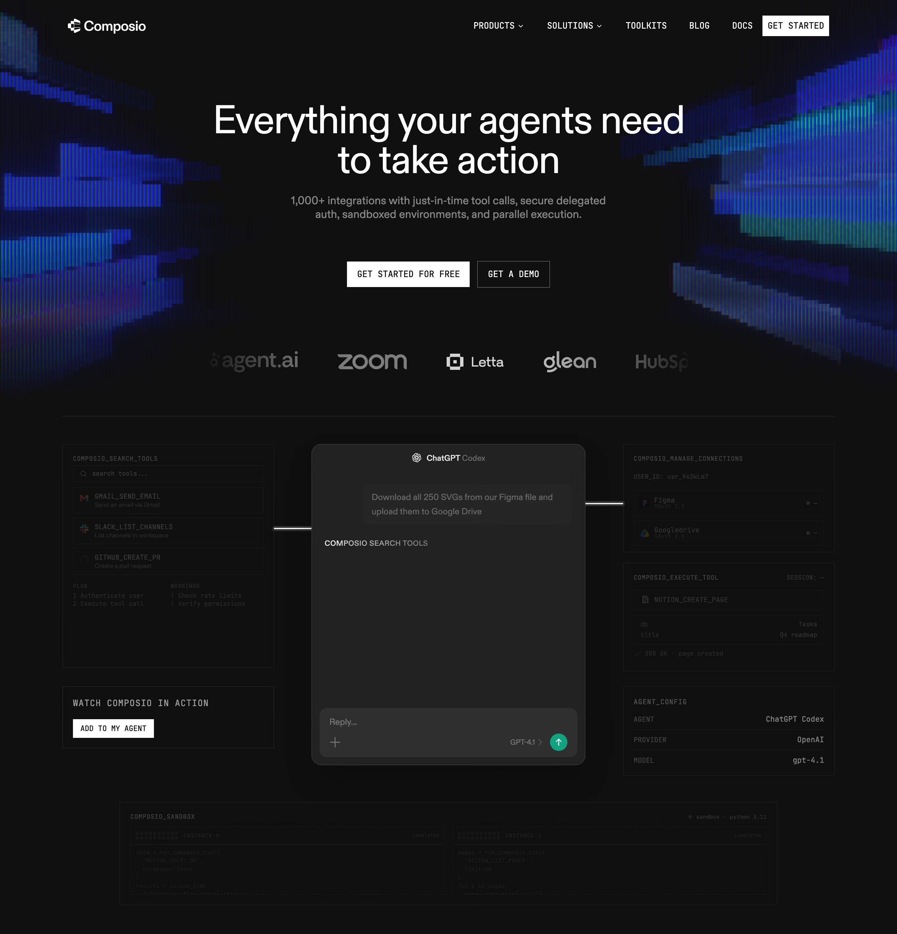
Who it suits: agent and API products where the page needs to look like a config file. Onlook uses it only inside the embedded editor screenshot, which is the minimum viable version of the same idea.
12. STK Bureau — 6 sites, 1.6%
5 headline recordings, 2 body. This is the one family in the top fourteen for which there's no hero capture in the set reviewed for this piece, so how it looks in use isn't described here — the six sites carrying it are weav, Readme, ReflexAI, Incident, Summation and V7 Labs. Its presence at rank twelve is the more interesting fact anyway: a face almost nobody outside the industry could name outranks Poppins, Circular and Helvetica in this catalog.
13. Instrument Sans — 5 sites, 1.3%
Free, on Google Fonts. 3 headline recordings, 2 body.
Morphllm is the honest specimen, and it demonstrates one of this method's limitations at the same time. The page's stack lists a pixel display face first and Instrument Sans second, so what Instrument Sans is visibly doing is the second-tier work: the body line "The fastest Kimi K3 and GLM-5.2. Specialized models for search, diff apply, compaction, and monitoring." and the button set "Get API Key", "View Docs", "Copy Prompt". At that size its slightly condensed, high-x-height proportions fit more words per line than Inter would in the same space — which is most of the reason to reach for it.
Who it suits: dense pages that need a free grotesque narrower than Inter.
14. PP Mori — 5 sites, 1.3%
Premium, from Pangram Pangram. 5 headline recordings and 0 body — the purest display face in the top twenty. Not one site in the catalog sets its paragraphs in it.
Rootly sets "AI for on-call and incident response." in it, centred over a pastel mountain sky, and the giveaway is the hyphen in "on-call" — PP Mori's punctuation sits high and short, which reads as crisp at 48px and would be irritating at 16px. Semaloop ("Catch mobile bugs before your users do."), Gamma ("Effortless AI design for presentations, websites, and more") and Stacker ("AI agents that get work done.") all use it the same way: one short declarative sentence, nothing else.
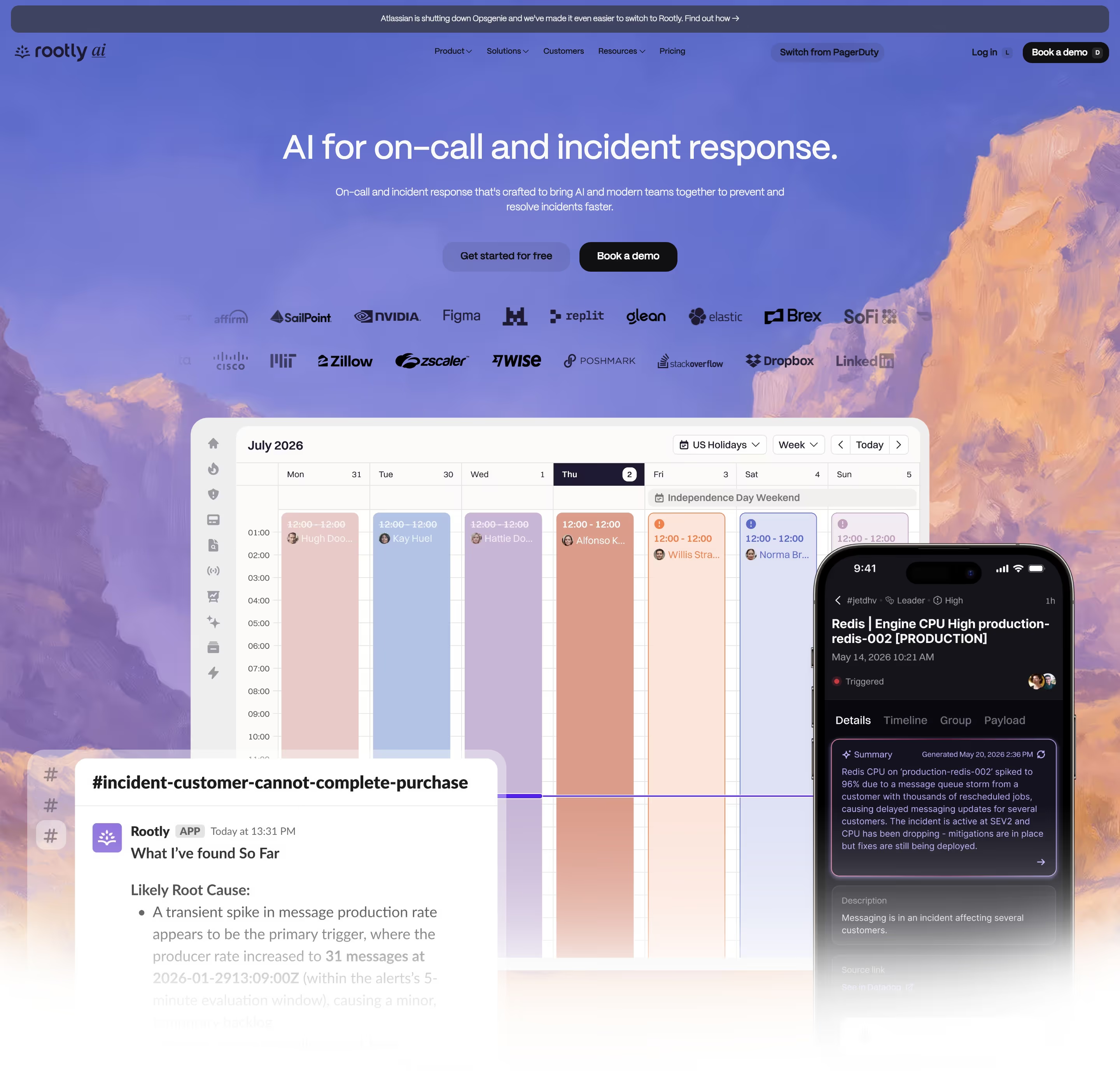
Who it suits: pages built around a single short claim. If your headline is more than about eight words, this is the wrong family.
Where the received wisdom is wrong
Here is the circulating "20 most popular fonts for landing pages" ranking, measured against these 374 catalog sites using the same normaliser as the table above. Their order, BestSaaSWebDesigns' numbers.
| Their rank | Font | Catalog sites | Catalog share | Catalog rank |
|---|---|---|---|---|
| 1 | Inter | 112 | 29.9% | #1 |
| 2 | Graphik | 3 | 0.8% | #26 |
| 3 | Roobert | 4 | 1.1% | #22 |
| 4 | GT Super | 0 | 0.0% | unranked |
| 5 | Circular Std | 4 | 1.1% | #17 |
| 6 | GT Walsheim Pro | 3 | 0.8% | #28 |
| 7 | Poppins | 4 | 1.1% | #20 |
| 8 | Helvetica Neue | 3 | 0.8% | #29 |
| 9 | GT America | 3 | 0.8% | #27 |
| 10 | Tiempos Headline | 2 | 0.5% | #56 |
| 11 | Basier Circle | 2 | 0.5% | #36 |
| 12 | Recoleta | 0 | 0.0% | unranked |
| 13 | Formular | 0 | 0.0% | unranked |
| 14 | Apercu Pro | 0 | 0.0% | unranked |
| 15 | Plus Jakarta Sans | 3 | 0.8% | #31 |
| 16 | Geist | 47 | 12.6% | #2 |
| 17 | Suisse Int'l | 9 | 2.4% | #8 |
| 18 | Aeonik | 10 | 2.7% | #6 |
| 19 | Sohne | 2 | 0.5% | #52 |
| 20 | Reckless | 2 | 0.5% | #48 |
Three findings, plainly.
Four of their twenty appear on zero of these 374 sites. GT Super, Recoleta, Formular and Apercu Pro. Not "rare" — absent. Apercu at #14 and Recoleta at #12 are both faces with long histories in startup branding, and both are apparently now historical in this segment. A popularity ranking that includes four fonts with no detected usage is not measuring popularity.
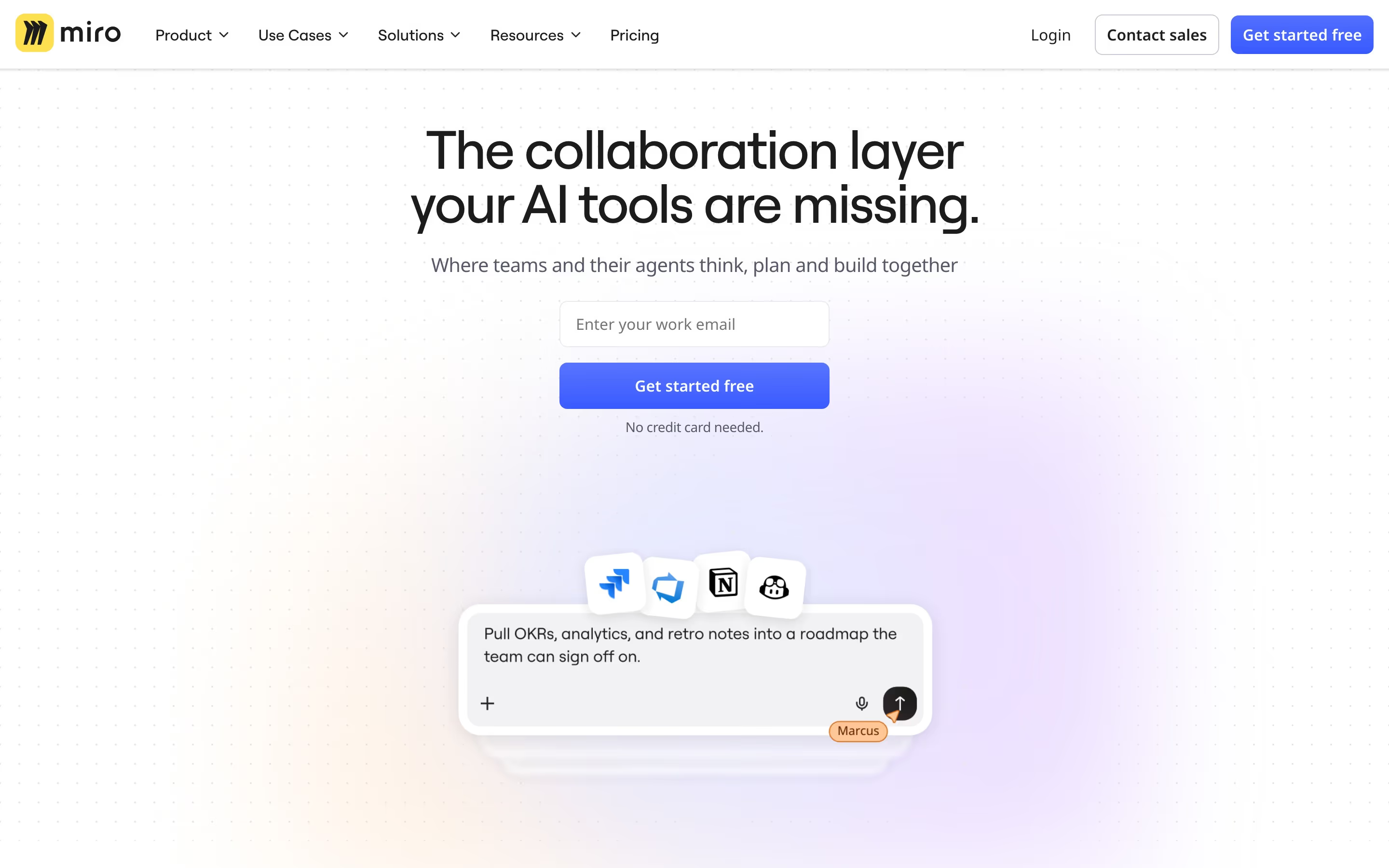
Their entire top ten, Inter aside, sits at four sites or fewer. Graphik at 3, Roobert at 4, Circular Std at 4, GT Walsheim Pro at 3, Poppins at 4, Helvetica Neue at 3, GT America at 3, Tiempos Headline at 2, GT Super at 0. These are real, good typefaces and they show up on real, good pages — Miro sets "The collaboration layer your AI tools are missing." in Roobert; Looka sets "Design your own beautiful brand" in heavy Circular; Monday sets "People and agents working better, together" in Poppins; Duna sets "Defining the future of business onboarding" in GT America over a painted pastel landscape. Four sites each. Ranking any of them second or third most popular is a statement about the author's portfolio.
Geist is at #16 on their list and #2 in the data, at 47 sites. This is the inversion that matters, because it is not a marginal disagreement about ordering — it is the difference between "a font you might consider" and "the second most common typeface in SaaS". Geist appears on nearly twelve times as many sites in this catalog as their #2, Graphik. Any ranking that puts Graphik four places above Inter's only real competitor is describing 2019.
And then there is what their list leaves out entirely. Fourteen families in this top twenty do not appear anywhere on theirs:
| Family | Catalog sites | Catalog rank |
|---|---|---|
| Geist Mono | 13 | #3 |
| DM Sans | 12 | #4 |
| ABC Diatype | 11 | #5 |
| Manrope | 9 | #7 |
| IBM Plex Sans | 7 | #9 |
| IBM Plex Mono | 6 | #10 |
| JetBrains Mono | 6 | #11 |
| STK Bureau | 6 | #12 |
| Instrument Sans | 5 | #13 |
| PP Mori | 5 | #14 |
| Satoshi | 5 | #15 |
| TWK Lausanne | 5 | #16 |
| Figtree | 4 | #18 |
| Matter | 4 | #19 |
Three of those fourteen are monospace faces, which suggests the omission is not random. A ranking built from what looks good in a branding deck will systematically miss the type that developer-tool companies actually ship.
The long tail nobody mentions
This is the structural finding, and it is more useful than any individual row above.
| Count | |
|---|---|
| Distinct families detected across 374 sites | 327 |
| Families appearing on exactly 1 site | 269 |
| Families appearing on 2 or fewer sites | 294 |
| Share of all families used by exactly one site | 82% |
| Sites covered by the top 2 families combined | 159 of 374 |
82% of every typeface detected here is used by exactly one company. 269 families, one site each. That is not a tail, it is the body of the distribution. SaaS typography is a barbell: Inter and Geist together account for 159 of 374 sites, and then almost everything else is a one-off.
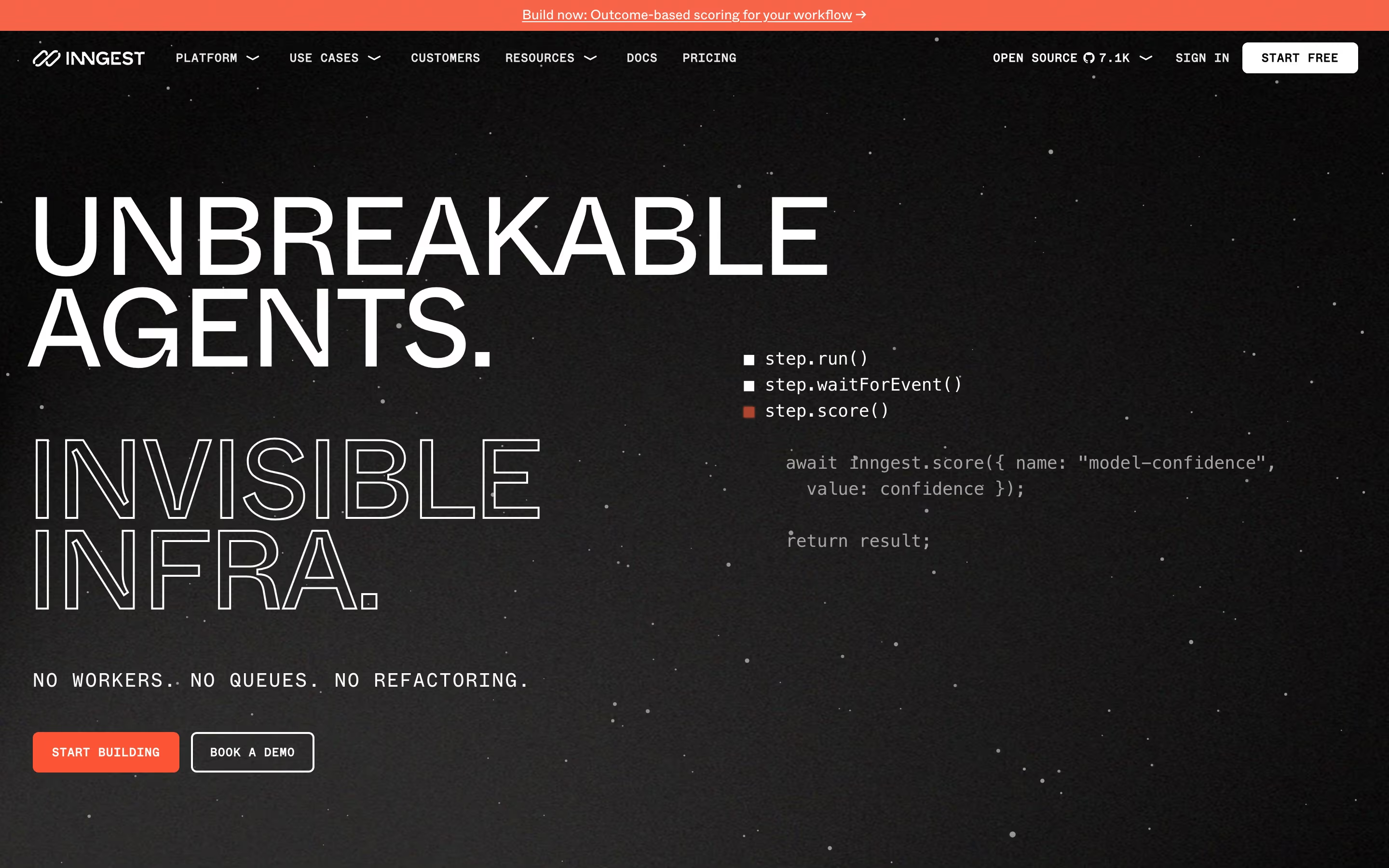
You can see the mechanism on individual pages once you know to look. Inngest runs Circular for the solid caps "UNBREAKABLE AGENTS.", a second display face for the outlined "INVISIBLE INFRA." below it, and a proprietary monospace for the body line "NO WORKERS. NO QUEUES. NO REFACTORING." and the buttons "START BUILDING" and "BOOK A DEMO" — three typefaces above the fold, of which this method's two-per-slot cap can only record part.
Hex is the same story in a different register: an italic serif for "The AI Analytics Platform", IBM Plex Sans for "where trust meets insight" directly underneath it, and a third, mono-ish face for the whole body paragraph and the labels running along the bottom — "Semantic models", "Rules & guides", "Endorsed tables", "Organization context". Windsurf runs a licensed grotesque nobody else in the catalog uses. Exa pairs a bespoke display face with Inter body.
Two practical readings follow.
First, "most popular font" is a question about the head of a distribution that has almost no middle. Once you are past rank two, you are choosing between options that appear on one to eleven sites out of 374. The difference between the #12 and the #40 most common typeface in SaaS is four sites. Optimising that choice for popularity is meaningless.
Second, the one-off is the norm among companies with a brand budget. If your goal is to look unlike your competitors, the data says the way to do it is not to pick the fifth-most-popular font. It is to pick a font that appears on one site — which, on 269 occasions in this catalog, is what somebody did.
Monospace and serif
Two whole categories of type behave differently enough to count separately.
| Families | Sites using at least one | |
|---|---|---|
| Monospace | 23 | 45 of 374 (12.0%) |
| Serif | 12 | 18 of 374 (4.8%) |
Monospace is a mainstream minority style. 45 sites — better than one in nine — set something on
their landing page in a fixed-width face, spread across 23 different mono families. The top three
are Geist Mono (13 sites), IBM Plex Mono (6) and JetBrains Mono (6). After that it collapses
immediately: Chivo Mono and Space Mono at 2 sites each, and then eighteen families at exactly one
site apiece — Berkeley Mono, DM Mono, Space Mono's neighbours, Noto Sans Mono (which is what
Temporal sets its buttons in), and a run of proprietary ones including figmaMono,
fragmentMono, ABC Favorit Mono, Modern Gothic Mono and Söhne Mono Leicht. Even inside the mono
category, the barbell holds.
Serif barely exists here. 18 sites out of 374, and no serif family appears on more than two: Hedvig Letters Serif, IBM Plex Serif, Reckless, Source Serif 4, Tiempos and Tobias are all at 2 sites, and the remaining six — including Instrument Serif, PT Serif and Untitled Serif — are at 1 each. That is the measured version of a thing designers say a lot: a serif headline on a SaaS page is a loud act. At 4.8% it is loud because it is rare, not because serifs are inherently expressive.
Worth noting which category the received-wisdom list over-weights. It ranks Tiempos Headline at #10 and Recoleta at #12 and Reckless at #20 — three serifs in twenty. This catalog counts 18 serif-using sites in total.
How to actually choose, given only what this shows
The data does not say which font converts better. Nothing here is an A/B test, and any article telling you a typeface lifts signups is selling something. What the counts do support is a shorter and more honest set of conclusions.
If you want your page to be invisible, use Inter, and know that you are choosing the default. 112 of 374 sites. It is free, it handles UI text and 64px headlines in the same family, and it will never be the reason a page fails. It will also never be the reason anyone remembers it. That trade is fine for a product whose screenshots are the star — which is what Linear is betting.
If you are shipping on Next.js, Geist is already the path of least resistance, so make it a decision instead of an accident. Its 47 sites are heavily concentrated in developer tools and infrastructure, which means the font now carries a category signal. If you sell to that category, that is free positioning. If you do not, you are borrowing somebody else's accent.
Use the headline/body split in the table as a fitness test. Suisse Int'l is 9 headline recordings to 1 body. PP Mori is 5 to 0. Circular is 4 to 0. Those are display faces, and the companies that license them know it. Conversely Geist Mono (9 body, 4 headline) and IBM Plex Mono (4 body, 2 headline) are being used to be read, which is a much braver call. Before you commit, find your candidate in the table and check whether anyone is doing with it what you are about to do.
Two families is the working pattern; three is a project. The most common configuration in this data is a display face plus a body face — Manrope over Inter on Supabase, Aeonik over Inter on Appwrite, Figtree over Plex Mono on Qodo, ABC Diatype over Plex Sans on Replit. Sites running three or more, like Inngest and Hex, are doing something genuinely harder and have the design resource to hold it together.
Free is not the compromise position. Of the families in this top twenty, Inter, Geist, Geist Mono, DM Sans, Manrope, IBM Plex Sans, IBM Plex Mono, JetBrains Mono, Instrument Sans, Figtree and Poppins are free or open source, and they occupy most of the upper half of the ranking. The premium faces — ABC Diatype at 11 sites, Aeonik at 10, Suisse Int'l at 9, PP Mori at 5, Roobert at 4, Circular at 4, Matter at 4 — sit in the single digits by design. You are not buying quality when you license one. You are buying scarcity, and the counts above tell you exactly how much scarcity you get.
And the choice matters less than what you set in it. Across the 374 sites, the pages whose typography is memorable are not the ones with the rarest font. They are Blacksmith explaining its entire product as a two-line YAML diff, Xata putting its value proposition in terminal type because its product is a terminal tool, and Appwrite ending a headline in a blinking underscore. All three of those use free typefaces from the top ten. To keep exploring beyond these fourteen, BestSaaSWebDesigns' hero sections hub groups every captured site by hero pattern, and the style and category hubs slice the same catalog a different way — every individual site page lists the exact typefaces detected on it, the same underlying data behind every count above.
At a glance
| Site | Category | Stack |
|---|---|---|
| Linear | Productivity & Collaboration | Next.js |
| Vercel | Engineering & Infrastructure | Next.js, Tailwind CSS |
| Xata | Engineering & Infrastructure | Next.js, Tailwind CSS |
| Treblle | Engineering & Infrastructure | Next.js |
| Cortex | Engineering & Infrastructure | Next.js, Tailwind CSS |
| Temporal | Engineering & Infrastructure | Svelte, Tailwind CSS |
| Supabase | Engineering & Infrastructure | Next.js, Tailwind CSS |
| Krea | Design & Creative | Svelte, Tailwind CSS |
| Blacksmith | Engineering & Infrastructure | Webflow |
| Qodo | Engineering & Infrastructure | WordPress |
| Composio | Engineering & Infrastructure | Next.js, Tailwind CSS |
| Rootly | Engineering & Infrastructure | Webflow |
| Miro | Productivity & Collaboration | Framer |
| Inngest | Engineering & Infrastructure | Next.js, Tailwind CSS |
Frequently asked
What is the most popular font for landing pages?
Inter, by a very wide margin. We detected it on 112 of the 374 catalog sites where a real typeface was found — 29.9%. It was recorded as a headline face on 69 of those and as a body face on 46. Second place is Geist at 47 sites (12.6%). Third place, Geist Mono, is at 13 sites. There is no close race for first.
Is Inter still the default SaaS font in 2026?
Yes, but it is no longer the only default. Inter's 112 sites are still nearly two and a half times Geist's 47, so nothing has displaced it. What has changed is that a second default now exists: Geist did not appear in this kind of count a few years ago and now sits at 12.6% of the 374 sites, mostly on Next.js projects.
Should I use a free font or license a premium one for my landing page?
The measured answer is that free wins on volume and premium wins on differentiation. Inter, Geist, Geist Mono, DM Sans, Manrope, IBM Plex Sans, IBM Plex Mono, JetBrains Mono, Instrument Sans, Figtree, Poppins, Plus Jakarta Sans and Albert Sans are all free or open source, and they occupy most of the top of our ranking. The premium faces in the top twenty — ABC Diatype (11 sites), Aeonik (10), Suisse Int'l (9), PP Mori (5), Roobert (4), Circular (4) — each sit in the single digits, which is precisely what you are paying for.
How many different fonts do SaaS landing pages use?
327 distinct families across the 374 sites, and 269 of those families appear on exactly one site — 82% of every family we detected is used by a single company. That is the real shape of SaaS typography: one dominant font, one runner-up, and a very long tail of one-offs. Note that our method keeps at most two families per element group, so sites running three or more typefaces are under-counted.
Do many SaaS sites use serif or monospace type?
Monospace, more than you would guess; serif, less. 45 of the 374 sites (12.0%) use at least one monospace family, spread across 23 different mono faces led by Geist Mono (13 sites), IBM Plex Mono (6) and JetBrains Mono (6). Only 18 sites (4.8%) use any serif family at all, and no single serif appears on more than two sites.
Related reading
We Analysed 355 SaaS Websites: Stacks, Colours, Fonts and Sections
Original data from 355 real SaaS websites we captured and tagged ourselves — which tech stacks they run, what colour they actually lead with, how dominant Inter really is, and which page sections most companies never build. With the limitations stated.
12 Real SaaS Hero Sections That Nail the First 5 Seconds
What Firecrawl, Xata, Rootly, Monday, Superlist, Tidio and six other real SaaS companies actually put above the fold — real headlines, real CTAs, real product UI, not generic hero-section advice.
The 30 Best SaaS Websites in 2026 (Reviewed From Real Screenshots)
Thirty SaaS websites reviewed at equal depth from screenshots we captured ourselves — what's above the fold, the one section each does unusually well, and the stack, palette and typefaces behind it. With a stated selection method, not a handpicked vibe check.